Dashes (a.k.a. Blakey needs to fix contrast on his monitor)
-
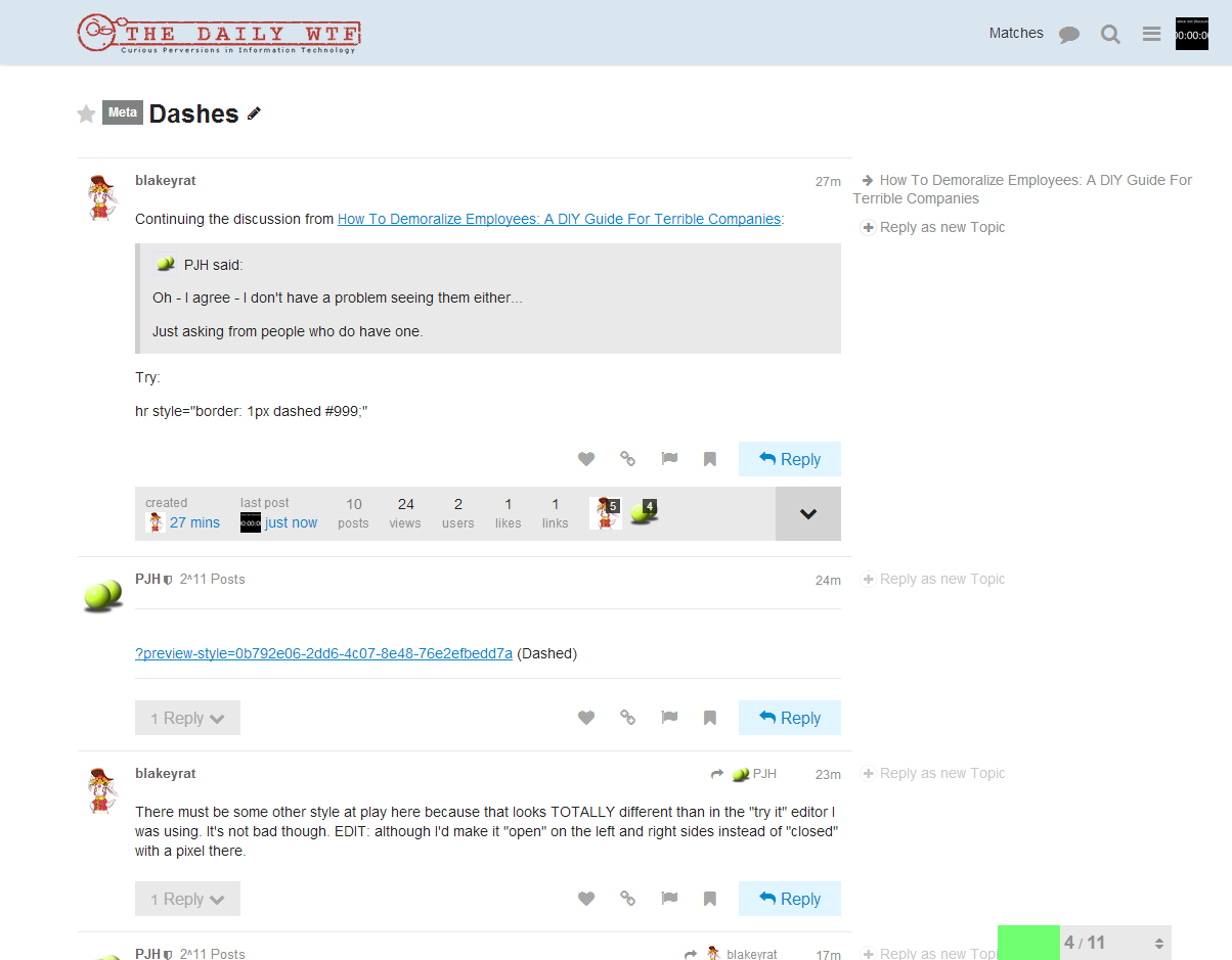
Continuing the discussion from How To Demoralize Employees: A DIY Guide For Terrible Companies:
Oh - I agree - I don't have a problem seeing them either...
Just asking from people who do have one.
Try:
hr style="border: 1px dashed #999;"
-
Edit: This post and the (about) 15 beneath it have been moved over from the other thread
Would this be any better?
-
If only you had the ability to apply CSS on a per-user basis. @blakeyrat could have rules that were composed of ClipArt like in MS Word yard sale brochures from the 80's-90's.
-
-
@Intercourse said:
If only you had the ability to apply CSS on a per-user basis.
Well quite. But sufficient numbers of people do have problems with hr's on here I think...
-
It is rather faint especially if my laptop's screen is at the wrong angle.
-
?preview-style=91edf7f2-3655-4041-a8e3-73a379a680e3 (height: 5px - previous was 10px):
-
Well it's visible. Ugly as shit, but visible.
-
Issue there is that it is only done to the ones inside the post, but the one that separates two posts is still the (apparently) hard to see style. If they are causing problems inside a post then the ones between should also probably have something.
-
?preview-style=7ee7bf69-2e1d-4109-8e0a-e679f97d1b1d (Sandbox 3)
-
but the one that separates two posts is still the (apparently) hard to see style
Problem is, that isn't a single HR. That's at least (from memory) three separate borders.
-
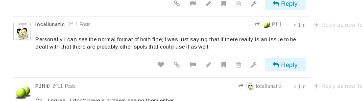
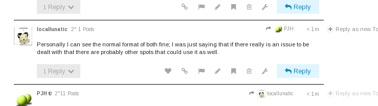
Personally I can see the normal format of both fine; I was just saying that if there really is an issue to be dealt with that there are probably other spots that could use it as well.
-
Oh - I agree - I don't have a problem seeing them either...
Just asking from people who do have one.
-
?preview-style=a71cd5f2-6763-46ae-ba73-6b65d8573e0b (Post Separators)
Before:
After:
-
That's at least (from memory) three separate borders.
Looks like it's just 2, if you're referring to the "between posts" border:
.topic-avatar {
  border-top:1px solid #e9e9e9;
}
.topic-body {
  border-top:1px solid #e9e9e9;
}
/* If you want to also modify the border
   between the last post and the button bar */
#topic-closing-info {
  border-top:1px solid #e9e9e9;
}
Bah, you posted right before I did.
-
Looks like it's just 2, if you're referring to the "between posts" border:
Two now. The one above the "In reply to" used to be part of it as well - no longer it seems.
-
Goddamned, go to the new topic in meta. You're going to make me agree with Jeff on something.
Let's not do 34732842734237483274 back-and-forth "can you hear me now?" bullshit exchanges in a topic with actual content, please.
-
-
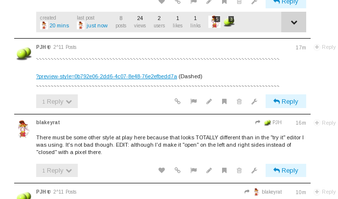
There must be some other style at play here because that looks TOTALLY different than in the "try it" editor I was using. It's not bad though. EDIT: although I'd make it "open" on the left and right sides instead of "closed" with a pixel there.
-
Ok - I'll move all the CSS crap over to it..
Edit: If I could locate that thread in the dialog.... :frowny:
-
Goddamned, go to the new topic in meta. You're going to make me agree with Jeff on something.
Let's not do 34732842734237483274 back-and-forth "can you hear me now?" bullshit exchanges in a topic with actual content, please.
Ah the perils of pointing a discourse annoyance in an offhand manner. Many good threads were lost to Meta that way.
-
They stand out lots to me, but I'm not one of the people changes are aimed at helping so you'd need to get input from someone like @blakeyrat on that.
EDIT: and you are apparently making a new topic for testing this junk out, n/m.
-
Changed to
hr {
    border-top: 1px dashed #999;
    border-bottom: 1px dashed #999;
}
-
Yeah I'm ok with that. I dunno how other people feel, what we really need is a designer. I ain't one, and Atwood sure as shit ain't.
-
Actually now that I look at it again, we might want to try a lower width than 100%. Maybe 66%? I'm not sure I like it going all the way to the edge of the screen, when there's no "ink" at the edge to contain it.
-
Width at 90%, and I've added the darkened line separating posts.
-
Ok it stopped working for me, even after using the magical link. I'm sure it's fine, whatever.
-
-
Why does this topic start at 4?
-
4 what?
-
-
Because that counter notes the post at the bottom of your screen.
As opposed to the URL which points to one near/at the top.
This has been discussed quite a few times...
-
Ok I like the darker division between posts.
The HRs though, if you're going to lower the width you gotta center them. Think of how HRs work in a book you've read. They're never left-aligned.
-
Well compared to the separators, they are sorta centred..
-
When I click the link it also doesn't work, but if you focus the address bar after doing so and hit Enter it does. Looks like it isn't picking up the preview stuff right for some reason.
-
I too like the darker division. Not worried about being smaller though.
-
I think the real problem when they were 100% is that they're inside an imaginary box that contains the post, but that box has no borders at all, so they kind of just "end" in the aether. Especially on the right side. If you center them, that problem goes away.
-

-
What do you think of these? Too "non-flat?"
hr {
    width: 65%;
    height: 0px;
    margin-left: auto;
    margin-right: auto;
    border: 1px solid #aaa;
    border-style: inset;
}
-
I want full borders on every post.
-

```css hr { border: none; height: 4px; background-image: url('/uploads/default/6562/1d22b2a01bd41b84.png'); } ```Somewhat terrible. what I'll see if I can do better when not falling asleep.
-
It would work if the link had
data-auto-route="true"on it, but you can't add that yourself. (That skips the Ember router and goes straight towindow.location =. No clue about the name.)
-
In case you missed it: http://what.thedailywtf.com/t/the-evil-ideas-thread/1353/272
(blakeyrat, don't waste your time following that link)
-
Testing.
really?
-
hmmm
#---
-
I ain't one, and Atwood sure as shit ain't.
Thank EDIT:
God$Deity. And I bet he agrees as well.
-
ok what the hell is this?
ok what the hell is this?
everything you do changes depending on random different side-effects of previous or later characters.
I seriously can't even guess what the effect will be on each thing, I have to just type it in and play with spacing and line returns until it resembles what I wanted. Which was for the PLAIN TEXT I TYPED IN TO STAY THE FUCK LIKE I TYPED IT.[code]guess it's all code blocks from here[/code]
#---
oh wait, that's right, it randomly does piss poor highlighting on code blocks, so that's out too.
#---
PRE all the way baby. Here's what I typed above to get random lines and dashes and nothings and somethings...
ok what the hell is this?ok what the hell is this?
-
How's this?
.topic-body, .topic-avatar, #topic-closing-info {
    border-top: 0 !important;
}

article {
    border: 0 solid transparent;
    border-image-source: url('/uploads/default/6575/e4d2242b1d9c9f77.png');
    border-bottom-width: 3px;
    border-image-slice: 0% 0% 100% 0%;
    border-image-repeat: repeat;
}
Using /6575/e4d2242b1d9c9f77.png
 :
:
Using /6576/5339c5e61e25bb46.png
 :
:
Is
border-imagea big no-no?
-
The horizontal rules seem to have gone invisible again.
It's like the CSS lost the rule... for the rule!

-
Absence of YEAAAAAAAAAAAAAAAAH and ginger guy with smug attitude.