Text rendering fail
-
I signed in to a website and noticed this in a corner:
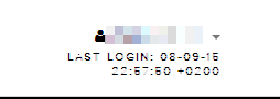
"Last login... 08-09-2016?
 ?! How can that be so broken?"
But if I zoom the browser to 110%:
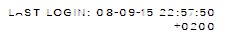
It actually says 15... and we can also see that part of the A is missing for some reason.
I know font rendering is not a trivial thing, but come on.
-
Must be using the Thermal Receipt Paper™ font. Did you leave your browser in the sun for too long?
-
That's in Chrome by the way (well, Opera technically, same thing) but it looks exactly the same in Firefox.
It looks a bit smoother in IE11 but the 5 still looks like a 6. On Edge on the other hand it actually renders well, woo!
-
I remember about a year ago I had a problem that all fonts in Opera looked like shit. But I resolved this issue by going to about:config and unchecking the "make all fonts look like shit" option. Maybe there's something for you too?
-
It looks a bit smoother in IE11 but the 5 still looks like a 6. On Edge on the other hand it actually renders well, woo!
For all the justifiable bashing of IE over the years, drawing text properly is one thing it's generally done better than the other browsers.
-
Paging @magus for luxurious font rendering!
-
Yes mistress Lady Jellypotato, I appear as summoned.
...I mean what? Our support ticket website here has disastrously awful kerning in IE, but apparently not in Chrome. My browser is still weird.
-
My browser is still weird.
So Sleipnir's luxurious pro level rendering juice doesn't fix it?
What a shame.
-
Well, to be fair, I don't have the wobsite to test it on. And anyway, he can do that himself.
Besides, Sleipnir basically just does MacOS antialiasing to all the text everywhere, making it slightly blurred. It's definitely not for everyone. In fact, I don't really like this browser very much, and only use it at work.
Now as for fonts, that's different. Buxton Sketch/eurofurence ftw!
-
I thought it means 2008-09-16 when first seeing this.

-
Except if you're using a custom font from Typekit (which loads fonts using a specific order, but is a pretty common web font provider) with IE-specific DX CSS transforms (needed if you want to match what all the other browsers can do with regular CSS). I tried this once to apply a small 5° rotation to some text and it lost all anti-aliasing in IE. Turns out I could have the rotation, or the correct font, but not both.
-
for some definition of 'love'.
-
To be fair, even Chrome on default seems to have problems rendering rotated fonts nicely. Or, in fact, rotating them:
-
Firefox isn't much better.
-
@thegoryone said:
Comic Sans
Comic Sans is so passé. The discerning designer has moved on, to Papyrus.
Filed under: amongst others
-
Papyrus is much more likable than Sans, at least imo.
I haven't tried a genocide run yet, though.
-
To be fair, even Chrome on default seems to have problems rendering rotated fonts nicely.
WOMM. (The OSX font renderer is a lot more capable.)
-
-
I hope Avatar 2 upgrades from Papyrus to Comic Papyrus.
-
I like Comic Sans.
I hope Avatar 2 upgrades from Papyrus to Comic Papyrus.
I hope that Gods of Egypt movie uses Times New Roman, just to fuck with people.
