Bugzzzzz
-
I spent a good chunk of yesterday trying to find out why projects weren't compiling. Somehow, I'd entered an O instead of a 0 in a #define statement that sets a firmware version using hexadecimal notation
And this is why I use a font with slashed '0's in my IDE, as abarker points out:
@abarker said:I sometimes use a 0 instead of an O. Usually, no one notices.
-
Il|1 is important too, as is rnm. Gotta watch out for lEnurnerab1e and the like.
-
Il|1
Which is why you don't use a san serif font in an IDE.
rnm
Monospace solves that one.
-
Or you couId design a font where the characters actua||y Iook different. Either way works.
-
design a font where the characters actua||y Iook different
Serifs are the easy way to get them to look different (note the capital i having small lines at the end of the main stroke):

-
-
I'm still using Buxton Sketch to program, as in my heretical thread. The I is shorter, and the l is curved, which works out rather well.
-
I guess I it's just different strokes then, or whatever, because the thing I don't like is when people overcomplicate stuff that really doesn't have to be rocket science.
Anyway, since we're sharing stories, have you read the Gillette episode of overqualified?
-
Hey, at least it's not Monaco.ttf. Scanning a line of Monaco text is like driving your eyeballs down a bumpy dirt road.
-
No repro here. My computer seems not to have Monaco.ttf installed. Perhaps this is a Good Thing.
-
Perhaps this is a Good Thing.
In more ways than one—Monaco is installed by default on Mac Os
In Monaco's defense, it wasn't designed for high resolution at all; all of the bad design decisions you see above probably make sense if you reduce the font back to a pixel grid.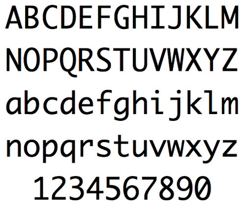
-
Apart from the l looking a bit odd, I don't really see anything objectionable about that...
-
It's incredibly uneven. There's excessive overshoot
 only on the round letters, achieving the opposite effect that overshoot is supposed to (without it, rounded or pointy caps, like the top of the A, appear smaller than the flat tops, due to optical illusion)
The same thing is happening with the miniscules
 although the effect may seem more subtle zoomed in like this, it is incredibly hard on the eyes when you try to scan a line of this font, between the way that none of the letters can keep a straight line (the a isn't even in line with itself), the slanty loops in some of the letters (but not the e wtf!?) clashing with the squareness of others, and of course the uneven spacing between all of the letters (which is always going to be tricky for monosopace, but modern programming fonts handle it a lot better than Monaco does)
-
Before I switched to Buxton Sketch, I used eurofurence. Before that, monofur. But before that I quite liked Source Code Pro.
Still, I don't regret my change to Buxton Sketch. It looks like chalk.
-
-
I like using Asian fonts for monospace because the embedded bitmap fonts for small pt sizes are pretty.
And I even go as far as fixing the \s in fonts that replace them with Yens.
-
Monofur is the same font, but monospaced. I would google it and find out if the results are similar, but I'll leave that to someone who's into that.
-
Way ahead of you!
Monofur only finds the font

-
Well, that isn't a bad thing to find, at least. The power of the 'e' is immense!
-
Nobody wants to see it probably, but here's a screenshot:

-
Nobody wants to see
What, that you're using
Stringbut notInt32? andcharbut notstring? is wrong with you!?
And even that wouldn't be too bad, but you have camelCase public methods!
-
It was written hastily for a thing here.
And I mostly do VB.NET at my job, so my sensitivity for proper casing has kind of vanished (and I also did Java for some time in my life which also affected me).I guess something is indeed wrong with me.
-
And I mostly do VB.NET at my job
Java for some time
I guess something is indeed wrong with me.
Yes, that seems to follow.
Still, you're here, so at least you are capable of recognizing problems. Better than most people.
-
Something I'd quite like to see is if an IDE would replace characters, rather than just highlight them, depending on their place in the syntax tree. So for instance, string delimiters would be displayed as quotation marks, and hyphen-minus would be replaced with a minus sign when parsed as an operator, or a hyphen otherwise.
-
That's a good idea. You could write a VS plugin without tooooo much effort.
