Desktop Mode should have configurable max width
-
@Tsaukpaetra said in Desktop Mode should have configurable max width:
So there really is no way to get around the XSS thing with custom themes?
Not that I'm aware of (short of hosting the CSS ourselves and modifying NodeBB to pull from there). But this is all pretty new stuff to me.
-
@Tsaukpaetra Well... you could perhaps get around it with a bunch of CSS and liberal use of
!important.Maybe... take all the CSS in the default theme, strip out all of the responsive
@mediarules, and make everything that remains into!important, then inject that. Test it to make sure they're applying correctly, because it's also entirely possible that the themes are using a few!importantrules of their own.
-
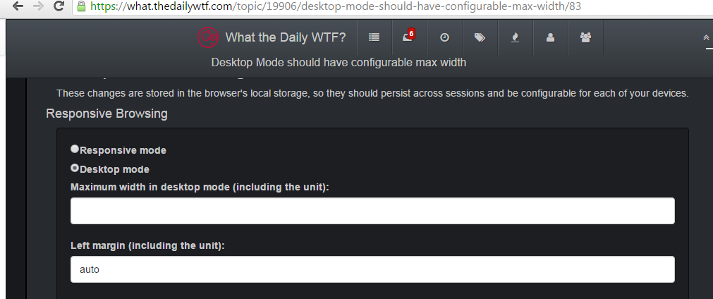
Update:
Current menu:

Settings dialog:
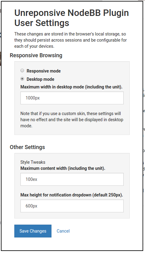
Those bottom two are based on my personal stylish styles. Those are not dependent on the default skin.
-
@boomzilla said in Desktop Mode should have configurable max width:
short of hosting the CSS ourselves and modifying NodeBB to pull from there
Ooh, I just had a Bad Idea: Proxy!
We could make a virtual route
/themes/bootswatch/{themenamehere}/bootstrap.min.cs, which would proxy-cache tohttps://maxcdn.bootstrapcdn.com/bootswatch/latest/{themenamehere}/bootstrap.min.css
Therefore, no XSS issues, right?
-
@Tsaukpaetra said in Desktop Mode should have configurable max width:
So there really is no way to get around the XSS thing with custom themes?
The obvious solution is to host the custom themes on our own domain so it's no longer an XSS. I don't know how practical that is in NodeBB.
-
@boomzilla Does maximum content width include header/footer?
I like it if it lets me make sane paragraph widths.
-
@blakeyrat said in Desktop Mode should have configurable max width:
The obvious solution is to host the custom themes on our own domain so it's no longer an XSS. I don't know how practical that is in NodeBB.
Or proxy it, like my post directly above yours mentioned. but then again, not much point in a CDN if you're doing that anyways...
-
@blakeyrat said in Desktop Mode should have configurable max width:
@boomzilla Does maximum content width include header/footer?
I like it if it lets me make sane paragraph widths.
Right now it only does the stuff inside a post, so sane paragraph widths. Buttons and headers and stuff stay where they are.
If you go into desktop mode you can set the maximum width for that, which affects everything. That is what I believe @accalia was asking for with this topic. This is basically how I build the rule for that setting:
.container-fluid { max-width: " + settings.maxFluidWidth + ";}"Happy to change that if it's not what was actually asked for.
-
@boomzilla said in Desktop Mode should have configurable max width:
Right now it only does the stuff inside a post, so sane paragraph widths. Buttons and headers and stuff stay where they are.
Does "reply" and "quote" count as "inside a post" or outside?
-
@boomzilla said in Desktop Mode should have configurable max width:
That is what I believe @accalia was asking for with this topic.
yep.
if there's an option to remove the left margin for the container that would be pretty swell as well, but that's not nearly as important as setting that max width.
-
@blakeyrat said in Desktop Mode should have configurable max width:
Does "reply" and "quote" count as "inside a post" or outside?
Those are part of buttons and headers and stuff. They stay over on the right. When I put in my stylish rule for post width, I couldn't figure out a decent way to make those move over that didn't mess up a bunch of other stuff. I was in over my head on the CSS.
-
@Tsaukpaetra said in Desktop Mode should have configurable max width:
@boomzilla said in Desktop Mode should have configurable max width:
short of hosting the CSS ourselves and modifying NodeBB to pull from there
Ooh, I just had a Bad Idea: Proxy!
We could make a virtual route
/themes/bootswatch/{themenamehere}/bootstrap.min.cs, which would proxy-cache tohttps://maxcdn.bootstrapcdn.com/bootswatch/latest/{themenamehere}/bootstrap.min.css
Therefore, no XSS issues, right?Just on a whim, I tried abusing TinyUrl to see if a same-domain URL with a simple 301 redirect to the external source would allow you manipulate the stylesheet. Doesn't appear to work. Proxying it should work, but you'd actually have to serve the content.
-
@boomzilla said in Desktop Mode should have configurable max width:
Those are part of buttons and headers and stuff. They stay over on the right. When I put in my stylish rule for post width, I couldn't figure out a decent way to make those move over that didn't mess up a bunch of other stuff. I was in over my head on the CSS.
The
#contentelement sets the width of the whole topic, including the width of the posts, including the widgets under each post.
-
@boomzilla It looks like they're all within LI with a component of "post", but unfortunately no CSS class. (Because why would there be.) But they're all within a UL with the class of "posts", and it looks like existing selectors use that combo:
.posts > LI { styles go here }And BTW don't feel bad, CSS is ass-shit.
-
@accalia said in Desktop Mode should have configurable max width:
if there's an option to remove the left margin for the container that would be pretty swell as well, but that's not nearly as important as setting that max width.
Ah, yes, that makes sense.
-
@blakeyrat said in Desktop Mode should have configurable max width:
And BTW don't feel bad, CSS is ass-shit.
I definitely don't feel bad about it. Just explaining the thought process.
-
@boomzilla Well you should feel bad so when I tell you not to feel bad you feel better! Sheesh. Can't do anything right.
-
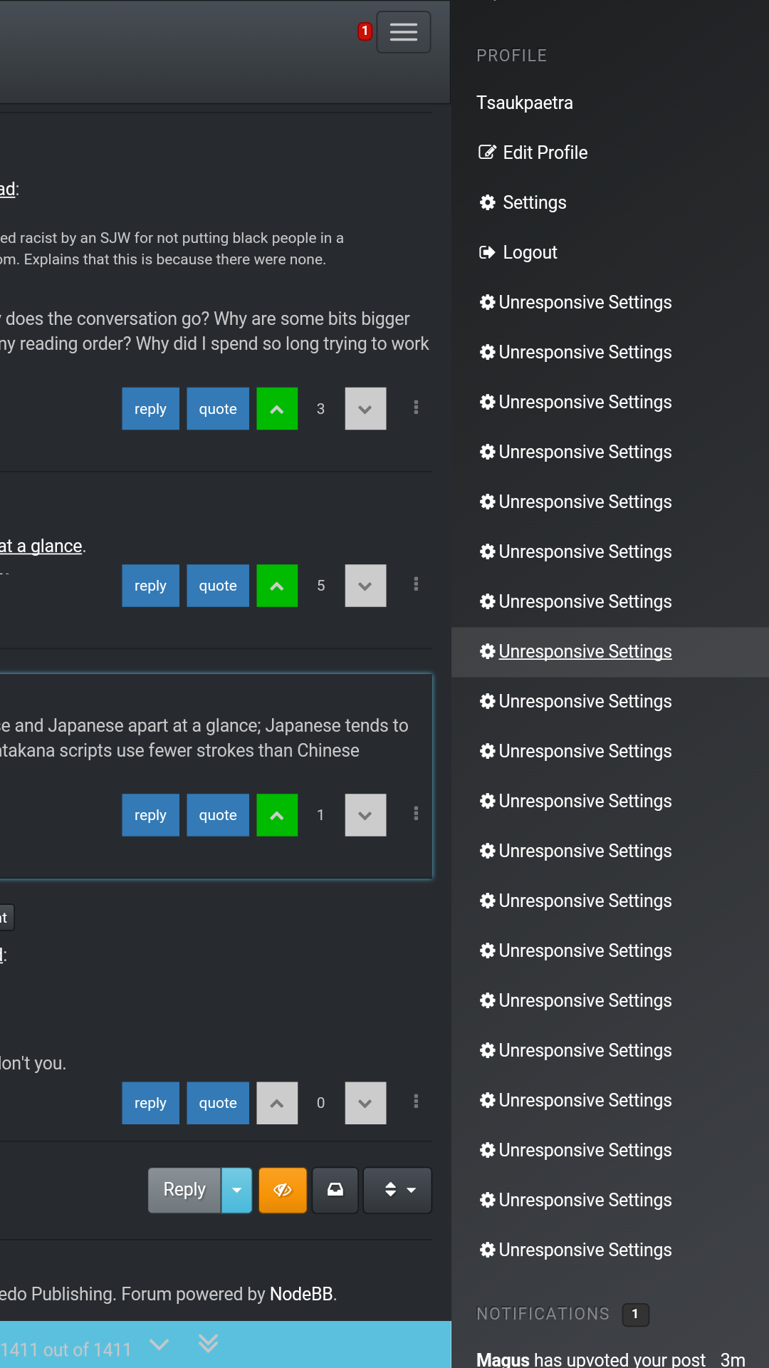
@boomzilla I like it.
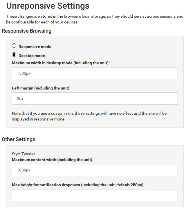
All things must be ruined with a trip down the bikeshed, so... why not just have the title of the dialog as "Unresponsive Settings"?
Also - what's the difference between "maximum width" and "maximum content width"?
-
@loopback0 Width of the whole page vs. width of posts? That's what I'd assume.
-
@RaceProUK I thought that, then thought "what happens if maximum width of the page is less than the width of the browser?" so wasn't sure I was right.
*shrug* CSS isn't really my thing.
-
@loopback0 said in Desktop Mode should have configurable max width:
Also - what's the difference between "maximum width" and "maximum content width"?
So...the maximum width sets the maximum width of everything (by constraining the containers). Maximum content just makes it so that no matter how wide your window, you can control how wide the paragraphs get.
@loopback0 said in Desktop Mode should have configurable max width:
why not just have the title of the dialog as "Unresponsive Settings"?
Probably a good idea.
I'm open to clarifying suggestions on the wording of all of it. I purposefully didn't go into an explanation when I posted the screenshots to elicit feedback on how unfriendly my wording was.
-
@boomzilla said in Desktop Mode should have configurable max width:
So...the maximum width sets the maximum width of everything (by constraining the containers).
For example, if I set maximum content (the posts etc, presumably) width to 1000px, maximum width to 1500px and the browser window is 1920px (give or take scrollbars) then what doesn't fill the full width of the browser?
If it applied to this skin (ignoring the setting doesn't affect custom skins, the blue makes it easier to visualise) - would the posts stop at 1000px wide and the blue header stop at 1500px?

-
@loopback0 said in Desktop Mode should have configurable max width:
If it applied to this skin (ignoring the setting doesn't affect custom skins, the blue makes it easier to visualise) - would the posts stop at 1000px wide and the blue header stop at 1500px?
Yes. And if you set the left margin (implemented, but haven't posted screenshots yet) to something other than auto, it wouldn't center the content in the page (@accalia's most recent request).
-
...and then:
-
@boomzilla Ok, gotcha. That fits in with what I first thought (before questioning it) so I guess that part of the wording is alright.
-
@loopback0 I think it would be clearer to say "maximum post content."
-
@boomzilla Or just say 'maximum post width'
-
@boomzilla said in Desktop Mode should have configurable max width:
I think it would be clearer to say "maximum post content."
Yes, but I think
@RaceProUK said in Desktop Mode should have configurable max width:
'maximum post width'
Is clearer still.
edit: although presumably it applies to things like the topic lists? In which case using the word post (so either version) might not be clearer.
-
@loopback0 said in Desktop Mode should have configurable max width:
title of the dialog as "Unresponsive Settings"?
Out of context, this would be hilarious!
-
@Tsaukpaetra said in Desktop Mode should have configurable max width:
Out of context, this would be hilarious!
:thatsthejoke.xml:
-
This stuff is now live. Probably requires a few refreshes, of course.
-
@boomzilla And cooties, apparently. Because adding a bunch of HTML and CSS obviously means the DB can no longer cope.
-
@boomzilla said in Desktop Mode should have configurable max width:
This stuff is now live.
Um...
I get that this shouldn't work for custom themes, but... is the duplication really necessary?
Edit: Also the popup dialog underlaps the title bar. ;)
-
@boomzilla A Ronseal bug report:
It's exactly what it is in the picture
-
@Tsaukpaetra said in Desktop Mode should have configurable max width:
Edit: Also the popup dialog underlaps the title bar.
Hmm...must be a custom theme thing. Doesn't do that on default.
@RaceProUK said in Desktop Mode should have configurable max width:
A Ronseal bug report:
I don't know what Ronseal is or what the bug is here.
-
Another bug:
My "Style Tweaks" settings:
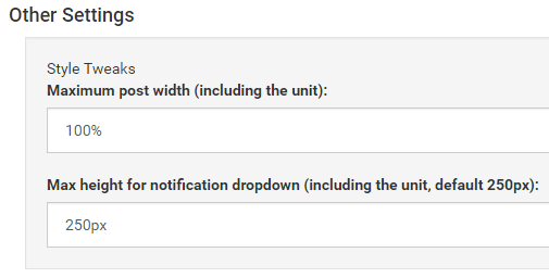
My Notification pane (now with added "let's not leak Mafia info" redaction):
What shows in Chrome's Developer Tools:
#menu .notification-list, .header .notification-list {
    max-height: 100%;
}
This is on Default skin.
-
@boomzilla said in Desktop Mode should have configurable max width:
what the bug is here
The top of the settings popup is behind the header bar.
-
@boomzilla said in Desktop Mode should have configurable max width:
Doesn't do that on default.
My screenshot is on the default theme
-
@RaceProUK said in Desktop Mode should have configurable max width:
My screenshot is on the default theme
Shit. I swear it wasn't doing that.
-
@ChaosTheEternal Ok but what the fuck is ronseal?
-
@boomzilla said in Desktop Mode should have configurable max width:
Shit. I swear it wasn't doing that.
It wasn't when it was first live...
-
Fun fact: it isn't under the title bar thing on mobile, but if I'm not paying attention, this might happen:
-
@Tsaukpaetra Hmm...yes, I see this when I switched to Darkly.
-
@boomzilla I think the trigger is changing topics, conditions for duplication are low-width view and custom theme.
At least, each and every duplicate link is totally functional, they do bring up the customization dialog.
-
@Tsaukpaetra Yeah, I just pushed 0.3.1 which fixes that and the z-index of the settings tab.
-
@ChaosTheEternal
Clarification on this bug, and another:It looks like the notification dropdown uses the Maximum post width setting for the max-height and not the Max height for notification dropdown setting.
Also, after saving settings and the page reloads, in Chrome 50 on Windows 10, if you re-open the settings dialog and hit "Save Changes", the page doesn't reload and the settings aren't actually saved. Not sure if that's a "this plugin" bug or something linked to it being a NodeBB dialog. You have to do a hard refresh to get that settings dialog to work again.
-
 Max notification height doesn't work · Issue #4 · boomzillawtf/nodebb-plugin-unresponsive
https://what.thedailywtf.com/post/893667 It looks like the notification dropdown uses the Maximum post width setting for the max-height and not the Max height for notification dropdown setting. Als...
-
That's some programmer UI you got going there.
Also, it's kind of weird that "responsive" mode is the one that stops responding to the width of the window beyond a certain point, while "desktop" mode is the one that's a bother to read on desktops with sufficiently wide monitors.
-
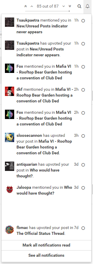
@boomzilla Is it worth adding a setting for the width of the notification dropdown? The dropdown is much better if it's made wider.
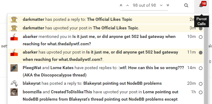
(local CSS provided by @darkmatter IIRC)
-
@loopback0 Ooooo...I like that.
@CreatedToDislikeThis said in Desktop Mode should have configurable max width:
That's some programmer UI you got going there.
Yeah. If you have suggestions on how to make that stuff better...