Poll: TDWTF's new design is...
-
Continuing the discussion from The Official "Likes" Thread:
@faoileag said:Just remembered what I wanted to do all evening: create a new poll!
So @apapadimoulis has put a preview of TDWTF's new design online, but no poll about it on Discourse? That can be changed:TDWTF's new design is:
- The best thing since sliced bread
- Overdue
- Better than the old one
- OK
- Worse than the old one
- Hopefully still a long way off
- Worse than Discourse
- There has been a preview of the redesign?
- FILE_NOT_FOUND
-
Amazing, no FILE_NOT_FOUND responses, yet. Nor any even slightly favorable, though that's not such a great surprise.
-
Amazing, no FILE_NOT_FOUND responses, yet. Nor any even slightly favorable, though that's not such a great surprise.
But only one vote "Worse than Discourse". Ok, that 's a rather high bar to clear, but still.
-
And of course feel free to hate on it, but actual useful feedback should go here - https://github.com/tdwtf/WtfWebApp/issues
-
Nor any even slightly favorable, though that's not such a great surprise.
I don't hate it. But it needs work.
-
Github is a barrier to issues.
-
https://github.com/tdwtf/WtfWebApp/issues
I just had one of those moments - wanted to create a github account ("faoileag", what else), turned out the nick was already taken. Turned out: by me. Sheesh...
-
The only thing THAT REALLY BOTHERS ME IN THE DESIGN ARE THE SCREAMING TITLES. What the hell is with the all-caps mania these days?
-
-
HOW DOES NO SOUND?
-
SO YOU DO LIKE IT. WHY ARE YOU COMPLAINING?
Yay double negatives.
-
NO, I DO NOT LIKE EVERYTHING IN ALL-CAPS ALL THE TIME.
It is a barrier to reading. And, apparently, a barrier to comprehension.
-
It is a barrier to reading.
So is a terrible design in general. So, all-caps = terrible design. Glad we got that squared away.
-
It is, yes, and there's even reasons for it. But most of the people who use all-caps don't want to know or care that not only is it a bad design, but there are actual reasons why it is bad.
-
It is, yes, and there's even reasons for it. But most of the people who use all-caps don't want to know or care that not only is it a bad design, but there are actual reasons why it is bad.
I keep having to explain to people who want me to put things in ALL CAPS because IT'S IMPORTANT, DAMN IT, that it's not only ugly, if it's ALL in CAPS, how the hell do you differentiate things that are REALLY IMPORTANT from things that are KIND OF IMPORTANT?
And no, none of them even thinks of bold. Good thing too.
-
That's not even the primary reason for it being a problem.
It's physically harder to read all-caps because your brain has to study each letter more than it would otherwise. We're excellent pattern-matching machines, and that works here by us reading words as units, recognising the word as a whole by its shape rather than individual letters.
-
All Caps Is Less Annoying To Read Than Capitalizing All The Frist Letters!
-
That's not even the primary reason for it being a problem.
I know. But try to dump your elaborate explanation on people like that. Enjoy the blank stare, followed by them pointing at Caps Lock
-
No, I just show them a paragraph in all-caps and the same paragraph in proper case and ask them which they could read more quickly. They usually get the hint.
-
They usually get the hint.
Must be nice to have some faith in humanity left. I ran out.
-
I don't have a lot left and what I do have is usually eroded each day, but somehow I find some more. Usually it's after I have a beer.
-
ITALICIZED ALL CAPS, OBVIOUSLY
-
Faith in humans: -1
-
And of course feel free to hate on it, but actual useful feedback should go here - https://github.com/tdwtf/WtfWebApp/issues
Including the fact that Google's already started scraping it?
-
Menus went to all caps because Uppercase first letters look lopsided in buttons. It just isn't symmetric!
File or FILE
See, all caps fits more evenly in the button space!
Filed Under: I hate designers
-
Why is there no '...TRWTF' as an option in the poll?
-
Oh. Man. Just got a chance to look at it from home because (you know, blocked at work.)
It's... very busy.
No me gusta.
-
...but like Discourse we're getting it anyway.
-
Oh. Man. Just got a chance to look at it from home because (you know, blocked at work.)
Same here.
..........ick.
-
I don't have a lot [faith in humanity] left and what I do have is usually eroded each day,
Don't blame us!but somehow I find some more. Usually it's after I have a beer.
Ah, the dregs.
-
On the contrary this place reminds me that there are people in the world who are actually intelligent.
-
Why is there no '...TRWTF' as an option in the poll?
I wanted to keep the list of options short. Please notice that- Whatever @morbiuswilters is saying
is also missing.
-
While I sympathise with 'keeping the list short' in line with Occam's Razor and not multiplying entities needlessly, I feel that 'TDWTF's new design is... TRWTF' is an option that should not have been overlooked.
-
Oh. Man. Just got a chance to look at it from home because (you know, blocked at work.)
I haven't even had that opportunity yet, since work is the only place I tend to
wastespend time here.Just the preview image on the article alone wasn't very appealing though. I like my internet circa turn of the millennium, thank you.
-
You mean before the rise of the dark times, the rise of the empIEre? When pages were fucking pages and AJAX didn't exist yet?
-
When pages were fucking pages and AJAX didn't exist yet?
So you would prefer a "like" button to be implemented in the form of a CGI request?Come on, just because Discourse is making a mess of it doesn't mean Web 2.0 is completely bad!
-
The hover background! My eyes still hurt!
Have you ever heard that people actually, you know, READ the fucking content? White on bright yellow? White on bright red? You're kidding me, right?
That's why I read articles mostly via RSS: the current design is that bad already. The new one makes it even worse.
I mean, bigger font, yes. Long overdue for that.
Garish backgrounds? No.
No option to view full articles? No.
Recent articles doubling Recent WTFs? What the actual organic gluten-free homegrown fuck?Make it more contrast, use readable color palettes, get a serif font, and maybe it's going to be usable.
-
-
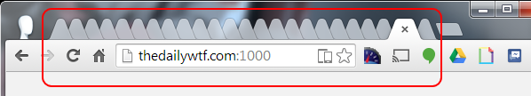
You certainly do like tabs, don't you?
Filed under: Do you memorize the position or how do you know which is which?
-
No, I didn't say that. I merely ascertained that those were the times, when buttons were actual buttons, things came only in pages and AJAX had not yet been invented (but since it came about in 2001, I'll let the matter slide, assuming you don't count 'loading via popup windows' or 'loading via iframe hell'), and actually yes, I wouldn't mind a like being a CGI request. It already is a CGI request anyway, just issued differently. First time I implemented likes on a system, it was straight requests rather than using AJAX.
Web2.0rhea is terrible because most sites engorge themselves on it. Strip it back to what's important and add the frippery if you must but you needn't concern yourself with it too badly.
-
You certainly do like tabs, don't you?
I made my screen smaller for the screenshot, but yeah I've got quite a few open right now.
-
-
The sort of design a cunt would make.
-
You certainly do like tabs, don't you?
...that's about the average number of tabs I have open in my browser...
(and when I start researching something, they multiply exponentially)
-
Well, I looked at it.
No.
Seriously, just no. It's bad. upon loading the page, my focus wasn't drawn to the stories, the actual reason for the site. The first thing in the mash of colour that I was able to focus on was the 'Recent WTFs'. Which isn't what I need to see first.
The actual article pages themselves are... okay. Image for the author is too big but whatever. (Not a fan of the horde of whitespace sitting to the sides of the page though. According to the internet, my screen must be half as wide as it actually is).
The front page just does not work for me at all though.
-
That's only slightly more (24) than I have open in one of my Chrome windows at the moment (20). I have 17 in this window, 13 in another, and a bunch of windows with fewer tabs.
-
Call me an old fart, if you like (because I am), but I'm with @Arantor on this one.
-
I think the new design is a kind of meta-WTF. Like, if you deliver WTF, then your design must also be WTF. It seems expertly designed to be very, very WTF.
-
I think it is shit. It looks like 100K other "Web 2.0" pages out there. Pages that got the idea wrong. The design is garish, and ugly. Websites do not need more shit, to be better. They do not need more color, and more widgets, and more shit. Simpler is better.
The one thing it is missing to be a RWTF is a popup asking me to sign up for your newsletter right after the page loads.
-
The newsletter popup should be delayed a few seconds, to catch you even more off-guard when you finally think it's all loaded and you're good to go.