Some proposed Discourse improvements for TDWTF
-
BTW, That controller you see is your standard Atari Jaguar controller.
Yup. And while my FPS game troll was pretty much directed in the same way @Maciejasjmj interpreted it, I did remember the Jaguar had this in the very least:
https://en.wikipedia.org/wiki/Alien_vs_Predator_(Jaguar_game)
No idea if there were any more FPSs on it, but honestly, it's probably better if I didn't know.
Filed under: It probably had Doom; everything has Doom, I have Doom on my microwave
-
I never played the Jaguar system so I have no first hand knowledge. I actually never saw one in real life.
As far as consoles go, I've only ever had this thing:
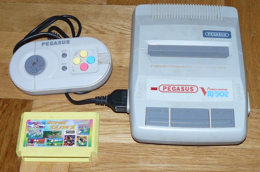
I do have a pad connected to my PC, but I only use it for old emulators. It also works for some platformers (though not much better than the keyboard).
Filed under: childhood memories
-
Is that a SNES/Super Famicom-looking Famiclone, with a gamepad that looks like an aborted child of a SNES controller and what an iPhone would look like in early 90s?
...
I'm in love, where can I get one?
-
Sort of. And those controllers were actually the best ones - the replacements were even crappier.
Getting a working one is kind of difficult, and they're pretty expensive for Famiclones (cult status et al), but they do sometimes pop up for just under $100.
-
Due to the whole show-the-target-post-in-the-middle-of-the-screen you get some really weird behaviour when using this.

I asked to go to post 80, but the menu bar says 79, the green box (which was the last UI element I interacted with) is off by one (up to two in the case of the editor being closed) and it's kinda jarring. I guess this is a low priority bug, but I'm still left wondering where I am. It could probably be mitigated by showing a post number in the thread view, or by "pinging" the requested post with a background fade after navigation.
-
Requested posts are always background faded on arrival. As for the "load in the middle top of the page rather than the top", yet again, that is @riking's change so you'll have to ask him.
I don't necessarily object to the change but it does result in a lot of questions and commentary about the different positions on the page, to wit:
- URL is shown as topmost post
- progress bar is shown as bottom most post
- navigated post target is middle top of page
That's three locations in play, instead of two if the target post loaded at the top.
-
Requested posts are always background faded on arrival.
Maybe for people that don't use high contrast mode.
@codinghorror said:As for the "load in the middle top of the page rather than the top", yet again, that is @riking's change so you'll have to ask him.
That's intentional? Because it's annoying as hell, and contrary to all my expectations.
-
If everyone else did it, I wouldn't be so annoyed by it but I don't know any software that does this on the web.
I actually think I'd have been way more amenable to changing the web if you guys had done it one step at a time.