The NodeBB Style Guide, alt. title: Sloppy Sloppy Sloppy - The Nobody Looked At This Before Shipping Story
-
Ok from the final product, let's try and figure out what the NodeBB style guide looks like:
Button captions are in lowercase, unless they're thread-level instead of post-level, in which case they are capitalized. Unless they are the "watching" button, in which case they are title case.
So far this all makes perfect sense.
Oh wait:
Post-level button captions are lowercase, but post-level menu captions are capitalized. Because of course they are. Plus all previous rules.
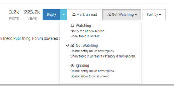
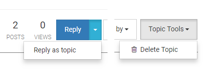
Thread-level menu items have little text explanations below each item. But only the "watching/Watching/WaTChInG" menu, none of the others do. The menu items are in title case, not capitalized like the menus at the post-level. Because consistency.
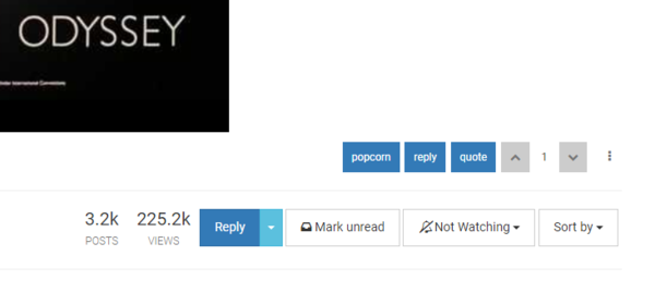
This screenshot illustrates another rule: thread-level labels (under the post count and view count) are in all-caps. Because why wouldn't they be.
But wait, this is all too simple and logical. Surely we can mix it up a bit? Ah, yes, let's look at the "sort By/SORT by/SoRt By" menu:
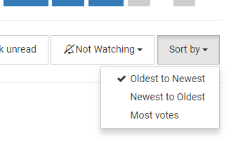
Here's a real treat. The top two items are title case (except traditional title case, not computer-UI-style title case, otherwise they'd have the word "to" capitalized also*) but as an added bonus, the last item is just capitalized. Naturally!
(EDIT: it just occurred to me that maybe the words "Newest" and "Oldest" are capitalized because someone thinks they're proper nouns? They aren't, though, so...)
Conclusion: did anybody actually look at this before shipping it to the public?
* Actually this casts a previous rule in doubt; is "Sort by" title case or capitalized? It could be either. However, "Mark unread" is certainly capitalized, and "Not Watching" is certainly title case. So the votes are tied 1:1.
-
I was under the impression the "Watching" functionality was created by us for us, not by the NodeBB team. Did they add it to vanilla?
-
@lb_ said in The NodeBB Style Guide, alt. title: Sloppy Sloppy Sloppy - The Nobody Looked At This Before Shipping Story:
I was under the impression the "Watching" functionality was created by us for us, not by the NodeBB team. Did they add it to vanilla?
I see broken, I post broken.
Whether it was made by the NodeBB team, someone at Inedo/DailyWTF, or Jesus Himself, it's sloppy sloppy work and everybody involved in releasing this to the public should feel ashamed.
-
@lb_ said in The NodeBB Style Guide, alt. title: Sloppy Sloppy Sloppy - The Nobody Looked At This Before Shipping Story:
I was under the impression the "Watching" functionality was created by us for us, not by the NodeBB team. Did they add it to vanilla?
I made it and submitted it as a PR originally. They disagreed with some of my choices and reimplemented, though I think there was a lot of discussion about what to call stuff.
-
What's great is you can make these composite images showing idiocy:
Those are not totally different control groups; that's the left side and right side of the exact same control group.
-
@blakeyrat said in The NodeBB Style Guide, alt. title: Sloppy Sloppy Sloppy - The Nobody Looked At This Before Shipping Story:
Whether it was made by the NodeBB team, someone at Inedo/DailyWTF, or Jesus Himself, it's sloppy sloppy work and everybody involved in releasing this to the public should feel ashamed.

-
@boomzilla Yeah yeah whatever. If you can look at a composite like the one I posted above and the sense of "wrongness" doesn't just crawl up your spine, well, maybe designing computer UIs is not for you and you should go dig ditches or something.
I know, doing basic QA work that the developers of this turd should have done years ago is waaahbulance, whatever.
-
@blakeyrat It's just funny to watch you freak out over picayune stuff like that. Like those people who can't stand it when the different kinds of food on their plate touch.
-
@blakeyrat Solution: Make everything random capitals at all times. It's certainly consistent.
Oh what's that? Consistency isn't as important as readability?
-
@pie_flavor Or, you know, just come up with consistent standards and stick with them?
-
@pie_flavor said in The NodeBB Style Guide, alt. title: Sloppy Sloppy Sloppy - The Nobody Looked At This Before Shipping Story:
Solution: Make everything random capitals at all times.
Is that not what they are currently doing?
-
These are the least of nodebb's problems.
-
@cartman82 said in The NodeBB Style Guide, alt. title: Sloppy Sloppy Sloppy - The Nobody Looked At This Before Shipping Story:
These are the least of nodebb's problems.
Yes, that's generally the sort @blakeyrat finds.
-
@blakeyrat said in The NodeBB Style Guide, alt. title: Sloppy Sloppy Sloppy - The Nobody Looked At This Before Shipping Story:
What's great is you can make these composite images showing idiocy:
Those are not totally different control groups; that's the left side and right side of the exact same control group.
I'm just shocked the top and bottom of the dropdowns line up.
-
@boomzilla said in The NodeBB Style Guide, alt. title: Sloppy Sloppy Sloppy - The Nobody Looked At This Before Shipping Story:
@blakeyrat It's just funny to watch you freak out over picayune stuff like that. Like those people who can't stand it when the different kinds of food on their plate touch.
Because evidence of surface-level carelessness certainly is NEVER connected with serious unseen issues with the underlying code.
NEVER.
-
@blakeyrat said in The NodeBB Style Guide, alt. title: Sloppy Sloppy Sloppy - The Nobody Looked At This Before Shipping Story:
Conclusion: did anybody actually look at this before shipping it to the public?
Yes, but like 99% of people they just didn't notice.
Seriously, I could have used NodeBB for 200 years and I'd never once have noticed such a minor thing if you hadn't pointed it out.
-
@cartman82 said in The NodeBB Style Guide, alt. title: Sloppy Sloppy Sloppy - The Nobody Looked At This Before Shipping Story:
These are the least of nodebb's problems.
And they are the most trivial to fix as well, which is why @blakeyrat, if somewhat obsessively, is right to point them out.
I'd like to add to his complains that there is no obvious logic as to why some buttons are one white background and some on blue.
While writing a post, "Discard" is on white and "Submit" on blue, indicating (probably?) the default action (default if what? not pressing enter since the focus is in the editor...). But then "reply" and "quote" are both on blue, indicating... I don't know, maybe just that they are buttons? And the buttons at the end of the thread are all on white except "Reply" because... again, probably that's the default (or recommended?) action? I don't know. Just pick a colour and use it for all buttons.
Oh, and the "Discard" / "Submit" buttons? They are glued to each other. Exactly not at all like all the other buttons.
If only there were some standard UI toolkits that could lay out buttons and other elements in a consistent manner and make a nice UI. Too bad no one has ever thought about it and each site has to reimplement it from scratch, isn't it?
-
@lorne-kates said in The NodeBB Style Guide, alt. title: Sloppy Sloppy Sloppy - The Nobody Looked At This Before Shipping Story:
@boomzilla said in The NodeBB Style Guide, alt. title: Sloppy Sloppy Sloppy - The Nobody Looked At This Before Shipping Story:
@blakeyrat It's just funny to watch you freak out over picayune stuff like that. Like those people who can't stand it when the different kinds of food on their plate touch.
Because evidence of surface-level carelessness certainly is NEVER connected with serious unseen issues with the underlying code.
NEVER.
That doesn't make blakey's spaz outs any less funny.
-
@anonymous234 said in The NodeBB Style Guide, alt. title: Sloppy Sloppy Sloppy - The Nobody Looked At This Before Shipping Story:
Yes, but like 99% of people they just didn't notice.
Well, that's fine, but as the software's developers it's their job to notice details like this. That's what the testing/QA process is. So you're just saying, in a new and creative way, "they're bad at their jobs." Well, great. We already knew that.
My complaint isn't even that it's bad. My complaint is that nobody even looked at it to decide if it was bad. Because if they had, they'd have seen it's obviously inconsistent. If it were consistent, but consistently bad (for example, everything was capitalized, which is the worst, most confusing, option), then it'd be a different argument, because then at least someone would have looked at it.
Look at the title of the thread again: nobody looked at this before shipping it out to the public.
@remi said in The NodeBB Style Guide, alt. title: Sloppy Sloppy Sloppy - The Nobody Looked At This Before Shipping Story:
I'd like to add to his complains that there is no obvious logic as to why some buttons are one white background and some on blue.
In the post editor screen, blue is the "constructive" option ("Submit" which is, BTW, capitalized) and white is the "destructive" option ("Discard").
So I dunno, maybe that was the plan?
Haha I said "plan" as if they ever had one, what a joke.
@remi said in The NodeBB Style Guide, alt. title: Sloppy Sloppy Sloppy - The Nobody Looked At This Before Shipping Story:
If only there were some standard UI toolkits that could lay out buttons and other elements in a consistent manner and make a nice UI. Too bad no one has ever thought about it and each site has to reimplement it from scratch, isn't it?
If you're writing a UI, I can't think of a worse environment to use for it than HTML5. It's a shame everybody dumped all over Flash (ActionScript 3 version) and Silverlight, because those frameworks were actually pretty good at all this.
-
@blakeyrat said in The NodeBB Style Guide, alt. title: Sloppy Sloppy Sloppy - The Nobody Looked At This Before Shipping Story:
I'd like to add to his complains that there is no obvious logic as to why some buttons are one white background and some on blue.
In the post editor screen, blue is the "constructive" option ("Submit" which is, BTW, capitalized) and white is the "destructive" option ("Discard").
And in the "discard post" dialog, the destructive option is the one that actually discards the post and it's therefore white. Oh, no, it's actually the other way round.
My own guess is that it's the "main" action that is in blue, i.e. the one that the user is expected to activate. Be glad the other ones are actual buttons (with white background) and not a size 8 pt text link, like Amazon does to trick you to subscribe to Amazon Prime (they're not the only ones, but that's the first one that came to mind).
(that dialog has marginally improved since when it said "accept/cancel" or somesuch, but it still doesn't make a lot of sense... "Are you sure you wish to discard this post? Cancel/Discard". Was it really that hard to put "no/yes" (or "keep/discard" if you want to keep action verbs)? Simple, direct, no possible confusion...)
So I dunno, maybe that was the plan?
Yeah, so much for that.
If you're writing a UI, I can't think of a worse environment to use for it than HTML5.
I'm no web developer, but why did everyone decide to reinvent the worst possible solution instead of trying to improve stuff that was already there, e.g.
<input type="button">?Scratch that, I just remembered that even on environment where there are strong existing graphic toolkits (i.e. desktop), developers do all they can to break out of those and fuck with the UI to roll out their wonderful ideas.
-
@remi said in The NodeBB Style Guide, alt. title: Sloppy Sloppy Sloppy - The Nobody Looked At This Before Shipping Story:
I'm no web developer, but why did everyone decide to reinvent the worst possible solution instead of trying to improve stuff that was already there, e.g. <input type="button">?
Srsly. Even HTML5, shitty as it is, has the basic widgets pretty much all covered. Just no web app uses them. Because... ... ... reasons?
-
@blakeyrat Probably because then they'd all look similar and people would be able to use knowledge for one app in another, and they wouldn't be "unique".
-
@e4tmyl33t You can style HTML5 widgets.
-
@e4tmyl33t said in The NodeBB Style Guide, alt. title: Sloppy Sloppy Sloppy - The Nobody Looked At This Before Shipping Story:
@blakeyrat Probably because then they'd all look similar and people would be able to use knowledge for one app in another, and they wouldn't be "unique".
and it would no-longer be art

-
@blakeyrat said in The NodeBB Style Guide, alt. title: Sloppy Sloppy Sloppy - The Nobody Looked At This Before Shipping Story:
@remi said in The NodeBB Style Guide, alt. title: Sloppy Sloppy Sloppy - The Nobody Looked At This Before Shipping Story:
I'm no web developer, but why did everyone decide to reinvent the worst possible solution instead of trying to improve stuff that was already there, e.g. <input type="button">?
Srsly. Even HTML5, shitty as it is, has the basic widgets pretty much all covered. Just no web app uses them. Because... ... ... reasons?
"Can we make our own scroll bars, but with extra pizzazz?"
-
@blakeyrat said in The NodeBB Style Guide, alt. title: Sloppy Sloppy Sloppy - The Nobody Looked At This Before Shipping Story:
or example, everything was capitalized, which is the worst, most confusing, option
-
 a tiny bit of work to make our casing a little less insane · NodeBB/NodeBB@c6c31e9
Node.js based forum software built for the modern web - a tiny bit of work to make our casing a little less insane · NodeBB/NodeBB@c6c31e9
-
@remi said in The NodeBB Style Guide, alt. title: Sloppy Sloppy Sloppy - The Nobody Looked At This Before Shipping Story:
I'm no web developer, but why did everyone decide to reinvent the worst possible solution instead of trying to improve stuff that was already there, e.g.
<input type="button">?I'm mobile, so can't check, but I'm 90% sure that's exactly what those are. Either that or
<button>s.