I think something like that would work better.
I also don't really understand how the topics have "cooled down" when they're being actively posted in. Surely the date of the first post is mostly irrelevant.
I think something like that would work better.
I also don't really understand how the topics have "cooled down" when they're being actively posted in. Surely the date of the first post is mostly irrelevant.
That seems to make sense. The purpose of the highlighting could definitely be made clearer though. If anything, I'd expect newer posts to be highlighted.
But why are some blue and others gr[ae]y?
EDIT:
It seems that all of the topics started on or before 21st May are blue (maybe this is what you were getting at). Is it to show long running topics?
Obvious joke is obvious.
I'm far too innocent to understand what you're referring to.
Yeah, I only just noticed that I do the same. The shininess of the right side of my spacebar key confirms it.
How do you press the spacebar on your keyboard?
I'm using a TrulyErgonomic keyboard, which moves the Shift and Ctrl keys up:
I'm confused and intrigued in equal measure.
How do you cope with switching between that and a regular keyboard? Also, what are the blanks in the corners?
Mine:
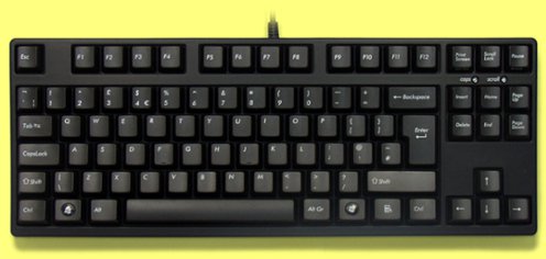
Nice mechanical action, small form factor and doesn't screw with those keys!
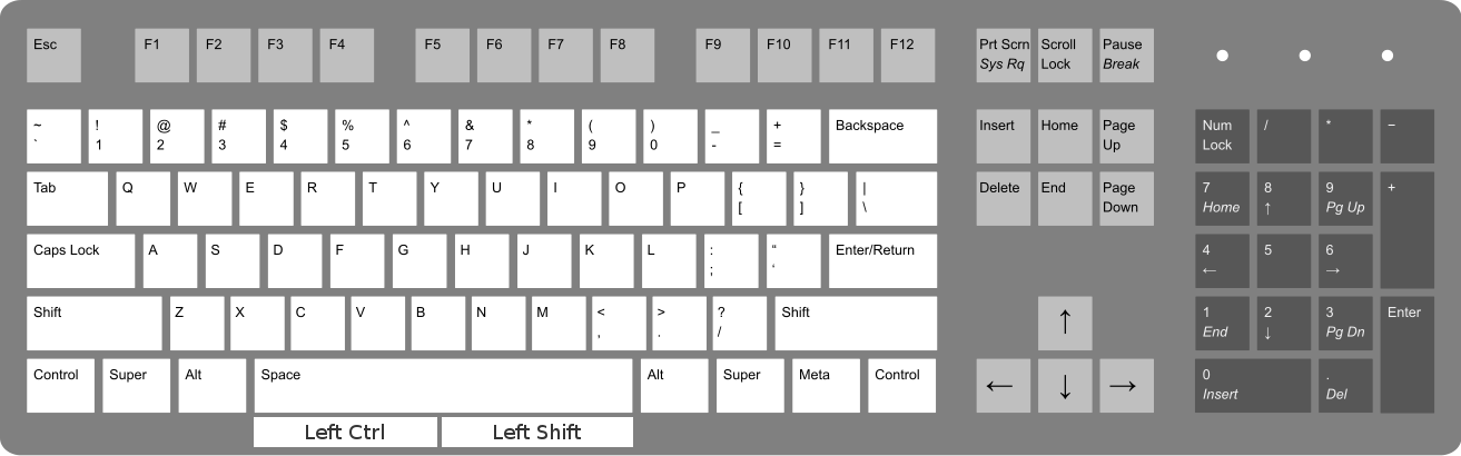
I modified your image to express visually what I tried to express verbally:
While it makes a lot of sense, I can imagine it being very frustrating when switching between that and a keyboard with a regular layout.
I had a netbook that switched the location of the left Ctrl and Fn and it drove me mad.
Specifically when trying to copy or cut and paste something:
Highlight range
-> Ctrl + X
-> wonder why my selection has been replaced with the character 'x'
-> fume.
I would also throw in one of these puppies for extra fun:
That has the potential for awesome. Can it be programmed to offer stamping / kicking actions in PC games?
You are not crazy, but there is some prior art in this department
Kinesis Advantage2 Ergonomic Keyboard

Split, contoured design that maximizes comfort and boosts productivity. Mechanical switches, onboard programmability and more.
Holy Jesus...
move the left Control to where the left Alt is
I think I'd rather avoid moving buttons. I had a netbook that switched the location of the left Ctrl and Fn and it drove me mad. I see the extra buttons as bonus keys that won't affect your use of traditional keyboards when you inevitably have to switch to one.
PS: eww, single row Enter key.
Thankfully I don't have that, this was just the best image I could find for quick modification. :)
onebox*.....*initially autocorrected to 'enema'
I want to turn this into a witty jab at Discourse, but I really like the oneboxing.
As a programmer, I find myself having to use modifier keys, especially Ctrl and Shift, approximately seven billion times per day. Annoyingly, these keys are only accessible using my smallest fingers (pinkies), while I have two big lumbering thumbs sharing a single key between them. In fact, judging by the wear pattern on my spacebar, I'm not using my left thumb at all. :(
I propose adding additional modifier keys below the space bar:
This would allow me to keep the fingers of both hands firmly around the home keys, reducing travel and offloading some of the pinky work onto my freeloading thumbs.
The keys would need to be recessed to allow normal use of the spacebar, but other than that, I can see no disadvantages. It's rare that space is used in conjunction with modifiers (except auto-complete and such), but for those cases, the regular modifier keys are still available.
I have also come up with a catchy name:
The Keyboard With Thumb Accessible Modifier Keys TM
I think strong parallels can be drawn between my programming and the surrealist movement.
It was beautiful how they all twinkled in over the course of about 15 seconds.
Agreed. I was forced to de-lurk in order to keep up with the discussions. It's not too difficult to create an account though, so it didn't bother me too much.
I encountered a similar problem with the ERP system in use at a company I worked for. The system would allow export and import in CSV format. Unfortunately, the export and import routines followed different rules.
When exporting, the system would escape double quotes in the data by doubling them up (which is correct behaviour as far as I'm aware). Thus an item with the name
12" Turnip Purifier would be exported as "12"" Turnip Purifier".
The import routine, however, didn't seem to know about the quote escaping rule and would update the system record to 12"" Turnip Purifier. This would be exported as "12"""" Turnip Purifier" in the next run, leading to a vicious doubling-of-quotes cycle.
To "fix" it, I had to write a VBA script to output the data in the broken format that the system expected. Sometimes you just have to go renegade in the turnip purification industry.
Sorry Nagesha, it won't happen again =/.
I wouldn't dare insult Java in front of you, Nagesh, lest you banish me to the fiery depths of Nakara (or some such).
It's a paragon of clarity compared to some of the VBA macros I've had to debug...
Same here. The site was much slower to load topics on my phone during my commute this morning.
The replaceState() method is working correctly now. I'm not sure what I was doing wrong before.
Thanks again.
That looks very useful; I'll check it out this evening.
Alternative bug fix: Automatically add at least two likes to any topic @Keith starts.
An odd glyph is entered into the edit window, some form of curved line with a dot under it.
Testing:
?
Confirmed on Chrome 34 on Linux.
You can't see all categories when creating a new topic in the mobile view. The screenshot below demonstrates the problem in Chrome:
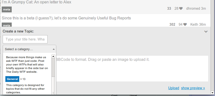
I've scrolled the page and category list as far as I can and the Coding Help category is hidden below the fold. The same happens on my phone (WP8, IE10).
I accidentally discovered that you can type to filter the list, but this isn't too helpful if you don't know which categories are hidden.
Also, to support the type-to-filter function, my phone pops up a keyboard when I open the "Select a category..." drop down, moving screen content around and reducing further the amount that can be displayed on the screen. Very annoying. Perhaps the text input could be activated by clicking a separate filter icon rather than when the list is expanded.
What point does it serve?
It means that if the user refreshes the page or closes their browser, when the page reloads, they'll be where they left off. If the URL didn't update as you scrolled, a page refresh would take you back to the location you were at on the initial page load.
Mini bug.
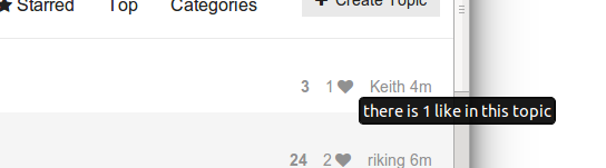
When hovering on the number of likes:
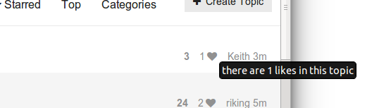
When hovering on the heart icon:
I'm using the mobile view if that is significant.
I experimented with replaceState(), but it seemed to be screwing with the history of previous pages. I'll try again tonight if that's the correct method.
Thanks for your help.
How does Discourse get the history API to update the URL for every reply, but still allow the back button to take the user to the previous page? This would be very useful for a project I'm working on, but I can't seem to phrase my search appropriately to find the answer on Google.
Eeehhhh.... I'm shipping down all the data on the first load.
Ah, that might not quite fit in with Jeff and Sam's vision. 
I like the idea though.
I like the idea of the topic jumper, but won't it start to add significant overhead on large threads? Surely fetching every reply from the database to calculate the size for every page request is going to cause problems when you hit threads with thousands of posts.
Are you generating the jumper on the initial page request or dynamically when the box is clicked?
I've been lurking for several years. I've only created an account now because it was getting too difficult to keep track of where I was in topics from multiple devices.
I'm a web developer and live in the UK. I'm not going to mention the fact that I primarily work with PHP...
 ?
? Surrealism - Wikipedia

