Climate change broke houston weather again. (The official everyone gets a h[w]oosh thread)
-
Let's assume I take that at face value. Do you know why it's rising?
going up faster 20 years ago right before when people started trying to curb our effects on everything?
And yet the conditions were still getting "worse" according to the theory you're accepting but not supporting.
You just keep trying to change the subject. Probably because you know you can't substantiate it.
-
https://www.climate.gov/maps-data
Except on their own site.
And our emissions record doesn't even match up with the blue line profile in the prediction they're showing.
So according to them, the drop in temperature can't be because...
people started trying to curb our effects on everything
-
half of your problem is that you're taking a high outlier and using it to create a super steep rise that supposedly then stops. but guess what, some years are higher/lower than average expectations. it's kinda why they talk AVERAGES. the overall trend in that graph is rising temperatures. if you are too poor at understanding that, then this discussion is essentially pointless.
-
changing the subject? YOU ASKED THE QUESTION? Are you really that dumb?
-
-
YOU ASKED THE QUESTION?
The one you haven't answered yet?
Are you really that dumb?
No, I know that you aren't going to answer it because there isn't a good answer, but it's fun to watch you dance around the cognitive dissonance.
-
so why are you drawing two lines to try to make it look like its not a rising trend? i could draw more lines and make it look rising, but that's not how it works. one line
jesus fucking christ it's amateur hour in here.
-
congrats, you've trolled me. i posted exactly what you asked for and you tell me i didnt answer.
-
i posted exactly what you asked for and you tell me i didnt answer.
Huh? Yeah, I totally missed it. I was asking about the science behind predictions of rising temperatures. So I guess your answer was "past performance?" It's rising "now" so it will rise in the future? Then what can we do about it? We can't change the past, so we're doomed?
Or am I misunderstanding you here. Could you link to the post that you say answered that question? Or maybe restate it? Something?
-
Because linear extrapolation doesn't work here.
How do you explain the fact that it levels off on the blue end of the chart?
It's level until 1910, rises until 2000, then level again.
If I were to include everything before 1910 in a single line,
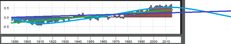
- Green : Single Line extrapolation, what you want me to show. But this only shows half the warming, and does not match any of the projections.
- Blue: Sine wave extrapolation for satirical purposes, if it were to cool back down to average (not going to happen). In actuality the graphs used for project aren't using linear extrapolation, they are using a curved extrapolation starting from the 1970s. This, according to you, should also be a misrepresentation.
- Purple : Single Line extrapolation if it were to stay level for another 3 decades.
This is why a single line extrapolation is totally pointless. And is only useful if you want to dismiss the hiatus.
-
1890 - 1910 : cooling trend
1910 - 1970 : stable trend
1970 - 2000 : warming trend
2000 -> stable trend.You can't single line extrapolate that. It's pointless. Unless you have another 30 - 40 years of future data, you could just as easily get a cooling trend again and end up with a flat line across the whole chart.
Which is what I said earlier, there isn't enough data.
-
How do you explain the fact that it levels off on the blue end of the chart?
He doesn't. He just wants to wait longer. Because eventually the models are bound to match up. For some reason.
-
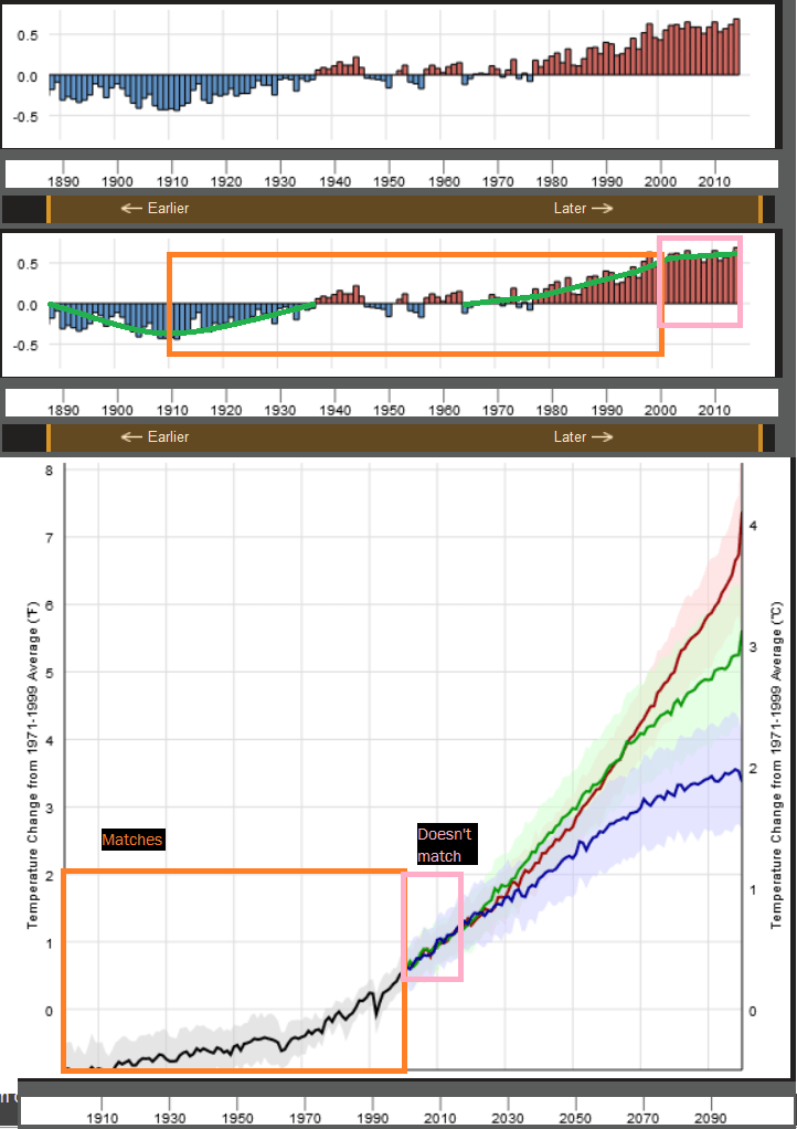
You are reading the graphs wrong. When the y axis sits around 0, and there are positive and negative values, it's generally a "year over year" graph. Otherwise, it probably shows absolute values.
So, the graphs that "don't match", are showing different things.
[img]https://what.thedailywtf.com/uploads/default/optimized/3X/0/8/088ba0c0450b05787fe90d0528ecf82023b9cd80_1_353x500.png[/img]
The top graphs show temperature change year over year. On this graph, the slope means acceleration. If it looks flat, that means constant change.
The bottom graph shows absolute value. A curve shows acceleration, and a straight line shows constant change.
The portion you highlight as not matching shows a mostly flat line on the top, which means the temperature change remains constant, and in the bottom graph it shows a mostly straight upwards trend, which ALSO means temperature change remains constant. So the two graphs in fact coincide.
-
The top graphs show temperature change year over year.
I could not find that description anywhere on the site.
The exact description is:
The temperature near Earth’s surface is rising: the bars show each
year’s average temperature compared to the 20th century average.Which means it is the current global-average-temperature compared to the average of averages from 1901-2000
So it is not showing rate of change.
Otherwise, 1970 to 2000 would also be relatively flat.
Also the temperature in the first graph is measured in C, and the second prediction graph is measured in F. A clever trick to make the prediction look even more scary.
-
Is begging the question really all you guys have?
There's also the "hockey stick", and see below:
Also the temperature in the first graph is measured in C, and the second prediction graph is measured in F. A clever trick to make the prediction look even more scary.
-
It's a good thing you've ignored the blue shaded area that represents the +/- ramge of the predicted temps, which the chart doesnt quite fall outside of yet. If it keeps staying flat for 2 or 3 more years, it'll have left that range and i'd accept that they're just flat wrong with the prediction.
Which has been my whole point... you have 25years of prediction for which youre showing 20 match but the last 5 are a little off but still in the range band... i dont quite consider that to be wrong yet, but you do apparently. to each his own i guess.
-
last 5 are a little off but still in the range band
No, the last 5 are outside the range band.
The bottom pink line of the pink square is more representative of current temperatures.I'm not leaving out the possibility that this is just a hiatus, but no matter how you pain the lines, the prediction is wrong...
for now.
-
i dont quite consider that to be wrong yet, but you do apparently. to each his own i guess.
Thank you. This is the answer to my question. Which is that you accept their error bars at 95% level. So the "not inconsistent with" gambit. That's fair, but looking at these things in binary fashion like that leads to really strange results.
Of course, we talked about that NASA article above (or was is a different topic) where they talked about humidity. And the models that did better on humidity did worse with temperature. We're only looking at the output for one parameter.
But if the parameters are all over the place, do you report the results of the parameters that agree and throw out the rest? This is awful statistical practice.
How does varied parameter performance affect interpretation? To me, this suggests some correlation but erodes the case for causation.
The hand waving that averaging really big and long term weather predictions leads to a good average prediction is a huge unproven assertion that does not deserve the benefit of the doubt.
-
And the models that did better on humidity did worse with temperature. We're only looking at the output for one parameter.
So, quantum mechanics is bullshit, we just suck at measuring more than one parameter.

But if the parameters are all over the place, do you report the results of the parameters that agree and throw out the rest? This is awful statistical practice.
That's what they've done, either that or fudge them to match like with all the 1800 year data.
Tree rings show warming until they don't. Oh, the higher temp is affecting growth (spontaneously?), let's fudge the later numbers with a new offset and get our warming trend back.
This is why I don't trust their data prior 2000 when we started getting some consistency in having longer term trends in multiple measurement techniques, rather than just hodgepodging a bunch of different techniques and throwing in offsets for the different techniques to account for their greater margin of error.
Apply their prediction models in the opposite direction.
According to that, Washington should have frozen to death crossing the Delaware.
-
No, the last 5 are outside the range band.The bottom pink line of the pink square is more representative of current temperatures.
bah was going to post but actually, those charts aren't even comparable because one is against the 1900-2000 average and the other is 1971-1999, and I don't have the figure off-hand for the difference to adjust it by.
-
So, quantum mechanics is bullshit, we just suck at measuring more than one parameter.
Uh huh.
Tree rings show warming until they don't.
Yeah. And that's assuming they showed it to begin with. This is before including proxies that the collectors said were bullshit and then using them upside down to how they would normally be included, because the statistics even it all out so it all works.
-
Yeah, 1970 showed below 0 for the second chart, but on 0 for the first chart.
Which is why I put my pink line at the top of the actual results, because the actual results ends where the hiatus begins for the temperature comparison chart.
But, you can't really accurately compare them.
-
using the offset for 1971 - 1999 from the average 1900-2000, I come out with somewhere between 0.35C or so as the increase relative to the prediction chart, which puts the current temperature rise a little bit higher than your bottom pink line. So the last 2 years are definitely just below that prediction band once you take into account the difference, though not as badly as you've drawn. It won't take but another year or two of stable temperatures before it becomes unquestionably wrong and they will have to show why and what they're missing to screw it up.
I imagine that the two charts are not meant to be used in conjunction given the different time frames for the baselines and that they're not presented side-by-side on the original source, but they are in the same data section so that is misleading.
-
I imagine that the two charts are not meant to be used in conjunction given the different time frames for the baselines and that they're not presented side-by-side on the original source, but they are in the same data section so that is misleading.
But you can't notice this...
So the last 2 years are definitely just below that prediction band once you take into account the difference
Until you do this...
used in conjunction
-
My thing is that if the years from 2005 to 2010 were exceptionally hot over what was expected, did they project an increased trend in the following years off of those years? Is it that 2005-2010 were actually the anomaly and we are not increasing at quite that high of a rate? That's where the problem comes in that i keep harping on over and over. 10 years of temperatures is barely enough to register a trend when you can have multi-year variances above/below average. Trends are LONG TERM. We have a 100 year LONG TERM trend of extreme heating. We have a 5 year SHORT TERM "trend" of not heating up much. But there are plenty of short term 5 year flattish trends in the middle of that graph... they obviously didn't mean the temperature stopped rising.

-
But you can't notice this...
@darkmatter said:So the last 2 years are definitely just below that prediction band once you take into account the difference
Until you do this...
used in conjunction
except i accounted for the difference in offsets, allowing me to compare the two charts correctly... maybe you should read what's actually there instead of what you want.
that, or i don't know wtf you're trying to point out other than that I can adjust charts and compare them?
-
10 years of temperatures is barely enough to register a trend when you can have multi-year variances above/below average.
So we should not evaluate the models yet? OK. Now, since we can't trust them (since they haven't been validated...or verified for that matter) why should we believe that we're headed for trouble?
-
I did read you. That's my point. You won't notice that their band is wrong, unless you offset and compare the prediction to the actual data.
And the fact that they're leaving up an old prediction that doesn't include the new temps is misleading.
I'd have to put my tin-foil hat on to say a scientist would have done that on purpose, but this is a government website.
-
Now, since we can't trust them (since they haven't been validated...or verified for that matter) why should we believe that we're headed for trouble?
I don't get your point here, I can do the exact same thing to you. Why should we believe we're not headed for trouble? The 100 year trend says we are. The 5 year trend says we're not. I know which trend I am more inclined to believe. You can believe the 5 year one if you want.
-
My thing is that if the years from 2005 to 2010 were exceptionally hot over what was expected, did they project an increased trend in the following years off of those years?
Nope, their prediction trend starts in 2000. We really need a new prediction with the newer temperatures to be fair to the actual scientists.
were exceptionally hot
I noticed that too, but we also have a quiet moment from 1940 to 1980. That's 40 years of hiatus, much longer than their 20 year at 1% chance predictions for hiatuses.
So if the warming isn't because of AGW in 1910, then that's natural warming.
If it is because of AGW, then we already have a longer hiatus than what they've predicted.Which means that this hiatus could last for another 30 years, at who knows what probability.
Again, we don't have enough data.
-
Makes me wonder how the @boomzillas and @xaades of 1974 felt after assuring everyone that clearly the 5 year trend was cooling, i mean look, it was one of the coldest years in decades! Ooops.
-
At 1974, I would have said there's no trend, or that the warming stopped.
I wouldn't have expected to enter a cooling period.
-
I noticed that too, but we also have a quiet moment from 1940 to 1980. That's 40 years of hiatus, much longer than their 20 year at 1% chance predictions for hiatuses.
So if the warming isn't because of AGW in 1910, then that's natural warming.If it is because of AGW, then we already have a longer hiatus than what they've predicted.
Which means that this hiatus could last for another 30 years, at who knows what probability.
Again, we don't have enough data.
I can agree with most of that, but I fail to see how 5 year or 30 year hiatuses have any impact in what the end result is if we continue the overall trend? So it gets unsustainably hot in 2130 instead of 2100? (all actual time estimates are made up and hyperbolic, which should be obvious but i can't trust everyone will get it) OoooOoO?
-
Why should we believe we're not headed for trouble?
We're not in trouble now. Why should we expect things to change? Why not worry about an ice age, which is much more dangerous?
The 100 year trend says we are.
Right...back to the past. But things have gotten warmer and colder at various points. This is nature.
I know which trend I am more inclined to believe. You can believe the 5 year one if you want.
Which trend I "believe?" That's the past. What's the point? I'm not so interested in predicting the past. Though if we could do a good job at that at least (with the models) I might give some credence to the predictions.
-
Makes me wonder how the @boomzillas and @xaades of 1974 felt after assuring everyone that clearly the 5 year trend was cooling
Those guys switched to panicking over warming. Duh.
-
I can agree with most of that, but I fail to see how 5 year or 30 year hiatuses have any impact in what the end result is if we continue the overall trend? So it gets unsustainably hot in 2130 instead of 2100? (all actual time estimates are made up and hyperbolic, which should be obvious but i can't trust everyone will get it) OoooOoO?
Drawing a trend into the future and thinking that's a good prediction is terrible. There's no justification for that at all. The model guys have a rationalization that's a lot better than extending a line.
-
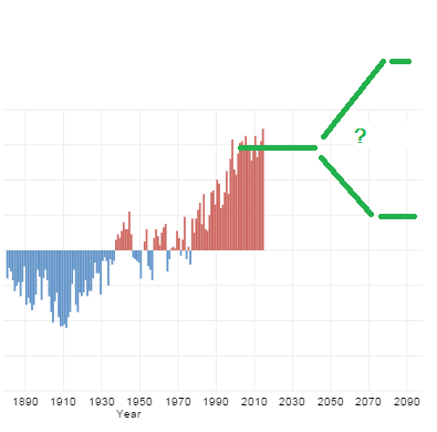
It means that their prediction models are not accounting for a hiatus that's taking up 1/3 of their chart.
A prediction that's 33% wrong, right off the bat?
Conclusion, not enough data.
I only have enough data to say that the earth appears to enter cycles just like it always has, and two of the last three cycles were warming.
There are two ways to predict that.
- The overall trend is warming and the hiatus would have been a cooling cycle if not for AGW.
- We cannot predict which cycle the earth will enter at any given point in time.
-
well it's going to get really fun if this year continues its path.
So far this is the warmest year in the last 100 years and it's not even close. Right now we're hovering around +0.85C over the 1900-2000 average, which translates to about +0.65C in that prediction chart. Putting us right back on target with the predictions.
-
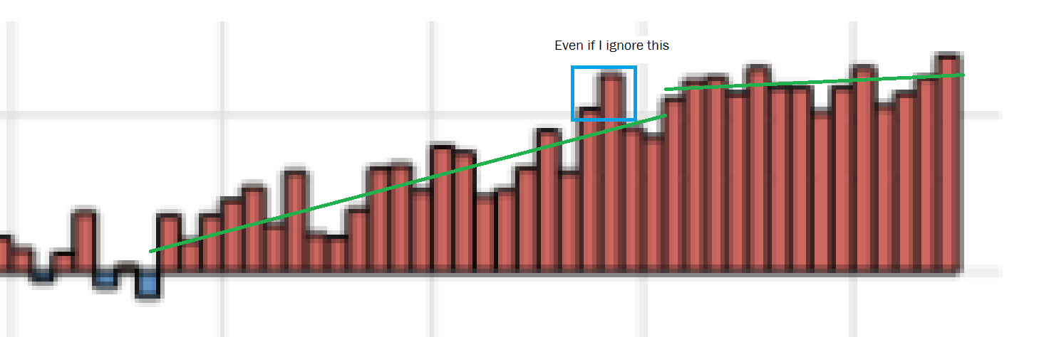
Or, this year could be another one of the 50 heat spikes on that chart.
I looked at the chart and this period of time seems remarkably stable. The next closest stable time was 1918 - 1925, and there are several that are only 1 year less than that. We've doubled that now.
-
So far this is the warmest year in the last 100 years and it's not even close.
Yeah, once you put in all the adjustments. Nevertheless, funny you should mention this as I just saw this today:
It’s the long-term difference between (1) the climate models used to promote energy policy changes and (2) the observations, which should drive the global warming debate, not qualitative “record warmest year” statements.
Lots more at the link.
The models don't even attempt to deal with stuff like the PDO and AMO or ENSO. Everyone admits they have no clue about clouds. The more you look into this stuff, the more it's obvious that the models aren't much more than WAGs.
-
If you remove 1930 - 1970 from that chart, I'd be making the same predictions they are.
\my prediction
-
Off what appears to be a random guy's (he IS a PHD climatologist though!!) anti-global warming site, a self-written article where he combines "average of all CMIPS climate models"? So.... basically setting it up to fail, he's comparing to no actual prediction at all.
Also, his plotted point for 2015 is nowhere near the # I gave from the other source... he's plotting it at around +0.47C?? Oh, yet another change in the baseline, this time to 1979-1983 temps. Though those are actually lower than the 1971 - 1999 average, so I still don't see how he's making up a smaller increase than what I read.
Unless his values are newer or older.
-
random guy's
He's one of the guys who runs the UAH program, i.e., one of the main satellite temperature monitoring stations. But I'm not going to hold your ignorance against you,.
where he combines "average of all CMIPS climate models"? So.... basically setting it up to fail, he's comparing to no actual prediction at all.
Yeah, you are a n00b. That's the standard thing that people do. Because individually the models are all over the damn place in all sorts of crazy ways. So they just average them all and call it good. To be fair, IIRC this is standard practice with stuff like weather forecasts, so it's not that crazy in and of itself.
But yeah, using those models at all seems like a prelude to failure.

-
That's the standard thing that people do.
Clearly it must be the standard, that's why the chart I linked actually shows specific predictions with +/- error banding.
-
Or you know, it could be that it works better to disprove global warming theories by conflating all the higher exaggerated predictions into the lower ones to make sure that none of them can be close.
Love to see exactly how many of those "standard" combined charts are posted on anti-global warming sites and how many are posted on pro-global warming sites.
-
He's one of the guys who runs the UAH program, i.e., one of the main satellite temperature monitoring stations. But I'm not going to hold your ignorance against you,.
Too bad if you follow his source on the data, it comes from....... dun de dun... a writeup by an economist:
 A First Look at 'Possible artifacts of data biases in the recent global surface warming hiatus' by Karl et al., Science 4 June 2015

Guest essay by Ross McKitrick University of Guelph June 4, 2015 UPDATED June 8 2015: Some changes and corrections noted in red. Also added MAT records and Kent figure 18…
Ross McKitrick
Department of Economics
University of Guelph
-
I don't know. Going off the prediction chart from your link.
It wasn't until the year 2000 that the lower margin of error diverged from the upper margin of error for the year 1980.
-
Or you know, it could be that it works better to disprove global warming theories by conflating all the higher exaggerated predictions into the lower ones to make sure that none of them can be close.
You'll have to take that stuff up with people like the IPCC.
Love to see exactly how many of those "standard" combined charts are posted on anti-global warming sites and how many are posted on pro-global warming sites
I'd honestly prefer to look at models individually, because then we'd be more likely to toss some of them out.
Too bad if you follow his source on the data, it comes from....... dun de dun... a writeup by an economist:
Who is someone who knows good statistical practice, as it turns out. I know you think you keep finding smoking guns, but you just come off sillier and sillier.
-
Who is someone who knows good statistical practice, as it turns out. I know you think you keep finding smoking guns, but you just come off sillier and sillier.
really, reusing something i already said to you elsewhere? that's just tired. too bad you are getting so thoroughly abused here that you couldn't keep the ad hominems in a side topic so this one could stay at least somewhat relevant to science.
-
because then we'd be more likely to toss some of them out.
Even the average predicted path of a hurricane throws a handful of models out.
But you know, if climatology was a real science, they'd be comparing temperature increase rates at the same CO2 rate that we have today. And try to extrapolate a common trend.
Are they doing that?
I don't know, hopefully.
![https://what.thedailywtf.com/uploads/default/optimized/3X/0/8/088ba0c0450b05787fe90d0528ecf82023b9cd80_1_353x500.png[/img]](https://what.thedailywtf.com/uploads/default/optimized/3X/0/8/088ba0c0450b05787fe90d0528ecf82023b9cd80_1_353x500.png%5B/img%5D)