Vivaldi!!!!!!!!! (it's a web browser I guess)
-
Ok.
-
-
You are completely incapable of levying criticism on Microsoft, no matter the circumstances.
Or, like @FrostCat said, you are Drax. I like that explanation better. You are Drax.
-
You are completely incapable of levying criticism on Microsoft, no matter the circumstances.
I have no idea if the post is levying(?) criticism. Is that what it is?
-
I have no idea if the post is levying(?) criticism. Is that what it is?
I'm not sure if it is, either. But it sure goes along with some other stuff posted earlier in the thread. But you're undoubtedly right, they're almost certainly unrelated and it's all gibberish.
-
-
-
It was
onlyjust the tip.
Filed under: Damn it Discourse, I'm trying to be honest here and you consider my edit as a ninja!
-
It was only the tip.

-
You are completely incapable of levying criticism on Microsoft, no matter the circumstances.
Perhaps he has monochromacy.
-
Perhaps he has monochromacy.
He has never seen a gray area in his life, so I find it unlikely.
-
-
Am I the only one that doesn't think the colored titlebars look awful? I mean, they don't look great either. I just don't care about them.
Meanwhile there are about 400 things that legitimately are bugging me about this thing. Like you can't click and drag most of the titlebar to move the window. I also can't hide/disable much of the useless crap that comes pre-installed even though it is supposed to be the most customizable browser ever. : (
-
Am I the only one that doesn't think the colored titlebars look awful? I mean, they don't look great either. I just don't care about them.
I've willingly make all the title bars on my Windows PCs purple.I don't mind coloured titlebars

-
Am I the only one that doesn't think the colored titlebars look awful? I mean, they don't look great either. I just don't care about them.
Oh, I had that off most of the time. The Discourse color changing thing amuses me though.
Meanwhile there are about 400 things that legitimately are bugging me about this thing.
Agreed. I pretty much use it only for basic browsing at home due to tab stacking at this point. The stacks are still vastly inferior to Opera 12 ones btw, but they are just the best thing currently available, IMHO.
As I said above: their heart seems to be in the right place when it comes to following Opera legacy. It's just a very early build. I'm giving them a chance.
That said, I'm still rooting for Otter. Hope they get that working properly and I'll be a happy panda.
-
What is so great about tab stacking anyway? You guys must have a lot more tabs open than I do. I don't really get to more than 10 and even they wouldn't naturally fit into groups for me.
Also, the little tab previews. I can only scan over their tiny little asses about as fast as I can just flip through the actual, whole tabs. Maybe all my pages just look too similar when zoomed way out.
-
At some point in the last 5 years, a bunch of morons forgot how to use bookmarks. So instead of bookmarking sites, they just keep ALL the sites open ALL THE TIME in different tabs.
Then I mock them.
-
You guys must have a lot more tabs open than I do.
Apparently.
Also, the little tab previews. I can only scan over their tiny little asses about as fast as I can just flip through the actual, whole tabs. Maybe all my pages just look too similar when zoomed way out.
The stacks are still vastly inferior to Opera 12 ones
You can't see the names in Vivaldi. They have that weird "small lines above tab" thing. Old Opera handled it in the way that every stack can be collapsed and extended as needed (don't equate it to expand in Vivaldi, it breaks the stack) and you could actually see the titles while still saving space.
Also, I'm fairly sure the previews are smaller in Vivaldi. Might just be my perception though. I kept them at default in Opera (never used them much anyway), and I'm pretty sure it was configurable, somewhere.
At some point in the last 5 years, a bunch of morons forgot how to use bookmarks. So instead of bookmarking sites, they just keep ALL the sites open ALL THE TIME in different tabs.
Or I use it because I browse a lot on a laptop with low screen resolution and shit just won't fit? I also have a set of websites that I visit and check multiple times in a day. Forums and such. I just keep all of that kind of stuff in a stack. I may open 5 tabs containing various documentation that I will refer to multiple times during the day. Stack. Intranet sites? Stack. Current tabs are unstacked and get closed and reopened as needed.
At the end of the day everything outside my "common" stack will get closed. But during the day I'd rather not poke around history just because I closed a tab I need 2 hours later, It stays there until I'm done with whatever I needed it for and I still have enough space to see more than a favicon for each tab. Even on a small screen. Or when taking up half a big screen.
-
Yeah, I mean, onyx posted a screenshot, you called it eye-searingly awful and compared it to something Microsoft did, then when I saw Microsoft introducing a similar colour-scheme, I just free-associated it with that exchange. I'm sorry that I just ben_lubared an image at you without appropriate exposition, but the way I see it, it restarted discussion in this thread, some of which was even on topic, so what's the deal?
-
Am I the only one that doesn't think the colored titlebars look awful? I mean, they don't look great either. I just don't care about them.
It's annoying / rude to ignore my theme. It's worse if it's dynamic like the browser does.
-
It's annoying / rude to ignore my theme.
That's the worst part, yes.
It's worse if it's dynamic like the browser does.
Pointing out once again that it can be disabled. Not a defence, just stating the facts.
-
Pointing out once again that it can be disabled. Not a defence, just stating the facts.
No, that's fair. I'm just saying that a static color is less awful than one that changes. To me. I'm sure there are people out there who will like it. Just like there are people out there who liked Aero.
-
To me. I'm sure there are people out there who will like it.
It has some benefits. But it's a bit too harsh of a change most of the time (see my gif above). If they added some kind of fade it might be less jarring. I'm ambivalent about it. Add fading and make colours a bit more muted and it may actually work.
Just like there are people out there who liked Aero.
KDE using hypocrite!
-
-
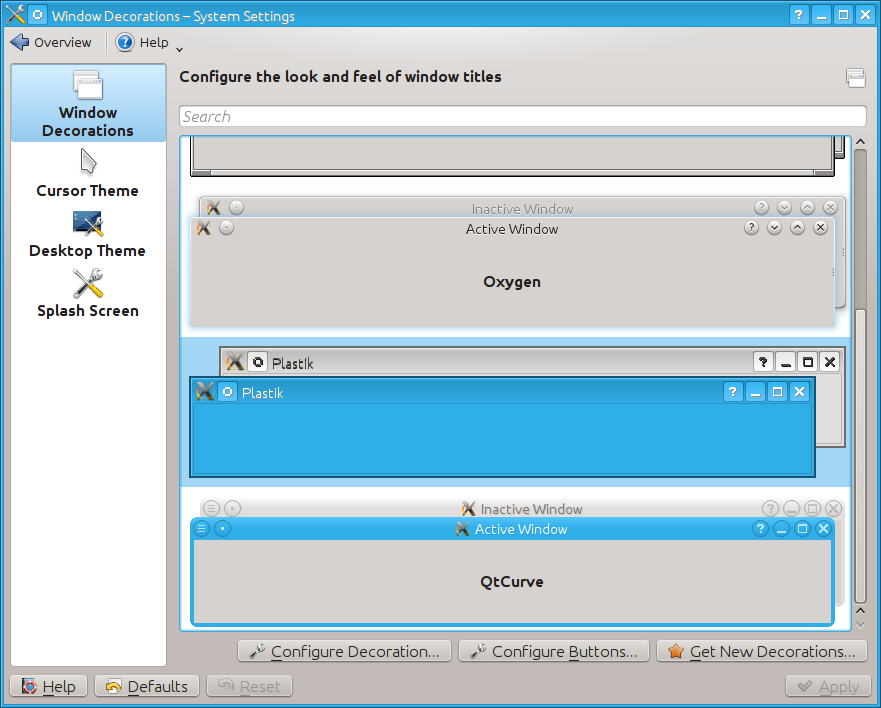
Eugh. Never liked Oxygen. Plastique was a bit better IMHO. I prefer flat-ish themes myself.
Filed under: INB4 "You messed up the names" : likely
-
Eugh. Never liked Oxygen. Plastique was a bit better IMHO. I prefer flat-ish themes myself.
I don't like Oxygen's round window button things. I use Plastik.
-
Huh. The buttons confused me, thought that was Oxygen.
Then again, I used it very shortly on and off. Didn't suit me.
-
I like it, because it's super stable (design / change wise) and simple and stays out of my way.
INB4: Luddite hates change, etc, etc.
-
-
I liked Aero. The blurry glass effect was pretty cool, and a nice way of telling technical people "hey, we're running on that GPU now" without doing pointless, distracting "turning windows into cubes and rotating them" shit.
I like the Windows 8 flat look, too. A lot of people made fun of the Zune/Windows Phone look and feel when it first came out-- now those people are tripping over themselves to completely rip it off.
-
I liked Aero. The blurry glass effect was pretty cool, and a nice way of telling technical people "hey, we're running on that GPU now" without doing pointless, distracting "turning windows into cubes and rotating them" shit.
Yeah, I turn off the cube stuff (and most other fancy effects), too, but I can totally do without the distracting blurry shit. I order glasses so I don't have to look at blurry shit all day. I don't want my computer pissing on me and telling me it's raining.
-
a nice way of telling technical people "hey, we're running on that GPU now"
That's nice. But how many jiggabytes does it have?
</average customer>
-
Luddite hates change, etc, etc.
Seriously, did you ever use it? Windows only drew text over the translucency if it was 1) really short (like a window title), and 2) deeply embossed.
That said, there were a lot of third-party programmers (like TortoiseSVN) who simply did not get the concept and drew tons of text all over Aero translucency. But that's because TortoiseSVN was written by idiot open source developers who couldn't write a quality UI if their fucking lives depended on it.
-
-
Hilarious.
-
Boomzilla doesn't like anything newer than Windows 95.
-
Seriously, did you ever use it? Windows only drew text over the translucency if it was 1) really short (like a window title), and 2) deeply embossed.
Yes, I used it. What's the benefit there? Woo hoo! Change for change's sake! Let's make stuff look shitty so we can show off! I found that crap distracting and ugly.
Boomzilla doesn't like anything newer than Windows 95
Windows 98SE,
BITCHCOMPLAIN.
-
Hilarious.
I joked with the
jiggabit. But that is my experience. Every time I ask an average person about their machine they'll tell me the make and hard drive size. That is all.They have no concept of hardware vs. software rendering. Let alone compositing.
It showed it uses GPU to you and me. Not to an average person. Which is all fine and dandy, but I know how to look up / check that kind of stuff with or without translucency. I am not attacking Aero here, but your point about it being a way to show people it uses GPU rendering is inconsequential, if not moot.
-
Yes, I used it.
Liar.
If that's true, answer this one simple question:
Why does it matter if it's blurry if the text is easy-to-read? Like... what would be the point of complaining about the blur effect unless it prevented you from reading something?
The answer is: you have never used it, and no matter how good or bad it was you'd hate it simply because it's 1) Microsoft, 2) "New" (in scare quotes, because fucking 2007, goddamned!)
-
I joked with the jigga bit.
Oh-- the rest wasn't the World's Worst Fucking Joke?
You do realize I typed the word "technical" in that sentence for a reason, right?
Every time I ask an average person about their machine they'll tell me the make and hard drive size. That is all.
It showed it uses GPU to you and me. Not to an average person.
Ok, I guess you didn't. Well! It's been a pleasure talking to you fucking retard idiots. I hope you enjoy that issue of Highlights For Children you're struggling through-- maybe in a few more weeks, you'll figure out whether you should do what Goofus does or what Gallant does.
-
If that's true, answer this one simple question:
Why does it matter if it's blurry if the text is easy-to-read? Like... what would be the point of complaining about the blur effect unless it prevented you from reading something?
I already answered this. The effect was distracting and ugly.
The answer is
@blakeyrat doesn't read.
-
You do realize I typed the word "technical" in that sentence for a reason, right?
I missed it, tbh. Multitasking.
Ok, I guess you didn't. Well! It's been a pleasure talking to you fucking retard idiots.
Well, that's not an exaggerated reaction in any way...
-
I already answered this. The effect was distracting and ugly.
You said it was blurry, that's what I was replying to. But of course you know that, you're just being Boomzilla.
-
Well, that's not an exaggerated reaction in any way...
Wow, it's almost as if you type something idiotic and you get called an idiot. Shocking.
Protip: Goofus has more fun, but will end up in jail eventually.
-
Wow, it's almost as if you type something idiotic and you get called an idiot. Shocking.
It's almost like I misread the context (which I did admit after you pointed it out) and posted something reasonable within that context. But I guess that equates to being an idiot, yes. Full marks.
Protip: Goofus has more fun, but will end up in jail eventually.
But that's where the fun starts!
-
It's almost like I misread the context (
What context? You just didn't fucking read the single sentence. There was no external context required here.
Look, I do not like when people don't fucking read what I fucking type. Ok? You know that already, but I'm reiterating. Why the fuck would you even come to a forum full of text if you're not going to fucking read it!? Then, even worse, reply as if you had!?
Goddamned.
You shitheads make me angry first thing in the morning.
-
But of course you know that, you're just being Boomzilla.
I don't understand why you would try to fight so hard against someone's declared subjective sensibilities.
You said it was blurry, that's what I was replying to.
Yeah, so what? I guess you've never needed glasses. Or perhaps it hasn't occurred to you that there's more to vision than reading text? I'm admittedly guessing here, because you didn't spell it out for us. But blurry shit is annoying because it is blurry. It makes you want to focus your eyes more properly.
Of course, when there's nothing you can do about it (because either your eyes just don't work well enough or the genius artistes at MS have decided you need to see blurry shit) it can lead to eye strain and headaches. And when part of your visual field is blurrier than the rest, it is distracting, because things look weird.
I accept that it's a sort of eye candy that some people like. But some people like salmiakki candy, too, and since I already loathe black licorice, I think that would make me feel ill, too, just like Aero does (though admittedly in a much milder fashion).
-
Yeah, so what? I guess you've never needed glasses.
No I haven't.
But blurry shit is annoying because it is blurry. It makes you want to focus your eyes more properly.
Do you have frosted glass on your shower door? Does it make you want to focus your eyes?
Of course, when there's nothing you can do about it (because either your eyes just don't work well enough or the genius artistes at MS have decided you need to see blurry shit) it can lead to eye strain and headaches.
Do you think frosted glass shower doors lead to eye strain and headaches?
That's insane, if true. But fortunately, there is no way that is true.
-
Do you have frosted glass on your shower door?
No, I have a curtain, but I'm familiar with this sort of thing.
Does it make you want to focus your eyes?
Not as much as stuff on a computer monitor that I'm using all day to do stuff.
Do you think frosted glass shower doors lead to eye strain and headaches?
No. Can you think of any reasons at all why your analogy might break down?
Why is it so important for you to champion Aero? Because:
That's insane
-
You just didn't fucking read the single sentence.
I didn't read the single word.
and a nice way of telling
technicalpeople "hey, we're running on that GPU now"That was my misread. Because someone asked me a question as I was reading. I'd apologize as I usually do when that happens, but usually people just tell me I'm wrong, not that I'm an idiot. While it doesn't rankle me one bit I decided I'll retract the courtesy since it wasn't extended to me either.
Look, I do not like when people don't fucking read what I fucking type.
I don't like many things. I try not to get angry though.
Why the fuck would you even come to a forum full of text if you're not going to fucking read it!?
I'm practicing my psychic skills.
You shitheads make me angry first thing in the morning.
If you have a short fuse don't deal with shitheads early in the morning?

