Helvetical Fronting
-
So, I use Visual Studio, and because I'm not stupid, also Resharper. One of the things I really like about R# (For brevity's sake) is the ability to apply colors to more things. For instance, my fields are a different color than my properties, which are a different color than my locals, which may be one of two different colors depending on whether or not they are mutable. This is cool, and lets me remove stupid things like those underscore prefixes the people over on the code review stack exchange think so highly of.
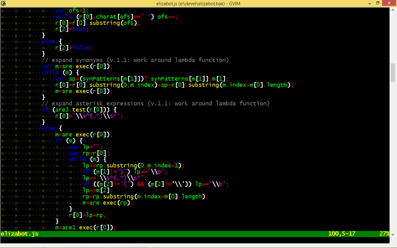
My overall color settings have a sort of chalkboard vibe. Because I noticed this and liked it, I next got an addon to make my editor background look like a smudged chalkboard. Overjoyed with the result, I began looking through Windows' fonts.
My current favorite programming font is Eurofurence, for it's beautiful diagonal 'e'. Recently, I've been trying out OCR-A Extended, which is also quite a nice programming font, But those just won't do on a chalkboard.
I've been going up the list so far from the bottom, and so far like the Lucida and Segoe handwriting fonts quite a lot, but I need something better. So please help, or I may end up programming for up to an hour using Comic Sans!
(As an additional note, I quite like Always Aligned, and program using tabs. Heresy on so many levels...)
-
Hererical?
-
can it print in color?
Because the argument I've been bashed in the head with, was printed code reviews.
Yes, I know we all have tablets and future stuff, but by golly some old folks just need to cut down trees.
-
Extra-heresy even, if I end up on Comic Sans MS. I Quite like Kristen ITC as well.
-
does comic sans use fixed width.
I can't go without fixed width in coding.
-
I use tabs, so I don't need fixed-width. As long as the characters are distinct enough, its good. That's why I loved using eurofurence. Monofur is the monospaced equivalent, and I don't mind them, but I am not shackled by the establishment!
(Ooh, Jokerman looks nice with my font. But no, no, I wouldn't use this any more than I'd use the Old English Script font)
-
So whoosh on me pointing out your tyop?
(Unless there's some really obscure joke I'm wooshing on. That's possible too I guess...)
-
No, no, a whoosh indeed. Thank you.
-
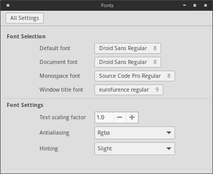
Eurofurence
Nice font.[spoiler]Incidentally, and coincidently, it's also a furry convention
 [/spoiler]
-
And that explains the weird Google results.
-
Yes, we found that out last week when a cow orker searched it. Also, your display pictures are getting steadily more pink. Though at least now you don't have to argue with blakey about the color.
-
-
Long ago, in the days of the distant past... perhaps even one year ago now, purple was called pink and chaos ruled.
...Chiller is quite a nice font, though strangely small.
-
I don't get the point of this topic, ESPECIALLY without a screenshot.
-
This post is deleted!
-
Right, topics exist for purposes. I forgot,
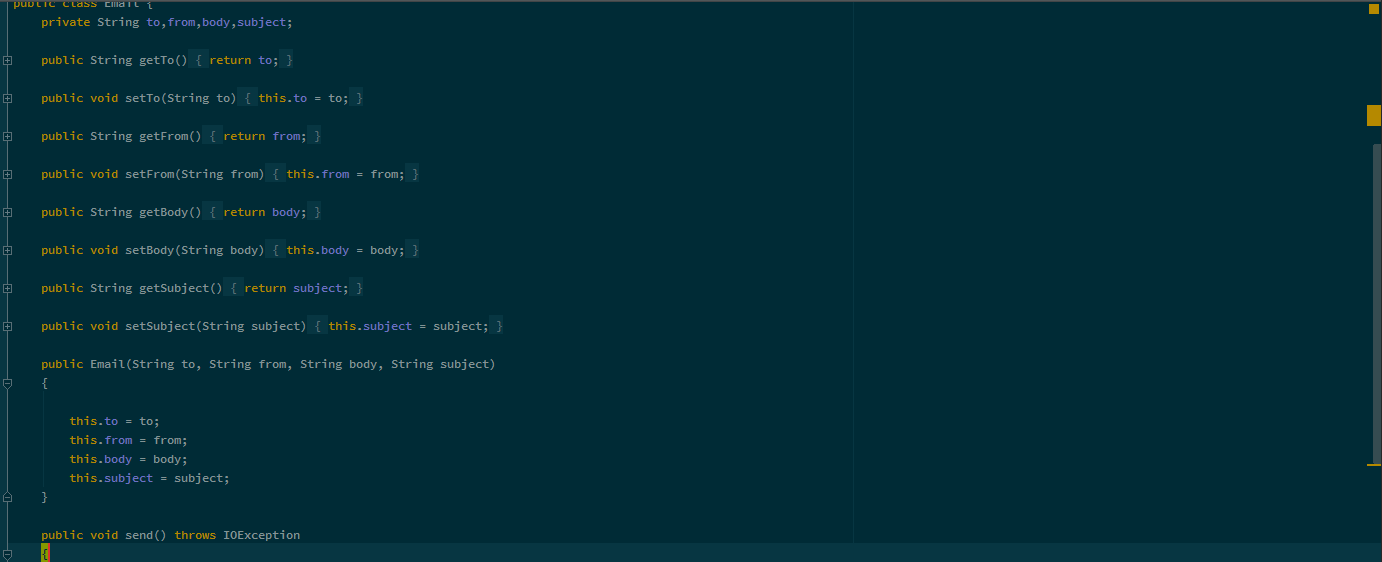
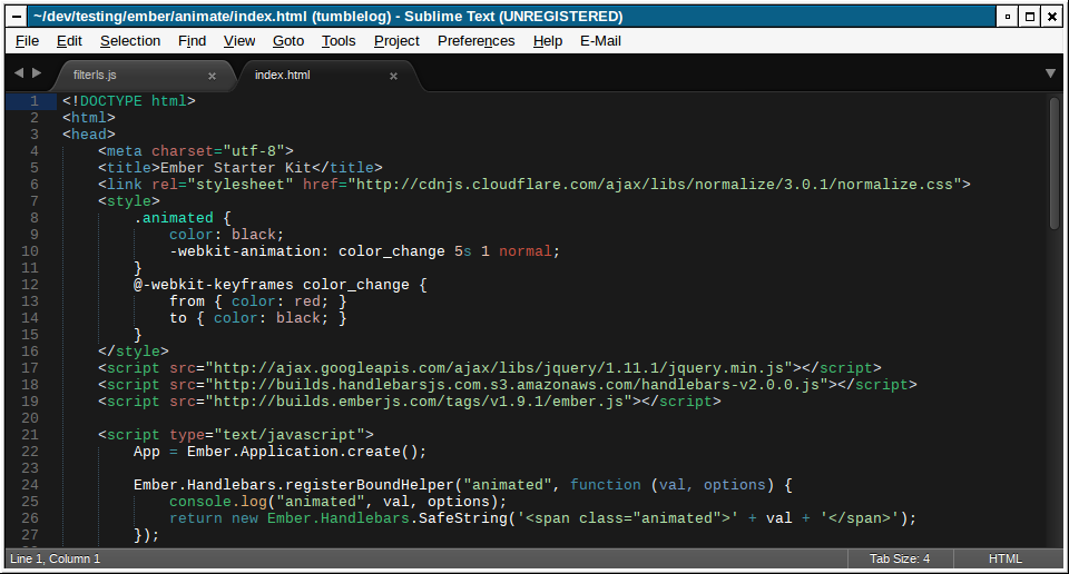
But, a screenshot will be forthcoming, upon my return home. I'd rather screenshot my own source.
Also, Buxton Sketch is almost entirely perfect.
-
Just screenshot it at work and anonymize it. Blur it out so you can't read the text, then people can just see the fon...... oh wait...
-
And that explains the weird Google results.
Weird? I don't think they're-
Oh, of course, you're not me
@Magus said:Long ago, in the days of the distant past... perhaps even one year ago now, purple was called pink and chaos ruled.
http://what.thedailywtf.com/t/teh-o-cial-discopaedia-abarker-creator-and-prophet-of-the-discopaedia/3866/20?u=raceprouk
-
Hmmm...
Didn't like it for anything else, but it works quite nicely as a window title font.
The rest remains the same as it was:
-
Yeah, it's a bit narrow for many things, much like Bradley Hand ITC (Such a shame, this would totally be the one if it's bold was not so markedly anorexic) - but the normal version (55?) is quite good for programming. Admittedly, you also need around 5-space tabs, but that does so help you eliminate those dirty spaces your pathetic uninformed projectmates leave around your beautiful, immaculate code.
-
zoi gy. In lojban, they call it pink .gy. xunblabi
-
[ ( zoi gy In lojban, they call it pink gy ) CU << xunblabi >> VAU ]
[ ( ? ) is/does << pink?? >> ]
[ ( xunblabi1 (pink??) ) << >> ]
1 2 2 3 3 1
-
Wow, I fucked up the English part. In lojban, they call it reddish white.
-
Semi topical, I was just in a discussion about new licence plates we're getting around here and I really like the font:

I wonder if it's something existing or made for this purpose.
-
I still prefer lightish red
-
I bet I could program in
or
-
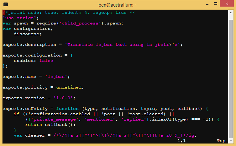
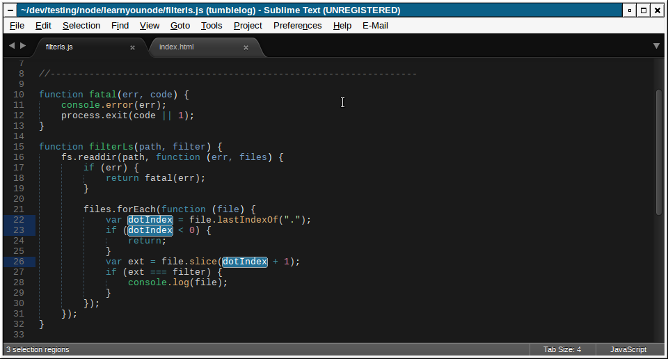
This is what it looks like on my laptop now:
-
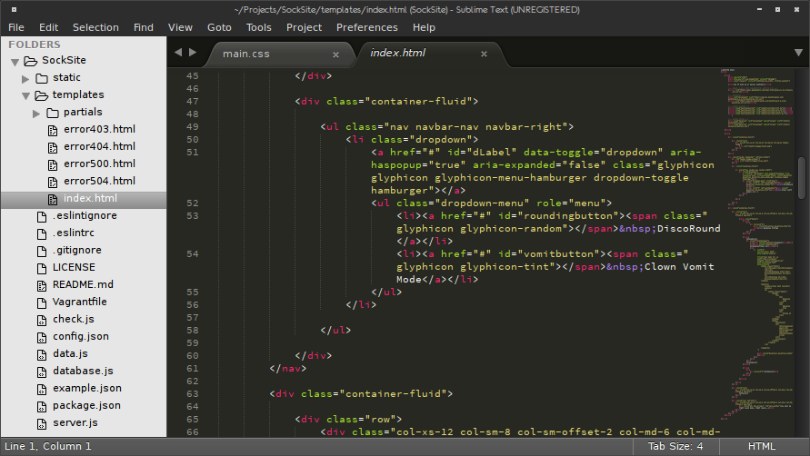
And now I'm going to inflict my Vim settings on you, because frankly, you deserve it...
-
now you've done it.....
-
Solarized. Nice.
-
is that what that style is? i basically spun the wheel until it landed on somethign darkish...
as long as i can tell the color differences i've never much cared what the colors were. ;-)
-
Yeah, it's supposed to be better for the eyes in different light conditions or something. FWIW it does seem to help me read stuff better after staring at a screen ~15hrs a day...
Bonus reading: http://ethanschoonover.com/solarized
-
Bonus reading: http://ethanschoonover.com/solarized
There's some real science behind that. However, to maximize visual distinctions, I made my colour scheme by selecting:
- all the red
- all the blue
- all the green
- all the yellow
- ...
-
-
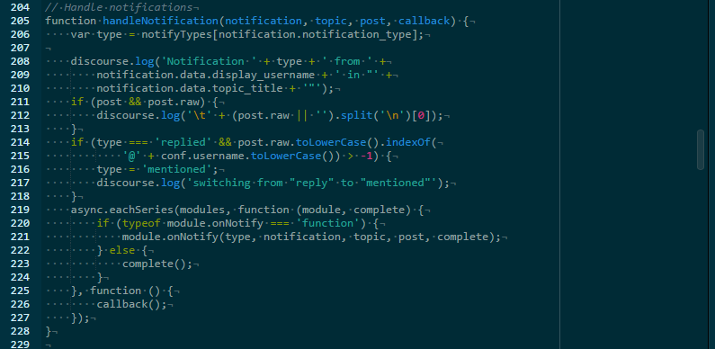
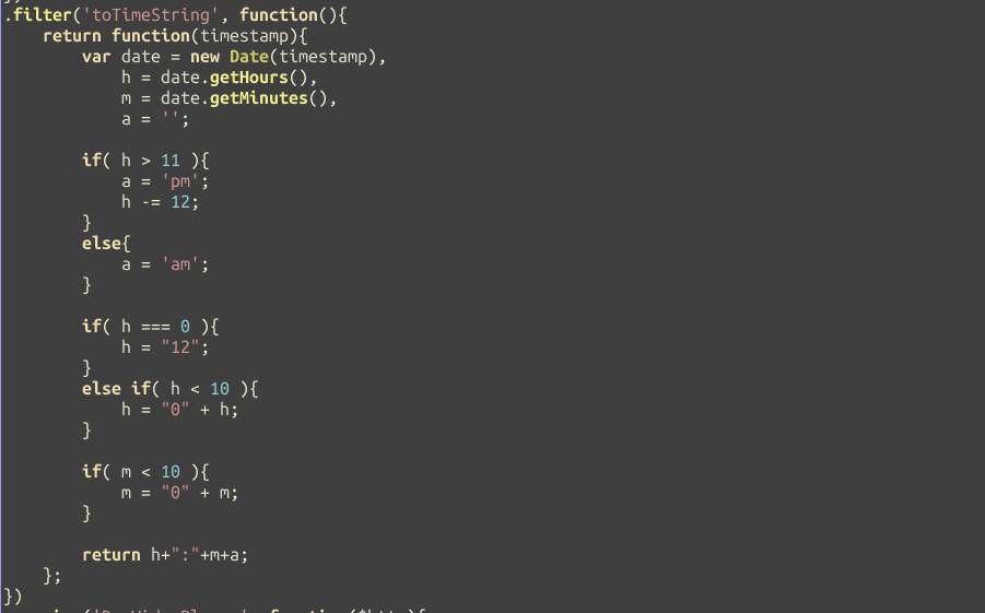
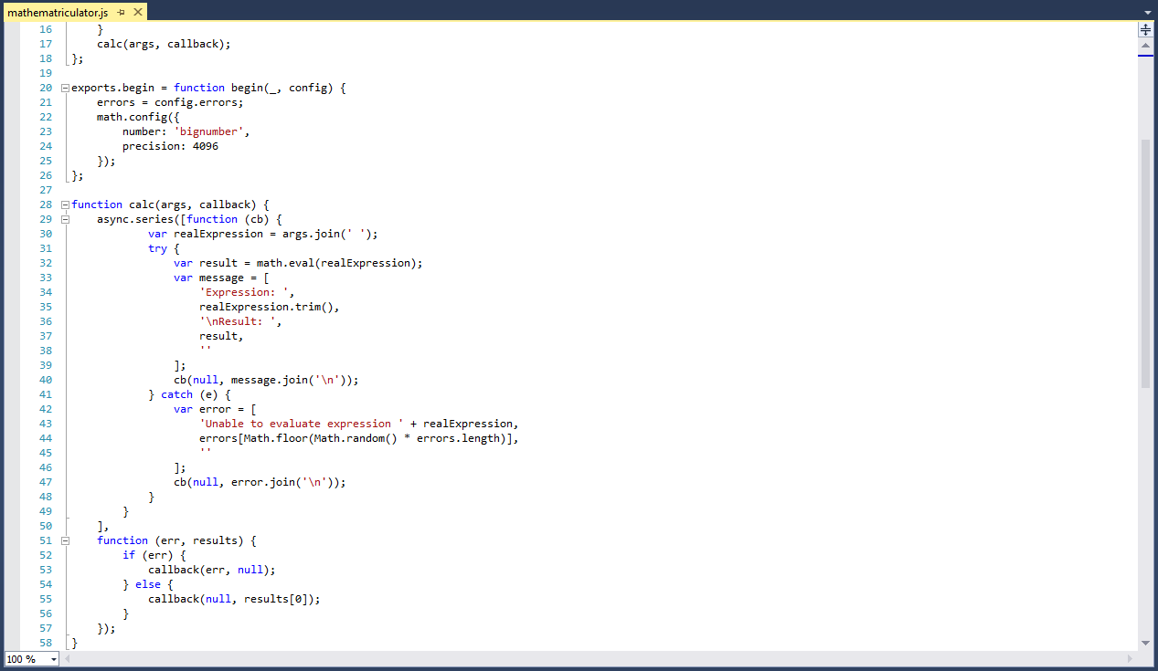
I like Monokai myself:
Which reminds me, I need to get Monokai for vim set up again... and powerline.
And yes, I should go and pay for Sublime, shut up...
-
powerline
That's depreciated in favour of Airline

Also, try GitHub Atom. Yes it's a single-threaded memory hog, but it works quite well.
-
jEdit + Zenburn + Ubuntu Mono
don't look at that code, I'm sure to don't
-
That's depreciated in favour of Airline
Don't see a bash plugin on there. Am I blind or do I still need powerline for that?
Also, try GitHub Atom.
Thanks, but last local application that used node.js didn't perform that nicely after any kind of prolonged usage (Vivaldi browser).
-
There's a command to export a bash prompt from your current powerline config.
As for Atom, that's not strictly Node. That uses a special shell that seems to work slightly better.
-
Yay, theme screenshot thread!
The only special theme I have is my customized Flatgrammer in sublime.
I use more or less defaults in everything else.
BTW, chalk on the blackboard theme? Disgusting. @tar's is also terrible. Ben's too, if that can be called a theme. Others are ok.
-
Pay for it you cheap... And what is wrong with you using that WM theme?
-
Pay for it you cheap...
Hey, I'm still evaluating, don't rush me! That's a multi-year process.
And what is wrong with you using that WM theme?
Tried all sorts of fancy shit. Turns out I appreciate good old clarity over all else.
-
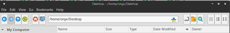
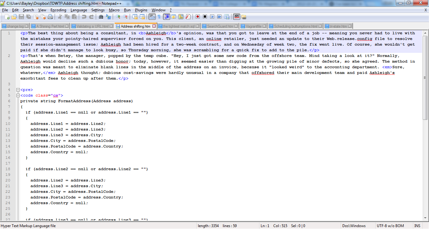
Am I alone in using a white background?
Yes, that's Visual Studio.
Yes, I use it for Node.js work.
Yes, there's an addon for Node.js.
Yes, it sucks.
-
Am I alone in using a white background?
You and pretty much any n00b out there who doesn't know how to change it.
-
I use white in webstorm and VS. I'm no biggot.
-
You and pretty much any n00b out there who doesn't know how to change it.
But what if I like the white background?
Note to self: try VS with a dark background
-
 ;P
;P
Notepad++ is ugly as sin but I don't have sublime on my home laptop, just at work.
-
Am I alone in using a white background?
You are not.
The only other alternative is neon-green on black - Matrix style. ... or amber... amber was nice sometimes
I'm not sure I've helped your defense.
Filed under: fiddling with AllTheSettings™ is (another) Barrier to Getting Things Done™
-
R#?
Someone's written a .Net statistical language!!


bingling....
"R# is a free programming language based on REBOL."

...2003-09-09... and 11 downloads this week

Oh.... R# "Resharper"
I don't know whether to be
 or
or  ...
...
-
 Graphic Design Inspiration, Resources & Freebies | UCreative.com
 Graphic Design Inspiration, Resources & Freebies | UCreative.com