responsivenes with vh and vw
-
I'd like to check if you guys if the idea I am using for responsiveness on screen resolution is cromulent
For some reason, the standard I see on the internet is like here, a maximum width, with a big blank margin:

The thing I'm testing is using vh and vw units for size, that makes the text grow larger with the window. I think it worked better:

But I rarely do any frontend, is there any reason why it's not the normal way of doing this? (as in, why frameworks like bootstrap and the like use fixed width?)
-
@sockpuppet7 making the text larger is absolutely an answer but I'm not sure it's a better one.
Personally, I don't want to read text that big for body copy, it's just uncomfortable for me, but that may be entirely subjective.
-
@Arantor I guess it depends on what device you are reading on; I like one size on a laptop and a different one on my phone.
-
If a text line is too wide, it causes eye strain both from increased movement while reading across and difficulty reacquiring the next line when you've finished the first. Because of this, Bootstrap caps page width at about 320mm (1200 CSS pixels). Ideally, on displays as wide as yours, instead of a single maximized window you have two windows side by side, or a main window flanked by two or more sidebars.
Edit: For something like Wibble, consider adding a second column of text once over a certain width. That keeps each line narrow enough to read easily. There may be some pain if an article is over a screen in height (since viewers would have to scroll to the bottom to finish the first column and then scroll back to the top to read the second) but I don't think Wibble articles are long enough that that'd be an issue.
-
@dkf said in responsivenes with vh and vw:
@Arantor I guess it depends on what device you are reading on; I like one size on a laptop and a different one on my phone.
The text produced comes out at 38.4px high on a maximised Firefox window on 1920x1080. This to me is too big to be comfortable reading for body text.
-
@sockpuppet7 said in responsivenes with vh and vw:
I'd like to check if you guys if the idea I am using for responsiveness on screen resolution is cromulent
For some reason, the standard I see on the internet is like here, a maximum width, with a big blank margin:
I can say that this is a standard I like. I usually don't maximize my browser horizontally, and I don't like reading super wide lines of text.
The thing I'm testing is using vh and vw units for size, that makes the text grow larger with the window. I think it worked better:
I'm not a fan of this. I've seen some sites do it (notably Buzzfeed) and I've always disliked it.
-
@boomzilla said in responsivenes with vh and vw:
I can say that this is a standard I like. I usually don't maximize my browser horizontally, and I don't like reading super wide lines of text.
I do, but I still don't want to read from one side of my monitor to the other.
Better Motherfucking Website has the right ideas about this stuff:
- body text 60-80 characters wide
- bigger line spacing
- slightly bigger font than default, but don't go crazy with it
-
@sockpuppet7 said in responsivenes with vh and vw:
is there any reason why it's not the normal way of doing this?
Typography rules that have been experimentally established over last couple hundred years.
@TwelveBaud said in responsivenes with vh and vw:
For something like Wibble, consider adding a second column of text once over a certain width. That keeps each line narrow enough to read easily. There may be some pain if an article is over a screen in height (since viewers would have to scroll to the bottom to finish the first column and then scroll back to the top to read the second) but I don't think Wibble articles are long enough that that'd be an issue.
In that case it would be better if the columns were limited to screen height and the page switched to scrolling horizontally by adding more columns. Like the reading view in Word.
I didn't think CSS supports flowing over multiple columns, but it seems CSS3 does (https://caniuse.com/multicolumn), you'd just need to adjust the number of columns suitably with some media rules and perhaps a bit of javascript to measure the content length.
-
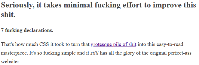
@hungrier said in responsivenes with vh and vw:
Better Motherfucking Website has the right ideas about this stuff:
Couldn't say I agree. It's not too bad but far from great.
For reference, this is how it looks for me:
@hungrier said in responsivenes with vh and vw:
body text 60-80 characters wide
I find that too narrow, makes for too much going back and forth when I have all that space available on the sides. Might be ok for a phone but that's because phone screens just generally suck for reading. Around maybe 100 characters or so would be better.
@hungrier said in responsivenes with vh and vw:
bigger line spacing
Too big, paragraphs lose visual coherence and the font gets lost in a sea of white. I'd rather have the font size even bigger but the line spacing reduced.
-
@TwelveBaud said in responsivenes with vh and vw:
For something like Wibble, consider adding a second column of text once over a certain width.
I've never seen anyone do this in a web page. Even if the text would fit in two columns without scrolling, I think I'd still prefer scrolling. Text in a web page isn't text in a paper magazine.
-
@hungrier said in responsivenes with vh and vw:
body text 60-80 characters wide
I do stick to 80 character lines in code comments. I could go higher (up to 100 or so) but 80 columns is still the default terminal width.
-
@PleegWat said in responsivenes with vh and vw:
@hungrier said in responsivenes with vh and vw:
body text 60-80 characters wide
I do stick to 80 character lines in code
comments.But @topspin, I hear you say, that's antiquated. We have ultra-wide screen displays now.
Yeah, I know. I prefer to have several readable files next to each other without using a horizontal scrollbar, instead of your 460 column abominations.
-
 : Sometimes the old ways are best.
-
@topspin I generally go up to 100-120 for code, but I'm not very strict on it. Particularly if you have a series of similar lines, allowing the longer lines can be significantly more readable than forcing line breaks.
-
@PleegWat said in responsivenes with vh and vw:
@topspin I generally go up to 100-120 for code, but I'm not very strict on it. Particularly if you have a series of similar lines, allowing the longer lines can be significantly more readable than forcing line breaks.
Yeah, I'm fine with 100, but that's about it. 120 already seems stretching it. And if you don't enforce anything, people will do several hundred columns of pure bullshit. Even after inserting line breaks, that code is usually shit.
And unfortunately "some leeway" doesn't work well with automation. I can tell clang-format to do 80 or to do 100, but the options for "try to do 80, but in this case the pain of doing a line break is worse than doing 90" are quite limited.
I tend to err on the side of clang-format and reserve "artistic freedom" in breaking the rules to rare cases.
-
@topspin In the old product, for the last few years it was just me. In the new product the javascript is wild west, and the java has an autoformatter which blanket discards all manual formatting. I'm one of two main guys writing shell scripts and the other guy is way more of a style cop than I am.
-
@ixvedeusi said in responsivenes with vh and vw:
I find that too narrow, makes for too much going back and forth when I have all that space available on the sides. Might be ok for a phone but that's because phone screens just generally suck for reading. Around maybe 100 characters or so would be better.
100 is fine, and maybe even more, but in general shorter lines are more comfortable to read. There's probably a formal definition, but intuitively it makes sense that you don't want the beginning of the line to be out of your central field of vision and into your periphery by the time you're at the end. Keeping it there also avoids having to break the flow of what you're reading to find the next line. I think bigger line spacing helps with that as well, as the lines are more distinct from each other in terms of where they are visually.
-
@PleegWat said in responsivenes with vh and vw:
@topspin I generally go up to 100-120 for code, but I'm not very strict on it. Particularly if you have a series of similar lines, allowing the longer lines can be significantly more readable than forcing line breaks.
Ugh. The stuff that fries me is when people shove a ton of markup on a single line. It's bad enough when they're putting all the stuff for that one tag into a line or three instead of giving every attribute its own line. I go ballistic when they do shit like this:
<div class="some stuff"><button click="foo()">Click Me
</button><span><input blah....>
etc...Like...they wrap at some reasonable column but it's even worse because the breaks make no semantic sense.
Should be a fireable offense.
-
@boomzilla sometimes that’s because bad CSS produces gaps if you leave white space between the tags, and that’s the less-effort fix for it.
-
@Arantor said in responsivenes with vh and vw:
@boomzilla sometimes that’s because bad CSS produces gaps if you leave white space between the tags, and that’s the less-effort fix for it.
Not in the cases I've seen around here, though I could almost respect a lazy fix for CSS shenanigans.
-
@boomzilla I’ve definitely seen it, I’ve definitely done it as well because time and situational incompetence around me. But it’s rarer than it used to be.
-
Hold my coffee.
<div
  class="some stuff"
    ><
    button
      click="foo()"
        >Click Me<
    /button
    ><
    span
        ><
        input blah....
-
@Zecc BRB, updating my IDE formatting settings
-
-
@Zecc That reminds me of the defaults for ESLint when applied to Vue components.
-
@PleegWat said in responsivenes with vh and vw:
@topspin I generally go up to 100-120 for code, but I'm not very strict on it. Particularly if you have a series of similar lines, allowing the longer lines can be significantly more readable than forcing line breaks.
I've got my .clang-format file set to 120.
And I changed my Terminal (win11) default to 120 too.
-
thanks for all the advice. I found something that reminded me of this thread:
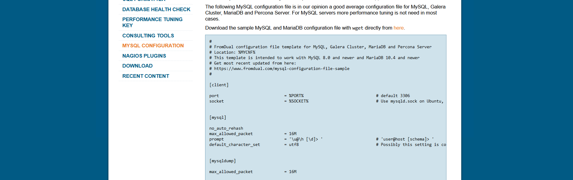
all that extra space on the sides, and the text truncated, that is infuriating
-
@sockpuppet7 said in responsivenes with vh and vw:
all that extra space on the sides, and the text truncated, that is infuriating
What is really frustrating is when left-right scrolling is disabled in those situations. Can't see the whole of the text, and won't let you change that.
-
@dkf said in responsivenes with vh and vw:
@sockpuppet7 said in responsivenes with vh and vw:
all that extra space on the sides, and the text truncated, that is infuriating
What is really frustrating is when left-right scrolling is disabled in those situations. Can't see the whole of the text, and won't let you change that.
Right click, inspect element, add
overflow-x: scroll, job done.
-
@sockpuppet7 said in responsivenes with vh and vw:
thanks for all the advice. I found something that reminded me of this thread:
all that extra space on the sides, and the text truncated, that is infuriating
Yeah but you can just scroll sideways if you really want to view that sample config file in a browser.
-
HE WASN'T ASKING FOR HELP
-
@boomzilla not with that attitude
-
@Arantor said in responsivenes with vh and vw:
Right click, inspect element, add
overflow-x: scroll, job done.On my phone?
-
@dkf said in responsivenes with vh and vw:
@Arantor said in responsivenes with vh and vw:
Right click, inspect element, add
overflow-x: scroll, job done.On my phone?
Well, not with that attitude, clearly!
No, for a phone other strategies are called for, namely bookmarklets that can operate on the current page.
Yes this approach works, I have a “view source” bookmarklet on my iPad for shit like this.
-
@loopback0 said in responsivenes with vh and vw:
@sockpuppet7 said in responsivenes with vh and vw:
thanks for all the advice. I found something that reminded me of this thread:
all that extra space on the sides, and the text truncated, that is infuriating
Yeah but you can just scroll sideways if you really want to view that sample config file in a browser.
I copied the text to a notepad++ window, but that is infuratingly bad UX, and being able to workaround it doesn't justify it
I gets sillier on the ultra wide screen:

And the thing I suggested on my original post wouldn't improve it either, (using vh / vw). What I think this should have was line wrapping, having a copy to clipboard button or a view file as raw text link
-
@sockpuppet7 said in responsivenes with vh and vw:
What I think this should have was line wrapping
That'd look like ass for this example and would be less readable.
@sockpuppet7 said in responsivenes with vh and vw:
having a copy to clipboard button or a view file as raw text link
There's a link to the file above it.
-
@Arantor said in responsivenes with vh and vw:
@dkf said in responsivenes with vh and vw:
@Arantor said in responsivenes with vh and vw:
Right click, inspect element, add
overflow-x: scroll, job done.On my phone?
Well, not with that attitude, clearly!
No, for a phone other strategies are called for, namely bookmarklets that can operate on the current page.
Yes this approach works, I have a “view source” bookmarklet on my iPad for shit like this.
I use Kiwi browser, which is basically mobile Chrome with extensions and developer tools.
