Xiaomi's new logo
-
 ‘Xiaomi should call the police’: new ‘squircle’ logo invites ridicule online
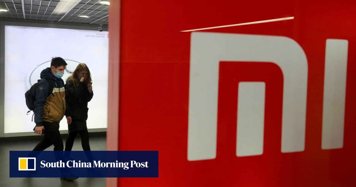
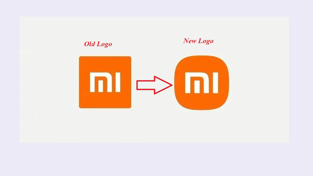
Smartphone maker Xiaomi has been widely mocked online after reports that it spent US$300,000 on a new logo that appears to just curve the corners of the old one.
Xiaomi’s new ‘squircle’ logo becomes the butt of online jokes with many claiming they could have made it for much less money
Smartphone maker Xiaomi reportedly spent US$300,000 on a new logo inspired by Eastern philosophy, but online ridicule said it just rounded the square corners
Looks like the designer cut some corners on their work.
-
@Zecc said in Xiaomi's new logo:
US$300,000 on a new logo
FUUUUUUU. That took like 5 minutes to “design”, so their weed-smoking design hipster makes $3,600,000 an hour.
I got the wrong job.
-
@topspin said in Xiaomi's new logo:
@Zecc said in Xiaomi's new logo:
US$300,000 on a new logo
FUUUUUUU. That took like 5 minutes to “design”, so their weed-smoking design hipster makes $3,600,000 an hour.
The company the weed-smoking design hipster works for makes a lot of money, not the design hipster.
-
Do Chinese companies pay taxes? Maybe that’s just another tax write-off scam in the tradition of the Double Irish arrangement for “licensing IP” to yourself.
Will probably try to write it off in the US and/or EU though.
-
@topspin said in Xiaomi's new logo:
@Zecc said in Xiaomi's new logo:
US$300,000 on a new logo
FUUUUUUU. That took like 5 minutes to “design”, so their weed-smoking design hipster makes $3,600,000 an hour.
I got the wrong job.
Some people are saying what might have happened was management got involved — and we know how that goes — yet the designer still got all the billable hours. More power to them.
-
The new logo is backwards compatible with their existing phone models, since those have the logo without any outline.
-
On the upside, as these things go, $300k is relatively cheap.
-
@cvi said in Xiaomi's new logo:
On the upside, as these things go, $300k is relatively cheap.
I think I've been at more expensive single meetings.
-
@Zecc said in Xiaomi's new logo:
‘Xiaomi should call the police’: new ‘squircle’ logo invites ridicule online
Smartphone maker Xiaomi has been widely mocked online after reports that it spent US$300,000 on a new logo that appears to just curve the corners of the old one.
Xiaomi’s new ‘squircle’ logo becomes the butt of online jokes with many claiming they could have made it for much less money
Smartphone maker Xiaomi reportedly spent US$300,000 on a new logo inspired by Eastern philosophy, but online ridicule said it just rounded the square corners
Looks like the designer cut some corners on their work.
 Standard procedure. I don't recall exactly how much IBM's logo redesigns cost but the 1972 was somewhere in the ballpark of $50,000. 1972 dollars!
And look how radical they were over the last 75 years:

-
@Zecc I used to read Brand New to see the designer community's reaction to various logo changes and compare it to my own; I typically felt the opposite of the consensus.

They went to a subscription-only model last year so I haven't read it since.
-
@Parody said in Xiaomi's new logo:
They went to a subscription-only model last year so I haven't read it since.
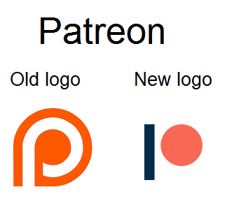
I wonder what they think of this:
-
@hungrier said in Xiaomi's new logo:
@Parody said in Xiaomi's new logo:
They went to a subscription-only model last year so I haven't read it since.
I wonder what they think of this:
It's missing a ball?
-
@dangeRuss said in Xiaomi's new logo:
@hungrier said in Xiaomi's new logo:
@Parody said in Xiaomi's new logo:
They went to a subscription-only model last year so I haven't read it since.
I wonder what they think of this:
It's missing a ball?
No, ball is present, but the other paddle is missing. Can't play PONG in this setup.
-
@hungrier said in Xiaomi's new logo:
@Parody said in Xiaomi's new logo:
They went to a subscription-only model last year so I haven't read it since.
I wonder what they think of this:
A representative quote from Archive.org:
Replacing the old monogram but maintaining the geometric equity, the new monogram is a dead-simple stick and ball that form an abstract ”p” and provide a playful element to the identity.
Unfortunately (but understandably) you don't get the poll results or the comments, which is the important part of these short posts. (Brand New has different categories for how in-depth they look at a change; this is one of the short takes.)
-
@Parody I don't know if Aaron Bouvier was the one who wrote that opinion paragraph, but if so I now know to disregard anything he says with extreme prejudice.
The most important aspect of the redesign might be the “Become a patron” button where, if I were a Patreon user, I would be embarrassed to use the old button but completely confident and proud to use the new one.
-
@hungrier said in Xiaomi's new logo:
@Parody I don't know if Aaron Bouvier was the one who wrote that opinion paragraph, but if so I now know to disregard anything he says with extreme prejudice.
The most important aspect of the redesign might be the “Become a patron” button where, if I were a Patreon user, I would be embarrassed to use the old button but completely confident and proud to use the new one.
Armin Vit was the author. (Aaron submitted the link/change.)
I disagree with the writeups more often than not, but it's not 100%.
-
@Parody That's good to know. I don't want to discount the wrong guy as a complete idiot
-
-
@dangeRuss said in Xiaomi's new logo:
@hungrier said in Xiaomi's new logo:
@Parody said in Xiaomi's new logo:
They went to a subscription-only model last year so I haven't read it since.
I wonder what they think of this:
It's missing a ball?
So they changed it from a weirdly shaped "p" that has the stem cut off, making it hard to read, to "IO"? That's quite the name change.
