UI Bites
-
@Tsaukpaetra said in UI Bites:
I'm happy with blaming Windows instead.
I'm guessing Windows 7?
You're guessing wrong.
-
NASA: After the explosion of the spaceship, here is the result of our investigation on what caused it: 'undefined'

-
@TimeBandit said in UI Bites:
NASA: After the explosion of the spaceship, here is the result of our investigation on what caused it: 'undefined'
Undefined Flying [object Object].
-
@Zerosquare said in UI Bites:
Actually Chromium + JavaScript is much better tested than the specialized UI toolkits that would have been probably used before, certifications notwithstanding.
But they're absolutely not designed for critical stuff, and the source code is needlessly huge and complex for such an application (which is definitely something you don't want when you're looking for reliability).
The stuff I worked on was not as critical, but the webview + javascript part was definitely the more reliable one. The C++ layer that controlled the device was way, way worse. And the C# UI of the other project was even worse still and that was more critical because that one configured devices that the patients depended on with their lives. The webview + javascript are so much better tested than what you write in house that even though they are much bigger, they are not really less reliable. And you still do cover them with the functional end-to-end tests.
-
I don't doubt your experience, but to me that says more about the lack of reliability of your in-house code than anything else (and I hope to never encounter whatever device this was used in).
-
@Zerosquare said in UI Bites:
I don't doubt your experience, but to me that says more about the lack of reliability of your in-house code than anything else (and I hope to never encounter whatever device this was used in).
I am very sure that's the standard quality.
There is the real microcontroller stuff. No dynamic memory, fairly short, really well tested. That's what ran on the device. But the control software, no, that's done just like all the normal software out there.
See, the screens are not particularly high safety level. The engine controllers are. Those run fairly simple control loops, hard real-time, no objects, no allocations. But if the screen reboots mid-flight it is basically a non-event. UI is always complex, so you just make sure rebooting it won't disrupt anything actually critical, add some health checks and carry on.
-
See, the screens are not particularly high safety level.
Most of the time, sure, it's not big deal. But what happens if a bug in the UI results in displaying wrong values or sending wrong commands (in a way that's not obvious), or if it becomes unresponsive in a situation where you need it right now?
Lots of stuff appear not to be safety-critical at first glance. Sometimes it takes an accident to show that they actually were.
I am very sure that's the standard quality.
This whole site is a living proof than "standard quality" doesn't mean "proper engineering".
-
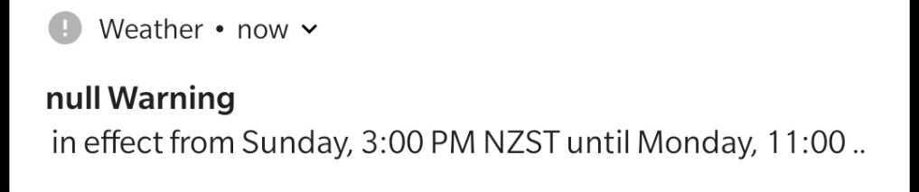
The null weather was actually pretty mild where I am. I think the worst of it passed further null.
-
I would not want to use a touch interface under heavy g.
-
UPDATE: now I'm on another computer and I'm seeing how the scrubber occupies the full width of the screen and the remainder of the UI elements are below it, I'm thinking what really happened was the bottom of the window was missing.
I did find it suspicious that I was seeing the taskbar, but I figured the browser had gone from truly full-screen to borderless maximized window mode, or whatever it is called, somehow. It didn't look like the window continued underneath the taskbar.
So it was not YouTube's fault this time, but Windows', for covering up the bottom of the browser with the taskbar.
I'm happy with blaming Windows instead.NEW UPDATE: the taskbar no longer occludes the bottom of the browser.
What did I do? I right-clicked the start button then dismissed the context menu by clicking elsewhere.
On the other hand now I seem to have lost the window previews when I hover over the taskbar buttons.

-
@Zerosquare said in UI Bites:
See, the screens are not particularly high safety level.
Most of the time, sure, it's not big deal. But what happens if a bug in the UI results in displaying wrong values or sending wrong commands (in a way that's not obvious), or if it becomes unresponsive in a situation where you need it right now?
There are presumably tests to make sure it does not display wrong values, but yes, I am wondering myself how you make sure it does not show wrong values (without some check system noticing an poking the reset). And while the thing is well tested, it's true that if you simply compute the whole image thirty times in a second the risk of something failing to get updated is lower.
Lots of stuff appear not to be safety-critical at first glance. Sometimes it takes an accident to show that they actually were.
E.g. MCAS, yes.
@Zerosquare said in UI Bites:
@Bulb said in UI Bites:
I am very sure that's the standard quality.This whole site is a living proof than "standard quality" doesn't mean "proper engineering".
No, it does not mean proper engineering. It just means proper engineering is rather rare even in places that do deal with safety critical things and should actually know better.
-
I would not want to use a touch interface under heavy g.
I have enough trouble in my car!
-
@Zerosquare said in UI Bites:
Most of the time, sure, it's not big deal. But what happens if a bug in the UI results in displaying wrong values or sending wrong commands (in a way that's not obvious), or if it becomes unresponsive in a situation where you need it right now?
Generally, you've got the safety critical parts as mentioned, and they'll be coded so that if you send them a wrong command they reject the command. They're written on the So Simple They're Obviously Correct principle, and that's actually fairly easy to do for hard realtime without memory allocation. You can't do anything very complicated that way, but for this application area you don't want that. There are also some very good tools for showing the correctness of such systems (assuming a correct spec, which you probably can write in this case).
The UI components are a different kettle of fish. Some parts will be written to a high standard (e.g., making sure that values from the sensors are correctly displayed) but they'll be made so that loss of the UI system is non-critical. There's also substantial benefits to doing it this way, since you greatly reduce the weight of the control system and have a lot fewer components involved. Weight/mass has always been a problem in this application area.
-
making sure that values from the sensors are correctly displayed
It's true that detecting that the screen is not updating is a bit of a problem in this case. I remember long ago we did something that was getting (by different team, so I didn't work with it) a UI done in some framework (I don't remember the name, it's been 14 years) that was designed for glass cockpit and similar critical applications. I wondered why it was redrawing the whole screen in a loop back then like all the normal desktop frameworks did – avoiding bugs that could miss updating some bit was obviously the reason.
-
if you send them a wrong command they reject the command.
If "wrong command" means "unknown command", "parameter out of range" or "not allowed in this context", yeah.
But "wrong command" can also mean "valid command, but not the one the user selected" or "correct command with valid parameters, but one of the parameters is not the correct value". How do you detect that?
-
@Zerosquare said in UI Bites:
-
Instance #45839 of "let's confuse radio buttons and check boxes". Obviously only one state can be selected at a time:
Flat design from the Azure DevOps "Review Pull Request" interface.
-
@JBert Closed, Won't fix
-
-
@Zerosquare said in UI Bites:
But "wrong command" can also mean "valid command, but not the one the user selected" or "correct command with valid parameters, but one of the parameters is not the correct value". How do you detect that?
How do you detect that the user didn't mean to flip that traditional switch?
Easy! Deep learning! 📚
-
@Tsaukpaetra said in UI Bites:
@Zerosquare said in UI Bites:
But "wrong command" can also mean "valid command, but not the one the user selected" or "correct command with valid parameters, but one of the parameters is not the correct value". How do you detect that?
How do you detect that the user didn't mean to flip that traditional switch?
Easy! Deep learning! 📚
So… send the signal to a cloud server somewhere to have it think about it for a while before sending the corrected signal back to the rocket?
No no, kill the pilots that make any mistakes during training, breed the remaining, rinse and repeat!
-
How do you detect that the user didn't mean to flip that traditional switch?
It's not the same thing. What you're describing is user error, which is another class of risk.
The equivalent of buggy UI code would be a design defect in the switch causing it to malfunction. While this is possible, a switch is a ridiculously simple mechanism when compared to millions of lines of code. And for these applications, you wouldn't use consumer-grade switches, either.
-

Good jorb!
(You see the right side of the full width window, the left is just cut out off the screenshot)
-
@topspin
 more might have done it
-
Right-clicks directory icon in file explorer address bar, picks "Copy address"
Pastes "Documents"
Sigh. That's fine, I'll just type in "C:\Users\Zecc\" manually again.

-
Right-clicks directory icon in file explorer address bar, picks "Copy address"
Pastes "Documents"
Sigh. That's fine, I'll just type in "C:\Users\Zecc\" manually again.
I really hate that misfeature. It's fine if you display just "Documents", but show the actual address when, you know, entering "address entry" mode. Don't fucking pretend that a root-less "Documents" exists!
-
@Tsaukpaetra said in UI Bites:
Right-clicks directory icon in file explorer address bar, picks "Copy address"
Pastes "Documents"
Sigh. That's fine, I'll just type in "C:\Users\Zecc\" manually again.
I really hate that misfeature. It's fine if you display just "Documents", but show the actual address when, you know, entering "address entry" mode. Don't fucking pretend that a root-less "Documents" exists!
IIRC the excuse is that that rootless "Documents" is not a folder, but a collection of documents stored in a variety of locations on your system. Not that I know how you'd add or remove locations to that.
And even then they should generate a better technical full path for it.
-
Not that I know how you'd add or remove locations to that.
IIRC, in Windows 7 it was quite easy and intuitive. However now I can't (immediately) find it, so apparently they hid it away and/or removed the feature. You can "Move" it to a different folder, but that looks to be about it
-
@Tsaukpaetra said in UI Bites:
Right-clicks directory icon in file explorer address bar, picks "Copy address"
Pastes "Documents"
Sigh. That's fine, I'll just type in "C:\Users\Zecc\" manually again.
I really hate that misfeature. It's fine if you display just "Documents", but show the actual address when, you know, entering "address entry" mode. Don't fucking pretend that a root-less "Documents" exists!
IIRC the excuse is that that rootless "Documents" is not a folder, but a collection of documents stored in a variety of locations on your system. Not that I know how you'd add or remove locations to that.
And even then they should generate a better technical full path for it.
That's called "Libraries", a good-intentioned idea:
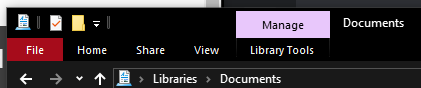
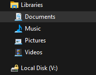
But also poorly-executed:

Because it's a shell-extension-thing.
-
IIRC the excuse is that that rootless "Documents" is not a folder, but a collection of documents stored in a variety of locations on your system. Not that I know how you'd add or remove locations to that.
In Windows 8.1 and 10 it's more likely to be your personal Documents folder ("%USERPROFILE%\Documents") than the Documents Library. (See below.)
Not that I know how you'd add or remove locations to that.
IIRC, in Windows 7 it was quite easy and intuitive. However now I can't (immediately) find it, so apparently they hid it away and/or removed the feature.
Yeah, they hid the Libraries back in Windows 8.1 and just show your user Documents folder now. You can show them again by right-clicking in an empty space in the left panel of an Explorer window (the list of drives and folders) and picking "Show libraries".
-
PRO TIP: no matter how much you like a particular shade of blue, using it for not-underlined hyperlinks and as well as plain
h2s is not a good idea.
-
@Zecc I've had this discussion with our UX contractor, who was (rightly) complaining that we make links non-underlined, and also a kind of dull blue-grey colour. No, I don't know why we do that either, and yes it means it isn't obvious what is a link (though they are bold which means you can find them once you realise that).
If links aren't underlined they need to follow some other obvious convention.
-
@bobjanova said in UI Bites:
If links aren't underlined they need to follow some other obvious convention.
FWIW, the convention of having a (noticeably) different color than the main text is fine by me.
As long as the same color isn't reused for other things!
-
Yeah, they hid the Libraries back in Windows 8.1 and just show your user Documents folder now. You can show them again by right-clicking in an empty space in the left panel of an Explorer window (the list of drives and folders) and picking "Show libraries".
With the somewhat
addition that "empty space" means "below the bottom item in the list" and not "in a space that is itself empty of words but is on the same line as some words".Oh, and on my Win10 system that has only ever been Windows 10, inside "Libraries" I have a library called "Documents" that appears to contain a document called "Documents" and a folder called "Documents". What it actually contains is:
- a folder whose real path is
C:\Users\$username\Documentsthat uses a document icon
- a folder whose real path is
C:\Users\$username\OneDrive\Documentsthat actually contains some files, with no real obvious reason why.
- a folder whose real path is
-
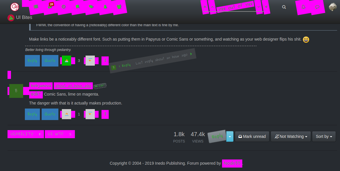
FWIW, the convention of having a (noticeably) different color than the main text is fine by me.
Make links be a noticeably different font. Such as putting them in Papyrus or Comic Sans or something, and watching as your web designer flips his shit.

-
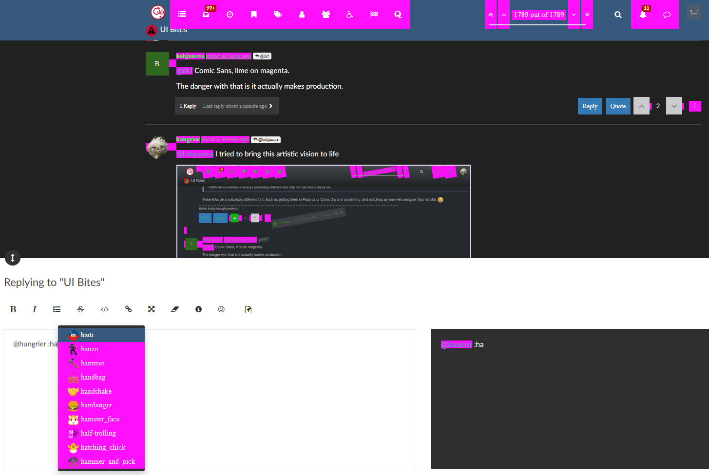
@dkf Comic Sans, lime on magenta.
The danger with that is it actually makes production.
-
@bobjanova I tried to bring this artistic vision to life
I don't know why only some of the links are rotated
-
-
FWIW, the convention of having a (noticeably) different color than the main text is fine by me.
Make links be a noticeably different font. Such as putting them in Papyrus or Comic Sans or something, and watching as your web designer flips his shit.
Make them spin.
-
@Steve_The_Cynic said in UI Bites:
Yeah, they hid the Libraries back in Windows 8.1 and just show your user Documents folder now. You can show them again by right-clicking in an empty space in the left panel of an Explorer window (the list of drives and folders) and picking "Show libraries".
With the somewhat
addition that "empty space" means "below the bottom item in the list" and not "in a space that is itself empty of words but is on the same line as some words".Yes, it needs to be not on an item entry; there's also space in between top-level items and at the top of the list. Alternatively, switch to the View Ribbon in any Explorer window, open the Navigation Pane dropdown, and pick it there. (I always think of the context menus first.)
Oh, and on my Win10 system that has only ever been Windows 10, inside "Libraries" I have a library called "Documents" that appears to contain a document called "Documents" and a folder called "Documents". What it actually contains is:
- a folder whose real path is
C:\Users\$username\Documentsthat uses a document icon - a folder whose real path is
C:\Users\$username\OneDrive\Documentsthat actually contains some files, with no real obvious reason why.
That's the default in Windows 10: the Documents Library has your User folder Documents folder and your OneDrive Documents folder. One of those two should be the same as the Documents item under This PC. You can let OneDrive take over as the Documents location if you want (the option to "Protect" or "Back up" your Documents) but I don't recommend it. Too many programs use the Documents folder for things that I don't really think of as Documents and wouldn't want replicated to every machine I use.
- a folder whose real path is
-
PRO TIP: no matter how much you like a particular shade of blue, using it for not-underlined hyperlinks and as well as plain
h2s is not a good idea.Stack Exchange doesn't care about the consistency of hyperlink colors, so why should anyone else? Some of their sites use two different shades of purple to represent unclicked and clicked links. It looks like you've visited literally every link on every page.
-
@Placeholder Maybe that's just your browser telling you that you have read enough Stack Exchange answers for one day.
-
status: Android go home, you're drunk...
-
status: one of the downsides of really-wide screens:

Tiny description box. Woohoo.
-
@Tsaukpaetra Maybe this is a Linux
hardwareproblem but I can't see whatever you posted:
-
I can't see whatever you posted:
Yeah I have no idea what my phone recorded. Now that I'm on desktop I re-encoded it and so maybe it will work better.
-
@Tsaukpaetra Now it's visible but full width and 3x taller than my screen.
-
@Tsaukpaetra Now it's visible but full width and 3x taller than my screen.
.... I don't know how to fix that...