The Problem With The Hamburger Icon
-
My 6-year-old son asked me this morning what I used to build in Minecraft when I was his age.
-
@Jaloopa said:
It also removes the visual cue that you are in something scrollable at all
That's much less of an issue in practice. The scrollbar shows when the content is first displayed, and a scroll-gesture (varies by input device; two-finger up-down swipe on my touchpad) makes the scrollbar show up again.
It very much was an issue in the gmail case, because the scroll bar was only visible when the mouse pointer was in the scrollable area. It did not show "when the content is first displayed", so the new version of their gdmh interface deleted about three quarters of my contact list, at least until I moved the pointer over the display area and saw the scroll bar appear.I think that was the version before the themable one where the default theme for some reason had the "compose" button in red.
It's amazing how Google manages to repeatedly show such Californian(1) enthusiasm for what they've just done to their gmail interface, and every time they manage to produce something where the UX sucks donkey balls in one weird way or another, frequently several at once.
(1) I'm well aware that the real California fails utterly to live up to most of the stereotypes of it that outsiders hold. My wife lived there for ten years or so, including Berkeley in the late 60s. The big clue that it isn't a wretched hive of bleeding-heart liberalism (as they say) is that it is the state that elected Ronald Reagan as governor.
-
It very much was an issue in the gmail case
That's one of the few Google services that I don't use. ;)
-
My 6-year-old son asked me this morning what I used to build in Minecraft when I was his age.
A few years back, a neighbour just round the corner asked me to administer first aid to her ailing Windows XP machine. It had acquired a piece of ad-spawning crap, fortunately one that was trivial to find and remove, which made it inconvenient to use. Neither the neighbour (many years ago an illustrator and animator for the Asterix cartoon films) nor her artist husband are technologists, and it was clear that her then 13 year old son had no concept of adults who know anything at all about computers. It was entertaining, in a way.
Like talking one time around 2000 to the son, then about eight, of a colleague. I had managed to acquire a faulty video capture device, and I was trying to assess how faulty it was, so I went to his house with my laptop and the device. The said son (his dad was a technology hoarding geek) had obviously never seen a laptop before, "what's that?" said he. "It's a PC, just like that one," I replied, indicating the tower-case desktop machine his dad had in the living room, "except I can fold it up and take it with me." This gave him a serious case of jaw-dropping awe. Think, a computer you can fold up! And take with you!
And putting on my grumpy old fart hat for a minute: the same son, on a different visit I made to their house (the first visit, if memory serves), had a friend over, and I was introduced to one and all as Steve. I found that very jarring, because when I was that age, your dad's friends, your friends' dads, and, most of all, your friend's dad's friends were all "Mr So-and-so", so being introduced as Steve rather than "Mr Cynic" was a bit disconcerting.
-
Another example: I overhead some students a while back when they found a 3.5" disk: "Cool! Someone has 3-D printed the save icon!"
What would they have made of 5.25" or 8" floppy disks?Or the 75MB removable disks I worked with one summer when I was a student. They were CDC Storage Module Device packs. Each pack was five 14-inch aluminium platters - the top and bottom ones were used only to protect the others, and contained no data themselves. The pack came in a plastic case - you removed the bottom of the case and used the handle on top to screw the pack onto the spindle in the drive itself, then unhitched the top and sides of the case and lifted it away, and closed the lid of the drive. The drive was the size of a couple of washing machines one behind the other, and in the lower part of the spindle there was an electromagnetic brake that came on when you asked the drive to stop. As we found out one day, the brake could fail "off", and if that happened, unloading the pack in a hurry was a challenge, as it had a substantial amount of angular momentum, and left to itself, it would have happily continued spinning (gradually slowing down) for a couple of weeks.
-
It's definitely a good time to be interested in technology.
I'm currently deciding whether it's worth paying the markup (which is quite harsh where I live) for a Kano or buying him the parts separately.
-
It's definitely a good time to be interested in technology.
I'm currently deciding whether it's worth paying the markup (which is quite harsh where I live) for a Kano or buying him the parts separately.
I want whoever designed that site shot. One finger or toe at a time until all that's left is a squishy mess gushing blood all over the place.
-
gdmh(1) words there.
(1) An initialism for a series of profanities.
God-damned mother hucking?
-
Another example: I overhead some students a while back when they found a 3.5" disk: "Cool! Someone has 3-D printed the save icon!"
That is a lie. You heard a comedian say that perhaps.
-
The scrolling! It's almost as bad as Discourse!
-
-
Sadly, that doesn't set a good impression of what is apparently a very worthy project.
http://www.kano.me/kit is a better link.
-
(1) I'm well aware that the real California fails utterly to live up to most of the stereotypes of it that outsiders hold. My wife lived there for ten years or so, including Berkeley in the late 60s. The big clue that it isn't a wretched hive of bleeding-heart liberalism (as they say) is that it is the state that elected Ronald Reagan as governor.
Right; obviously it's impossible for a State to change in 50 years.
How would you know?
I don't know for sure, I'm just 99.9% certain. Kids aren't that ignorant. And it sounds exactly like the kind of "clever" tweet joke someone would take and attribute to themselves.
I am not buying it.
-
http://www.kano.me/kit is a better link.
So buy "build it yourself" you mean "99% of it is a single Raspberry Pi chipset, and you plug in a crummy keyboard."
Pfft. If you're gonna build something, build something. The Radio Shack kits I had as a kid, you didn't "build a radio" by just taking an existing radio and plugging in an antenna. You wired up all the resistors and capacitors and transistors individually, you actually built it.
-
I'm more interested in the programming aspects of it (for him) than the building part. The Kano OS is the part I want to try out and it's available for free separately.
I was already looking at a Pi 2 now that Windows 10 IoT is out for it.
-
It also removes the visual cue that you are in something scrollable at all
That's much less of an issue in practice. The scrollbar shows when the content is first displayed, and a scroll-gesture (varies by input device; two-finger up-down swipe on my touchpad) makes the scrollbar show up again.
There are actually cases, e.g. a horizontally scrollable image embedded into a page, where you've to resort to a caption reading "this thing is scrollable" nowadays. (Not very likely the cursor is over this viewport, when the user touches the screen/trackpad.)
I don't really see the fuss; people have understood for decades that clicking [Apple icon] also pulls down a menu with assorted items that did not make it into anywhere else.
There's quite a difference in using an OS and visiting a website. (And this was mainly about the pattern used in websites.) I may expect a user to make friends with the metaphors of an OS in constant use, but what may we expect a visitor to learn in order to navigate a site?
My first thought on reading that:Xerox invented the hamburger menu? I always knew hamburgers were the worst.
On reading further:Oh I see, modern hamburger menus aren't consistent with Xerox's original design philosophy. Well then I guess they're not so bad after all.
Please get me right: It's not like everyone has to use icons and mechanisms like Xerox did forever. (E.g., we haven't any action keys on the keyboard and there is more often not a mouse than there is.)
But there is the one thing that practically every single interface inherited from Xerox and this is the concept of progressive disclosure. The pattern in question claims to be consistent, but isn't.Moreover, it uses an icon that makes only some sense, if associated to an object. Assuming the *"some menu"-*icon (aka Hamburger) to be understood as "global", because it's "undefined", is mere tech-centric thinking. To real world users it's just "unrelated".
Also, it introduces a verb-noun-action syntax into an else object-oriented interface (noun-verb), by making it call "some menu" (do anything) -- look/search/scan (new view) -- select/call (what).
There are problems with it in the real world, and these may be associated with these violations of underlying principles. – And it is much worse in websites than in mobile apps. (If there's a back icon, a title, and an actions-icon of some kind in the app's chrome, users are likely to know, what to expect – because of an essential lack of options. Also, in this case, there's an object, namely the viewport.)[Edit] Moreover, it reuses an icon that is in constant, but infrequent use for years, Users have learned (if at all) over years that this either an anchor for a popup menu providing contextual options and/or presets for a specific object (Xerox-use), controlling the view-mode of a specific object/content (list view), or an icon for preset-files. Essentially, it symbolizes a list of items in a popup-menu associated to an object.
The current use is, like, "hey a menu, don't ask which and what for, there's just one". This is just not consistent.
-
Moreover, it uses an icon that makes only some sense, if associated to an object. Assuming the "some menu"-icon (aka Hamburger) to be understood as "global", because it's "undefined", is mere tech-centric thinking. To real world users it's just "unrelated".
I don't understand what you're trying to distinguish between "tech-centric" and "real world users."
-
I don't understand what you're trying to distinguish between "tech-centric" and "real world users."
I think, the idea of falling back to the global context, if there is no specific object, is something we've learned in tech and especially in programming. Outside, there just isn't an object, if there is no object.
-
I think, the idea of falling back to the global context, if there is no specific object, is something we've learned in tech and especially in programming. Outside, there just isn't an object, if there is no object.
Which to me is just using different words to say the same thing, so I wonder why you keep bringing this up.
-
so I wonder why you keep bringing this up.
Because we know this to be a problem. Users are reporting that they never had the idea to visit/activate the icon – thus missing the broader context. There are even examples of it in this thread.
[Edit] Some of the expectations are, it may be about options to the content, like sharing etc, which they are not motivated to use. So they never think of clicking the icon. To others, it's just not telling.
-
Users are reporting that they never had the idea to visit/activate the icon – thus missing the broader context.
I agree. I've had issues like this. I think the most infamous, to me, was how MS made their logo / icon in the top left of the window an application menu when they introduced the ribbon after everyone had been trained that those menus were really window manager stuff that you mostly didn't need to care about.
I just don't see how your words about global vs "no object" meaningfully relates to this.
-
I just don't see how your words about global vs "no object" meaningfully relates to this.
The case "user mistook icon for an option to the content (sharing, etc)" is an example for this. The user expects the icon to symbolize an action that is related to an object, because that's what she learned while dealing with interfaces. So the user searches for an object, and finds the visible content, in consistency with the usual interface mantras. (The user has successfully established a user model.) The design pattern is, "since this icon is not related to a specific object, it's about global, top-level actions, even, if embedded in the content". Clearly, one is missing the other here, in terms of conversation. And I do not think that it's the user's fault.
It's a bit like putting exclusively all the options that are usually in the menus of the chrome into a contextual menu of the background visible in the viewport. Because, if the right-click doesn't find an object and eventually hits the background, it must be about top-level actions, unrelated to the visible content. I wouldn't expect this to be a successful pattern.
Other users may just ignore the icon, because it appears to be unrelated (to anything). – Consistent with selective perception. (User hits web-page, hastily scans page, ignores flashing ads and related info boxes, visually isolates the content. Reads. Is there anything of interest or any interesting options left? No. User apparently doesn't miss any. User is gone.)
-
ey in the late 60s. The big clue that it isn't a wretched hive of bleeding-heart liberalism (as they say) is that it is the state that elected Ronald Reagan as governor.
You realize things may have changed in the past few decades, right?
-
I think your idea here is correct, but something isn't right about the way you're communicating it. Unless you're thinking that "global" means that it applies to everything, which to me is a non-tech-centric way of thinking. If I were talking "tech-centric," then global implies no context, which is pretty much the same as "no object."
I'm not arguing that your basic concept is wrong, just that you're making it hard to understand by apparently contradicting yourself.
You realize things may have changed in the past few decades, right?
There are still areas that would elect someone like Reagan. They're just overwhelmed by the people who actually did reelect Jerry Brown.
-
There are still areas that would elect someone like Reagan. They're just overwhelmed by the people who actually did reelect Jerry Brown.
That kind of political dimorphism exists in most states.
-
Yes, but most states don't have the reputation / stereotypes of California.
-
@Steve_The_Cynic said:
ey in the late 60s. The big clue that it isn't a wretched hive of bleeding-heart liberalism (as they say) is that it is the state that elected Ronald Reagan as governor.
You realize things may have changed in the past few decades, right?
Of course. Perhaps I should have qualified that with "back in the day, " in front of it, and changing "isn't" to "wasn't".
Sigh. Must practice my humour more.
-
@Steve_The_Cynic said:
gdmh(1) words there.
(1) An initialism for a series of profanities.
God-damned mother hucking?
humping
-
The case "user mistook icon for an option to the content (sharing, etc)" is an example for this. The user expects the icon to symbolize an action that is related to an object, because that's what she learned while dealing with interfaces.
Eh...but many users have also learned that "global" menus apply to a context. Like having copy / paste in the Edit menu. Or whatever. While it's true that you've given good examples of user confusion, the more I think about this, I'm not convinced that you're describing some general rule about usability as it relates to contextual vs apparently non-contextual things.
-
Hmmm.... blue pie makes me hungry.
-
Eh...but many users have also learned that "global" menus apply to a context. Like having copy / paste in the Edit menu. (...) I'm not convinced that you're describing some general rule about usability as it relates to contextual vs apparently non-contextual things.
GUIs are generally object oriented. There's generally a noun-verb syntax (select object, select action). Both, nouns/objects and verbs/actions, are supposed to be visualized and the applied action is supposed to result in a visual experience (change of visual state). Therefor, actions are expected to be related to something (like the item "Copy" in the "Edit"-menu being related to the current selection). This is the essential grammar that's to be known by anyone who uses GUI interfaces.
(Technically, this was first implemented by means of stylesheets related to every object. GUI actions were about changing a property in the stylesheet of a selected object. Clicking the modern Hamburger icon is in this context like selecting the global object – the application, the website – and calling a menu for editing its properties. We may describe this action as a break-out of the current visual context or application state. The icon is hardly communicating this, especially, if embedded in the content area.)
Edit: Maybe things were clearer, if we were calling the Hamburger icon a (contextual) break-out button.
Are three stacked lines communicating a break-out? Hardly.
-
Roku nailed it on this regard.
Manager: We need an icon to show a menu with everything a user can't see
UX Ninja: Hamburguer?
Manager: No, thanks, I'm not hungry.
C Programmer: an asterisk!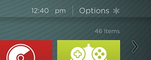
-
C Programmer: an asterisk!
Manager: Like indicating directions? Let's make it a wind rose!
User: Hum – Call the NATO?
-
Have any of the mobile developers using the hamburger menu concept done usability testing on it?
What were the results?
Surprisingly; yes, there are mobile developers that have done some actual real user testing regarding 'the hamburger icon'.
Afaik the results were split about fifty-fifty between users that managed to locate the hamburger and managed to understand that it hid a menu of sorts with actionable items and users that didn't.
Add the text 'menu' or similar to the hamburger icon and it raises success by about 10% to a better 60%. Add a clearly demarkation around the icon, mimicing a button, and the hint of the item being tappable/clickable raises success to about that same 60%. Do both and get somewhere between 60% and 70% success rate.
And now for the kicker: LEAVE OUT THE HAMBURGER ICON and keep only the text and button markings and your success rate will remain between 60% and 70%.
In other words; the contribution of the hamburger icon itself is zero and we can probably safely assume that the 50% of users that managed success in the icon-only case, only managed success due to prior exposure to this broken piece of user interface to the point where they underwent the virtual equivalent of having it beaten into them with a stick.
-
I overhead some students a while back when they found a 3.5" disk: "Cool! Someone has 3-D printed the save icon!"
This is the most beautiful thing I have ever read.
-
That is a lie. You heard a comedian say that perhaps.
And you are not psychic, so you don't know what I've heard or not.
Believe it or not, people can be funny without being professional comedians.
-
How about like it has always been (as far as I've used them) with drop-down menus?
-
I want whoever designed that site shot
I was specially impressed by the thin white text on bright orange.
-
people can be funny without being professional comedians
Here in Germany, it is a felony to be funny without being a certified comedian.
-
Here in Germany, it is a felony to be funny without being a certified comedian.
And the certified comedians have a quota of up to one funny thing per show ...
-
Why not ζ , with ξ right next to it meaning
kill -9 this application?The point is that any symbol will do, as long as it is consistently used for something similar -- especially if it used similarly in more than several places. It does not have to be used for exactly the same thing or according to the original geezer who invented it, since people are not automatons.
Thus, you may not exactly know if is a contextual menu, a general menu, or a list of name suggestions for your dog that will appear, but you do know that something will drop down and give you a list of alternatives.
(unless people mistake for , that is.)
-
Three horizontal lines screams identity at me.
Filed under: ≡
-
Relatedly:
You can easily type ≡ with the German T2 layout - just hit Alt Grt followed by Shift0!
Filed under: [⑧](#Ä8)
-
-
@Mikael_Svahnberg said:
(unless people mistake for , that is.)
That would be a justified mistake.
Too right.
-
So, what was the second hexagram, and what interpretation did you get for it?
-
So, what was the second hexagram, and what
interpretationdid you get for it?33% off I'd hope...
-
And you are not psychic, so you don't know what I've heard or not.
True; but you didn't hear that from a kid.
-
No. A student. Not a kid. Otherwise it would have been a pupil.
-
Aha. Now it becomes clear.