Axes are hard.
-
Our application has a flash chart tracking some integer nuber of thingies over time. At one point there was a bug that the axis would display non-integer numbers of thingies: .6, 1.2, 1.8, etc. The first attempted fix was rounding. Unfortunately, the ticks were still at the same place, and that left us with an axis that had labels of '1, 1, 2, 2' and was otherwise misleading...
It all worked out in the end, but apparently we're not the only ones who had trouble with this:
The real WTF, though? The stock message board, of course.

-
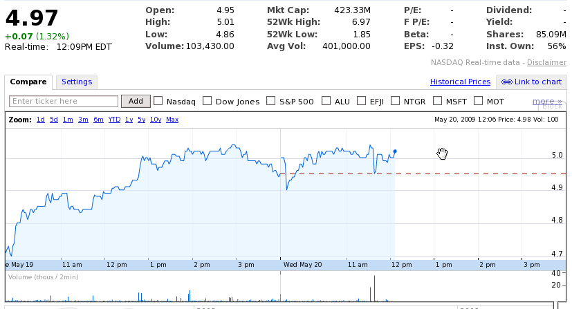
Could you put a red arrow to the wtf? I'm not seeing it. Are you saying its the 4.7, 4.8 , 4.9, 5.0?
Thats exactly what I would want it to say. If the thing I'm looking at a graph for has a variance of less than 1 over the x axis, I would like the y axis to be in increments that are the right scale for the variance.
-
Look at the big price-number, and also the small text in the top-right of the graph. 4.97, 4.98, right? Then look at where the 5.0 line is.
-
cool story, hansel
-