Because what Windows needs is yet another UI overhaul :unamused:
-
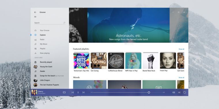
According to Microsoft's Belfiore, the design adds light, depth, motion, and the quality of physical materials to Windows UI, as well as to its apps.

-
The provided screenshot looks somewhat like a mix between OSX and KDE plasmoids.
I wouldn't hate the look, but come on MS, you're not even done redesigning Win10 as it is!
-
@RaceProUK so, imitating material design, badly.
-
@Onyx said in Because what Windows needs is yet another UI overhaul
 :
:I wouldn't hate the look, but come on MS, you're not even done
redesigning Win10 as it is!FTFY, given it's still a Frankenstein system in some places
-
@RaceProUK said in Because what Windows needs is yet another UI overhaul
:it's still a Frankenstein system in some places
Sometimes, I appreciate this, but only because the "redesigned" tools tend to suck. For example, I couldn't uninstall VMWare Player using the new Add/Remove Programs UI, the option was missing, but it was there in the old Control Panel thiggy.
Which is another reason they shouldn't mess with the looks again, the new-but-soon-to-be-old stuff is lacking even where "finished".
-
closer ties between PCs and smartphones
-
@El_Heffe said in Because what Windows needs is yet another UI overhaul
:closer ties between PCs and smartphones
IKR? didn't they JUST learn that lesson with Windows 8.
-
More info:
 New Windows look and feel, Neon, is officially the “Microsoft Fluent Design System”
New "design system" will span everything from phones to virtual reality.
-
Fluent Design System
Holy shit. Microsoft hired Spectate Swamp.
-
So.............. Can you opt out of this UI or is staying on Windows 7 paying for itself?
-
One of the biggest issues with Metro was that Microsoft did not provide strong guidance to developers on how to actually build their interfaces.
I would disagree with this. There was plenty of advice, conventions, etc. for pretty much everything. What there wasn't enough of was the controls that first-party apps used.
-
@RaceProUK said in Because what Windows needs is yet another UI overhaul
:@Onyx said in Because what Windows needs is yet another UI overhaul
:I wouldn't hate the look, but come on MS, you're not even done
redesigning Win10 as it is!FTFY, given it's still a Frankenstein system in
somea lot of places
-
@RaceProUK said in Because what Windows needs is yet another UI overhaul
:the design adds [...] depth [...] and the quality of physical materials
And with that, the loop is closed and we are back to design principles of 15 years ago. That is good news for the devs who haven't updated their app in 10-15 years, it will suddenly look fresh and modern again!
-
Yeah, told you, see the similarities?
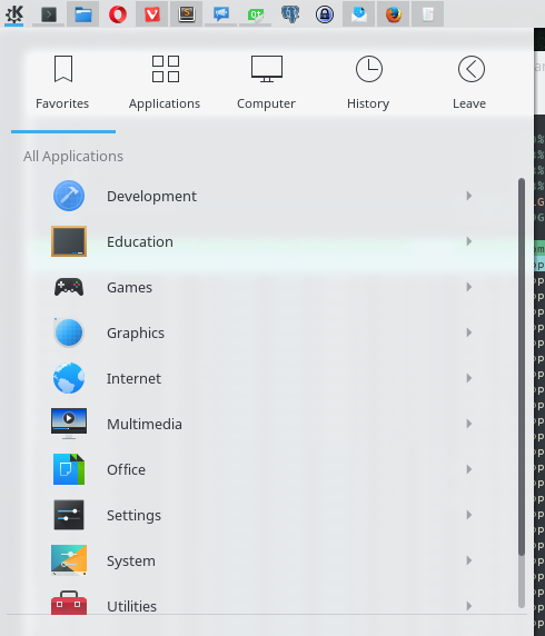
Terminal in the background to accentuate the blur a bit, my background is too dark to make it noticeable otherwise.
-
@CreatedToDislikeThis said in Because what Windows needs is yet another UI overhaul
:So.............. Can you opt out of this UI or is staying on Windows 7 paying for itself?
I'm pretty sure this falls under Microsoft's current thinking which is "installing Windows means we own your computer, you have no say in anything, so just sit down and shut up".
Which is not really all that much different from their old way of thinking. They're just really being dicks about it now.
-
@El_Heffe said in Because what Windows needs is yet another UI overhaul
:Fluent Design System
Holy shit. Microsoft hired Spectate Swamp.
Now I understand the mysteries of Windows Update's stunning performance. It's really just SSDS!
-
@El_Heffe said in Because what Windows needs is yet another UI overhaul
:I'm pretty sure this falls under Microsoft's current thinking which is "installing Windows means we own your computer, you have no say in anything, so just sit down and shut up".
Which is not really all that much different from their old way of thinking. They're just really being dicks about it now.Since Apple does that, and they make like $53 krajillion a year doing it, why wouldn't Microsoft try it also?
-
@Onyx Except that their standards would almost certainly say not to just apply that effect to everything.
If you actually watch some of the demos, it looks pretty nice to work with.
-
@Magus That menu and tooltips for notification area icons / taskbar entries are pretty much the only ones which are using that effect fully. If there were two columns in the main menu I'd assume they'd make one half of it a solid color or something to improve the contrast.
-
-
@blakeyrat no they don't. Unless you are talking about iOS being a locked down device, but Windows Phone and Android aren't any better.
-
@Onyx Then that is quite like their policy.
They also seem to like the idea of subtle glow effects around your actions, preferably ones which more visibly display the often faded borders on things, and elastic movements, even for things which display which item in a list you've selected.
They're very much into layering all of it.
-
@Magus said in Because what Windows needs is yet another UI overhaul
:elastic movements
Ugh, hope that will be customizable... I messed around with such effects a lot on Beryl/Compiz back in the day, and I can say that they become annoying after a while. Having non-bouncy slides on something like a quadratic curve seems to work the best. Too much animation just start becoming visual noise, often making you feel like the UI is slower than it really is; even if the content already loaded, is on your screen and is usable, if there's a menu/tab animation still running at the time I often found myself waiting for that to finish as if it matters.
-
@Onyx Go look at it!
The movements are all very subtle and fast. The thing they like best is a small amount of parallax, but I seriously doubt the little blue marker on the side moving around like it does will annoy you much, if any.
-
@Magus looking for links is work

-
@Onyx Wow, that new start menu looks incredibly well organised and clear.
Maybe I'll switch to Win10 after all.Oh, wait...

-
@Onyx said in Because what Windows needs is yet another UI overhaul
:Ugh, hope that will be customizable... I messed around with such effects a lot on Beryl/Compiz back in the day, and I can say that they become annoying after a while. Having non-bouncy slides on something like a quadratic curve seems to work the best. Too much animation just start becoming visual noise, often making you feel like the UI is slower than it really is; even if the content already loaded, is on your screen and is usable, if there's a menu/tab animation still running at the time I often found myself waiting for that to finish as if it matters.
That's my experience as well.
All this crap looks impressive at first, but once the novelty wears off, I just end up shutting it all down.
The OS is there to put the apps I want where and when I want them, and then get out of the way. If you notice it at all, it's doing a bad job.
The current Windows 10 look is actually quite nice IMO. I hope they don't ruin it.
-
@cartman82 Windows XP with all the shite turn to "best performance" used to be so nice.
-
@cartman82 said in Because what Windows needs is yet another UI overhaul
:The current Windows 10 look is actually quite nice IMO. I hope they don't ruin it.
-
@cartman82 said in Because what Windows needs is yet another UI overhaul
:The OS is there to put the apps I want where and when I want them, and then get out of the way. If you notice it at all, it's doing a bad job.
http://i.imgur.com/2G83xNE.png
Adding more "features" to an OS is

-
@El_Heffe Yeah. The OS should just get out of your way. Every app should render fonts in its own way. And you should have to re-enter your fileshares, network configuration, etc. for every single app. And accessibility features, like high contrast or speech recognition, should be completely left to application developers, it's not like they could possibly get those wrong.
The Atari 2600 had the ideal OS, every development since then has been a waste of effort.
-
I am fed up with flat. They should go back to Aero, it looked so cool.
-
@blakeyrat I don't notice anything special about the font rendering utilities provided by my OS, let alone notice them on a daily basis
-
@blakeyrat said in Because what Windows needs is yet another UI overhaul
:@El_Heffe Yeah. The OS should just get out of your way. Every app should render fonts in its own way. And you should have to re-enter your fileshares, network configuration, etc. for every single app. And accessibility features, like high contrast or speech recognition, should be completely left to application developers, it's not like they could possibly get those wrong.
I never said that.
Font rendering is not a "feature". It Is a basic function that should be handled by the OS. Applications doing their own font rendering are
Same with network configuration, accessibility features and fileshares. Those are not "features", they are basic components, like the tires on a car. More importantly, they are also things that don't need to undergo massive changes from one version of the OS to the next.
Cortana is a feature. Completely pointless and useless (to me). If someone else likes it, that's fine, but I have no use for it, and it cannot be removed or disabled without breaking things.
The Start Menu in Windows 10 is completely broken and useless - a good example of the OS "getting in the way." (Fortunately, there are 3rd party applications which fix that.)
I've used every version of Windows from Windows 3.0 in 1990 to Win 10 today (except I skipped Windows ME). Each new version was better than the previous one. Until everyone in Microsoft's Windows division got infected with some sort of alien brain worms and produced Windows 8, followed by the equally awful Windows 10.
As Donald Trump likes to say:
Sad
-
@El_Heffe said in Because what Windows needs is yet another UI overhaul
:followed by the equally awful Windows 10.
I disagree. Windows 10 is way better than Windows 8. Not because Windows 10 is the best thing ever, mind you. No, it's because Windows 8 was just so bad!
-
@Onyx said in Because what Windows needs is yet another UI overhaul
:@Magus said in Because what Windows needs is yet another UI overhaul
:elastic movements
Ugh, hope that will be customizable... I messed around with such effects a lot on Beryl/Compiz back in the day, and I can say that they become annoying after a while. Having non-bouncy slides on something like a quadratic curve seems to work the best. Too much animation just start becoming visual noise, often making you feel like the UI is slower than it really is; even if the content already loaded, is on your screen and is usable, if there's a menu/tab animation still running at the time I often found myself waiting for that to finish as if it matters.
+++++
I specifically turned off all my animations in Android because it's distracting.