Web design like it's 1996
-
I was taking a wikiwalk today when I came across a peculiar website:
 Glass Insulators Collectors Reference Site
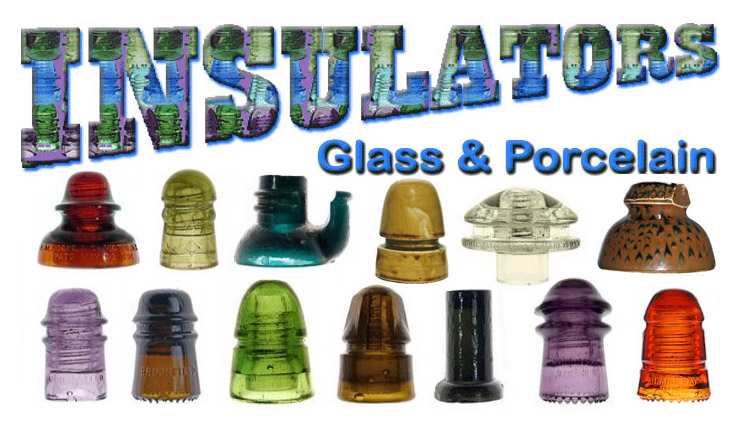
Glass Insulators were first produced in the 1850's for use with telegraph lines. As technology developed insulators were needed for telephone lines, electric power lines, and other applications. In the mid 1960's a few people began collecting these glass and porcelain insulators. Today there are...
I must admit it's not eye-gauging bad as it is perfectly navigable, reasonably organized and devoid of framesets.
However, it's not that good either as it looks like someone actually spent effort to clone a 1999 Geocities page (if only it had more GIFs and a marquee). A bit similar to how LINGS CARS tries hard to imitate MTV or some other ridiculousness.
Apparently it's at the top of the design consultancy's portfolio so they must have had some fun making it.
-
@JBert Have you seen the other sites in the portfolio? It's like an homage to HTML 3.2.
-
@JBert It's above average on my opinion
-
@RaceProUK that's probably the last good HTML spec
-
@JBert said in Web design like it's 1999:
I must admit it's perfectly navigable and reasonably organized
So what's the problem?
-
@El_Heffe said in Web design like it's 1999:
@JBert said in Web design like it's 1999:
I must admit it's perfectly navigable and reasonably organized
So what's the problem?
It's really ugly to modern web aesthetic senses, and aesthetics, believe it or not, do matter.
How much they matter, and whose aesthetics are relevant, are, of course, per capita.
-
@RaceProUK said in Web design like it's 1999:
It's like an homage to HTML 3.2.
But then you have stuff like
<link rel="apple-touch-icon" href="apple-touch-icon-iphone.png">
<link rel="apple-touch-icon" sizes="72x72" href="apple-touch-icon-ipad.png">
<link rel="apple-touch-icon" sizes="114x114" href="apple-touch-icon-iphone4.png">
<link rel="apple-touch-icon" sizes="144x144" href="apple-touch-icon-ipad3.png">
and
#main {
	margin: 20px auto 20px auto;
	width: 900px;/* border: 2px solid #666;
background-color: #EFFFFF;
border-radius:10px; -webkit-border-radius:10px;
padding: 10px;
box-shadow: #666 0px 2px 3px; -webkit-box-shadow: #666 0px 2px 3px;
*/
}
even if the bit with border-radius and box-shadow is commented out; though it wouldn't look bad if it wasn't.
-
@Dreikin said in Web design like it's 1999:
It's really ugly
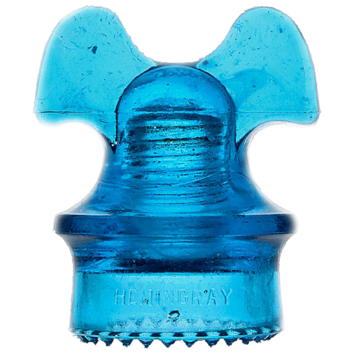
Wrong. I'd like you to draw your attention to the image at the bottom of the page:

-
@El_Heffe Making "bare bones" pages is not a problem, but whoever made this actually spent effort making it ugly. The background image, that title, those icons on the left of each link.
Change the font, give it a plain background, and change the icons, and you got yourself a perfect website.
-
@RaceProUK said in Web design like it's 1999:
@JBert Have you seen the other sites in the portfolio? It's like an homage to HTML 3.2.
their rental inventory of almost 20,000 VHS movies as well as laser discs and DVDs
-
@JBert said in Web design like it's 1999:
Apparently it's at the top of the design consultancy's portfolio so they must have had some fun making it.
It does say that the site began in 1996. Which makes your thread title wrong.
-
@boomzilla
It currently doesn't have GIFs or a marquee so it must be redesigned at some point.EDIT: According to the Internet Archive's snapshots of http://www.insulators.com dated 1999 they actually had a Java applet in there but the site didn't change much since the first snapshot of November the 7th, 1996.
Impressive...
I've changed the title so I hope you're happy.
-
I see your crappy design and raise you this monstrosity.
-
@The_Quiet_One said in Web design like it's 1999:
I see your crappy design and raise you this monstrosity.
They decided on a menu to present the really important stuff, then threw the unimportant stuff around the page.
Like, logging in, and discussing with them about property management.... you know, the two things they actually do.
-
@The_Quiet_One said in Web design like it's 1999:
I see your crappy design and raise you this monstrosity.
It's a bit ugly, but I can easily read it on my phone. Above average IMO.
-
@wharrgarbl said in Web design like it's 1999:
@JBert It's above average on my opinion
@wharrgarbl said in Web design like it's 1999:
@The_Quiet_One said in Web design like it's 1999:
I see your crappy design and raise you this monstrosity.
It's a bit ugly, but I can easily read it on my phone. Above average IMO.
Your average is pretty low

-
@TimeBandit The internet average is low, not my fault.
-
@The_Quiet_One said in Web design like it's 1999:
I see your crappy design and raise you this monstrosity.
Nothing says quality like over 1.5 screens (at 1080p on desktop) of nothing between the end of content and the footer. Even the yellow background colour ended before the footer came. But it is powered by the GoDaddy Website Builder!

-
"This is a large site of over a thousand HTML pages and 25MB of pages and images. The site was started in 1996,"
so yes.... web design like it's 1996. Literally.
damnit @boomzilla
 d me, and also caused the title to be what made me respond. oh well.
-
@darkmatter said in Web design like it's 1996:
This is a large site of over a thousand HTML pages and 25MB of pages and images. The site was started in 1996,
and we never updated itFTFY
-
E-mail: information@getcreativenow.com
Last updated Monday, February 27, 2012Does anyone think he's still there to reply?
-
@darkmatter Perhaps. He seems to be active on Facebook as recently as February. He really likes glass insulators.
-
@boomzilla said in Web design like it's 1996:
He really likes glass insulators.
Toby Faire, it looks like some of those would also be popular with @Perverted_Vixen… ;)
-
@dkf said in Web design like it's 1996:
@boomzilla said in Web design like it's 1996:
He really likes glass insulators.
Toby Faire, it looks like some of those would also be popular with @Perverted_Vixen… ;)
