Enter your topic title here... where?
-
That one has been bothering me for some time...
When creating a new topic, who had the brillant idea of making the field to enter the title look like anything-but-a-text-field???
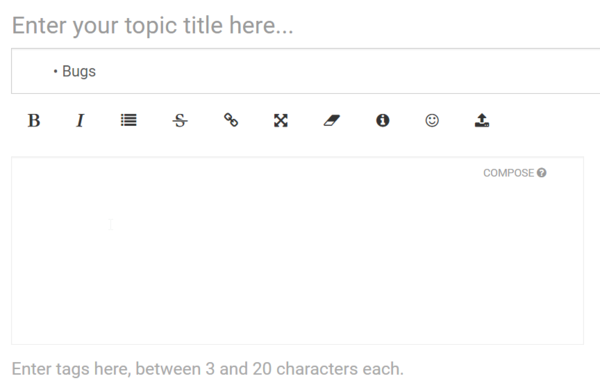
There are some vaguely accepted standards in UI, and one of them is that a text field is supposed to look like, well, a text field.
The issue is compounded by the field just below it (category), which at first glance does look like a text field, not like a combo! (because the "arrow down" is far, far on the right, so not immediately visible... on my snapshot it's not even visible at all)
Same goes for the tags field below the composer, but that one being optional, it's less of an issue, I guess.
-
Tumblr's not much different
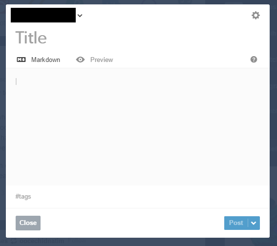
The blog dropdown is better than nodebb's category dropdown, though.
Filed under: Why would you use Markdown mode when HTML and WYSIWYG exist, though?
-
@aliceif said in Enter your topic title here... where?:
Why would you use Markdown mode when HTML and WYSIWYG exist, though?


-
@aliceif said in Enter your topic title here... where?:
Tumblr's not much different
Other stupid sites doing the same stupid mistake does not make it less of a mistake.
-
@remi said in Enter your topic title here... where?:
@aliceif said in Enter your topic title here... where?:
Tumblr's not much different
Other stupid sites doing the same stupid mistake does not make it less of a mistake.
But bashing tumblr is fun.