Because everyone loves a pretty chart
-
This chart was going around at work, it's a filterable visualisation of the "World's Biggest Data Breaches".
It's pretty cool, it's done by year, the most recent are at the top, and it's filterable by organisation and method of leak.
You can even click on a breach for more information. Some of them link to articles, some of them just expand and tell you more information inline.
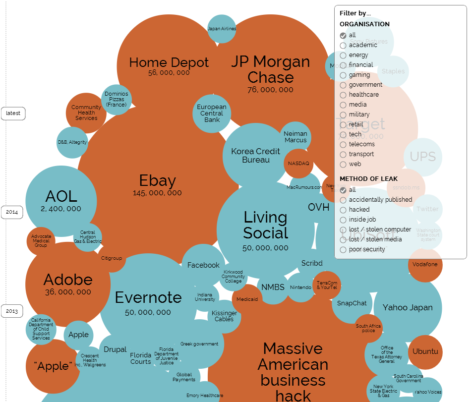
Filed under: A visually appealing representation of who's fucked up the most
-
I didn't know the ECB had a data breach. Great.
-
Here's the linked article for the ECB breach
Update: Blackmailer hacks ECB website, steals email addresses and contact details - CityAM
The European Central Bank (ECB) has had its website hacked, with sensitive personal information including email addresses and contact data stolen. The ECB received an anonymous call on Monday night requesting money in return for the stolen data. The bank didn't say how much the blackmailer asked...
-
Haha the Belgian national rail (NMBS) guy clicking the wrong button and dumping full client data public on the website is also present.
-
How the heck can they make it that easy to leak data?
Seriously, a single incorrect button click?
-
Backdoor gone wrong?
-
Backdoor gone wrong?
I saw that movie last week. It was okay, but there were a few shitty scenes.
-
Backdoor gone wrong?
No no foul play just stupidity ...
I guess it was something like clicking the wrong button and removing any security restrictions or making it readable for everybody.