Unicode making life difficult. Again.
-
All that instead of simply making emoji yellow, because then they'd look like the Simpsons, and no-one would complain.
I very rarely like the emoticon images, and usually try to avoid them coming up :P.
If they wanted Matt Groening's emoticonnery, why not @Zoidberg?
-
Hey, boys and girls. It's Zoidberg, the loveable tramp.
-
Colours in Unicode. That's THE line that they weren't supposed to cross.
Well, now that they jumped the shark, they can finally implement some of my proposals, like characters for italic, bold or underlined text, characters that control the text's position in the screen... The possibilities are endless!
And then it's only a small step to...the return of the <blink> tag!
-
If only we had "UTD" and "DTU" (Up to down, down to up) too, we could give any text pretty shapes. By combining those, the color-picker characters and good old block characters, we could finally reproduce all Piet Mondrian paintings in plain text!
-
You choose to use MySQL
After all it's Oracle now too so one should kinda expect it to do the same kind of sh*t…
-
like characters for italic, bold or underlined text
They 𝒅𝒐 have characters for 𝑖𝑡𝑎𝑙𝑖𝑐, 𝐛𝐨𝐥𝐝, u̲n̲d̲e̲r̲l̲i̲n̲e̲d̲¹ and also 𝕕𝕠𝕦𝕓𝕝𝕖𝕤𝕥𝕣𝕦𝕔𝕜,
𝔣𝔯𝔞𝔨𝔱𝔲𝔯 and 𝓈𝒸𝓇𝒾𝓅𝓉.[spoiler](that line is supposed to render like "They do have characters for italic, bold, underlined and also doublestruck, fractur and script"; the later three should render in appropriate font, but as discourse won't pass style and as I don't know what font to select just imagine they are rendered in appropriate fonts.)[/spoiler]²
These exist because there is a context where font used does have semantic meaning: mathematics. They first added some special-font characters that are used for some common objects in mathematics or physics like ℜ or ℎ, which is even called U+210E PLANCK CONSTANT (though Planck constant is actually named with plain h, because single-letter mathematics entities are always typeset in italics). And one day they realized it is silly and added the rest to complete basic latin alphabet in each script.
¹ Ok, that just uses a combining underline as does d̳o̳u̳b̳l̳e̳u̳n̳d̳e̳r̳l̳i̳n̳e̳, o̅v̅e̅r̅l̅i̅n̅e̅ and o̶v̶e̶r̶s̶t̶r̶i̶k̶e̶.
² [spoiler]Hell, discourse won't even let me make things <small>, so I am making them [spoiler] instead...[/spoiler]
-
They did render fine in Chromium at least.
Now, how did you do that fraktur thing? Never seen it.More characters. That's nice.
-
At least on this particular Mint 17 machine with the fonts I have installed, they render fine in Firefox 33 too:

In Chromium italic and bold are slightly smaller than the rest of the characters:

-
If only we had "UTD" and "DTU" (Up to down, down to up) too, we could give any text pretty shapes. By combining those, the color-picker characters and good old block characters, we could finally reproduce all Piet Mondrian paintings in plain text!
If they're just going to add skin colors, you won't have the right palette. I propose they add the 256-color VGA palette.
-
I just think it'd be nice if you do a minimum of research before saying things like that.
Um...what?
Some wind just knocked all the papers off my desk.
-
Um
[some generic eye candy]
[some generic douche]
I just think it'd be nice if you do a minimum of research before saying things like that.
http://www.lnt.com/photos/product/standard/6156980S7991/humor/what-are-you-smoking-funny-tin-sign.jpg
-
I propose they add the 256-color VGA palette.
Too 1980's. Why not go straight for 32-bit color?
-
-
Not enough code points.
If you want to screw up decoders really badly, just add a code point that says that the next three (four) bytes are to be interpreted as a RGB(A)-color.
If you want to be a bit nicer, you could probably add code points that correspond to Red=0 ... Red=255, and a different for Green = 0 .. Green=255. That's just three or four times 256 code points.
For extra fun, do this for RGB(A), sRGB, YUV and a few different color spaces.
-
you could probably add code points that correspond to Red=0 ... Red=255, and a different for Green = 0 .. Green=255.
They already do something similar for flags.
🇦🇺
-
If you want to be a bit nicer, you could probably add code points that correspond to Red=0 ... Red=255, and a different for Green = 0 .. Green=255. That's just three or four times 256 code points.
This is probably the least insane way to do it. It even fits with the rest of the scheme, sort of. Now, where's that evil ideas thread?
-
We could call it Discode.
-
i know i'v e posted that one here a couple of times by now.....
-
This is probably the least insane way to do it. It even fits with the rest of the scheme, sort of. Now, where's that evil ideas thread?
But since we're talking unicode, they'd probably make this a set of combining characters, so that the color specification changes the preceding thingy - contrary to every other system that has ever existed.
Besides, how long until somebody wants to be able to use different colors in a single code point? Eugh.
-
Besides, how long until somebody wants to be able to use different colors in a single code point? Eugh.
You know, I just wanted to suggest to use the codepoints several times, and apply them to different parts of the glyph (skin, hair, eyes, lips...).
-
how long until somebody wants to be able to use different colors in a single code point?
+1 Yes, I can even think of a use case for it. Which way

 is the evil ideas thread?
-
Missing blondes, rangas, and albinos. Five skin tones is clearly not enough.
You should be able to set a skin opacity value. And a hue. Maybe some YUV+alpha parameterization?
-
If only we had "UTD" and "DTU" (Up to down, down to up) too, we could give any text pretty shapes.
Needs moar degrees (or radians).
-
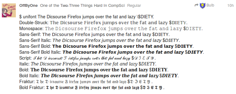
$ unifont The Dicsourse Firefox jumps over the fat and lazy $DIETY.
Double-Struck: 𝕋𝕙𝕖 𝔻𝕚𝕔𝕤𝕠𝕦𝕣𝕤𝕖 𝔽𝕚𝕣𝕖𝕗𝕠𝕩 𝕛𝕦𝕞𝕡𝕤 𝕠𝕧𝕖𝕣 𝕥𝕙𝕖 𝕗𝕒𝕥 𝕒𝕟𝕕 𝕝𝕒𝕫𝕪 $𝔻𝕀𝔼𝕋𝕐.
Monospace: 𝚃𝚑𝚎 𝙳𝚒𝚌𝚜𝚘𝚞𝚛𝚜𝚎 𝙵𝚒𝚛𝚎𝚏𝚘𝚡 𝚓𝚞𝚖𝚙𝚜 𝚘𝚟𝚎𝚛 𝚝𝚑𝚎 𝚏𝚊𝚝 𝚊𝚗𝚍 𝚕𝚊𝚣𝚢 $𝙳𝙸𝙴𝚃𝚈.
Sans-Serif: 𝖳𝗁𝖾 𝖣𝗂𝖼𝗌𝗈𝗎𝗋𝗌𝖾 𝖥𝗂𝗋𝖾𝖿𝗈𝗑 𝗃𝗎𝗆𝗉𝗌 𝗈𝗏𝖾𝗋 𝗍𝗁𝖾 𝖿𝖺𝗍 𝖺𝗇𝖽 𝗅𝖺𝗓𝗒 $𝖣𝖨𝖤𝖳𝖸.
Sans-Serif Italic: 𝘛𝘩𝘦 𝘋𝘪𝘤𝘴𝘰𝘶𝘳𝘴𝘦 𝘍𝘪𝘳𝘦𝘧𝘰𝘹 𝘫𝘶𝘮𝘱𝘴 𝘰𝘷𝘦𝘳 𝘵𝘩𝘦 𝘧𝘢𝘵 𝘢𝘯𝘥 𝘭𝘢𝘻𝘺 $𝘋𝘐𝘌𝘛𝘠.
Sans-Serif Bold: 𝗧𝗵𝗲 𝗗𝗶𝗰𝘀𝗼𝘂𝗿𝘀𝗲 𝗙𝗶𝗿𝗲𝗳𝗼𝘅 𝗷𝘂𝗺𝗽𝘀 𝗼𝘃𝗲𝗿 𝘁𝗵𝗲 𝗳𝗮𝘁 𝗮𝗻𝗱 𝗹𝗮𝘇𝘆 $𝗗𝗜𝗘𝗧𝗬.
Sans-Serif Bold Italic: 𝙏𝙝𝙚 𝘿𝙞𝙘𝙨𝙤𝙪𝙧𝙨𝙚 𝙁𝙞𝙧𝙚𝙛𝙤𝙭 𝙟𝙪𝙢𝙥𝙨 𝙤𝙫𝙚𝙧 𝙩𝙝𝙚 𝙛𝙖𝙩 𝙖𝙣𝙙 𝙡𝙖𝙯𝙮 $𝘿𝙄𝙀𝙏𝙔.
Script: 𝒯 𝒽𝑒 𝒟 𝒾𝒸𝓈ℴ𝓊𝓇𝓈𝑒 ℱ 𝒾𝓇𝑒𝒻ℴ𝓍 𝒿𝓊𝓂𝓅𝓈 ℴ𝓋𝑒𝓇 𝓉𝒽𝑒 𝒻𝒶𝓉 𝒶𝓃𝒹 𝓁𝒶𝓏𝓎 $𝒟 ℐ ℰ 𝒯 𝒴 .
Italic: 𝑇h𝑒 𝐷𝑖𝑐𝑠𝑜𝑢𝑟𝑠𝑒 𝐹𝑖𝑟𝑒𝑓𝑜𝑥 𝑗𝑢𝑚𝑝𝑠 𝑜𝑣𝑒𝑟 𝑡h𝑒 𝑓𝑎𝑡 𝑎𝑛𝑑 𝑙𝑎𝑧𝑦 $𝐷𝐼𝐸𝑇𝑌.
Bold: 𝐓𝐡𝐞 𝐃𝐢𝐜𝐬𝐨𝐮𝐫𝐬𝐞 𝐅𝐢𝐫𝐞𝐟𝐨𝐱 𝐣𝐮𝐦𝐩𝐬 𝐨𝐯𝐞𝐫 𝐭𝐡𝐞 𝐟𝐚𝐭 𝐚𝐧𝐝 𝐥𝐚𝐳𝐲 $𝐃𝐈𝐄𝐓𝐘.
Bold Italic: 𝑻𝒉𝒆 𝑫𝒊𝒄𝒔𝒐𝒖𝒓𝒔𝒆 𝑭𝒊𝒓𝒆𝒇𝒐𝒙 𝒋𝒖𝒎𝒑𝒔 𝒐𝒗𝒆𝒓 𝒕𝒉𝒆 𝒇𝒂𝒕 𝒂𝒏𝒅 𝒍𝒂𝒛𝒚 $𝑫𝑰𝑬𝑻𝒀.
Fraktur: 𝔗 𝔥𝔢 𝔇 𝔦𝔠𝔰𝔬𝔲𝔯𝔰𝔢 𝔉 𝔦𝔯𝔢𝔣𝔬𝔵 𝔧𝔲𝔪𝔭𝔰 𝔬𝔳𝔢𝔯 𝔱𝔥𝔢 𝔣𝔞𝔱 𝔞𝔫𝔡 𝔩𝔞𝔷𝔶 $𝔇 ℑ 𝔈 𝔗 𝔜 .
Bold Fraktur: 𝕿 𝖍𝖊 𝕯 𝖎𝖈𝖘𝖔𝖚𝖗𝖘𝖊 𝕱 𝖎𝖗𝖊𝖋𝖔𝖝 𝖏𝖚𝖒𝖕𝖘 𝖔𝖛𝖊𝖗 𝖙𝖍𝖊 𝖋𝖆𝖙 𝖆𝖓𝖉 𝖑𝖆𝖟𝖞 $𝕯 𝕴 𝕰 𝕿 𝖄 .
-
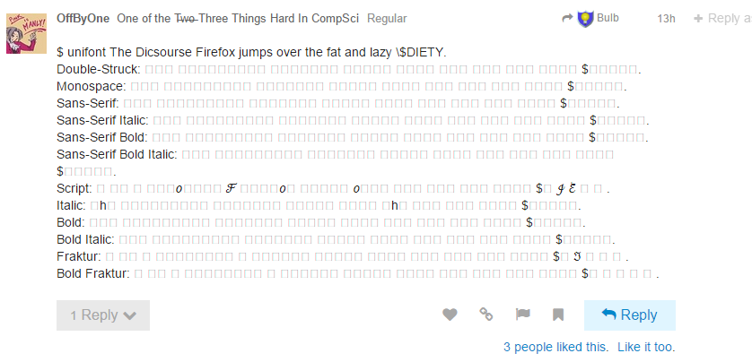
Hey guys, no fair, stuck on a frickin' XP machine for the next couple of weeks and I can't see the fun you're having.
Bonus points: surprisingly many websites are broken even with current Chrome on XP but they use Unicode characters for glyphs and shizzle.
-
Hey guys, no fair, stuck on a frickin' XP machine for the next couple of weeks and I can't see the fun you're having.
That's the beauty with text based things: it's your imagination that makes it awesome!
I'll screenshot tomorrow. It seems my sofa laptop is quite font deprived...
Like for "glyphs and shizzle"
-
how long until somebody wants to be able to use different colors in a single code point?
At last, I can have my rainbow font...
-
Um...what?
What are you smoking?
'Afro' emoticons combat lack of emoji diversity

Oju Africa has launched a set of "afro" emoticons, following a debate over the lack of diversity of emojis
I'm super willing for someone to explain to me why I'm an idiot for believing that article—the idea that Miley Cyrus and some douche from MTV could change Unicode has really been bothering me.
-
-
Bonus points: surprisingly many websites are broken even with current Chrome on XP but they use Unicode characters for glyphs and shizzle.
Uh, even on Win8, Chrome is really bad at displaying Unicode characters.
-
Monospace…
Sans-Serif…𝔚𝔗𝔉?
I understand bold (used for vectors), doublestruck, fraktur and script (used for some complex objects). I kind of understand italic (and bold italic); all variables are normally typeset in italic, so it allows distinguishing variables in text. But "MATHEMATICAL MONOSPACE"? Mathematicians name things with single letters; there is not much that would make monospace different on single letter and for technical stuff it is not sufficient as it only has latin letters and not punctuation. And "MATHEMATICAL SANS-SERIF"? At time when sans-serif is progressively more, like, the default?
-
[size=40]📶[/size]
-
-
Hey guys, no fair, stuck on a frickin' XP machine for the next couple of weeks and I can't see the fun you're having.
Here, have a screenshot:
-
At last, I can have my rainbow font...
Tread carefully... From there you're just one "Discourse is rainbows!" away from a Jeff-approved font.
Imagine the horror of a font where not only :( stands for "frowning", but with about 32K of lolcat glyphs.
-
-
I'm super willing for someone to explain to me why I'm an idiot for believing that article—the idea that Miley Cyrus and some douche from MTV could change Unicode has really been bothering me.
Thank you, that was the context I needed. I think that if we can keep the activism of that sort of person to this sort of thing it's a net win for sanity in the world.
-
I'm surprised it got 0 results.
-
-
what the.....?
what system are you on?
-
That's how mine looks too. Chrome on Win 8.1.
-
on FFS Chrome.....You are allowed to use more than one font to render the page.... and i know i have those glyphs in one of my fonts on this system! (i just scrolled up to fing the original on my win7 work system)
-
yeah, Chrome on Win 7.
-
Mine looks like @OffByOne here with Chrome on linux. I've made it a point to install a lot of fonts in order to see all the pretty glyphs we play with around here.
Hmm...it seems like chrome support has improved. I think that it's now displaying more than it used to. Or I just tested the wrong ranges.
-
I've made it a point to install a lot of fonts in order to see all the pretty glyphs we play with around here.
Same here, at least on this machine.
If anyone knows an easy way of looking up which font FF uses to render certain glyphs, I don't mind making a list of the fonts that are used in the above screenshot.
-
$ unifont The Dicsourse Firefox jumps over the fat and lazy $DEITY.
Double-Struck: 𝕋𝕙𝕖 𝔻𝕚𝕔𝕤𝕠𝕦𝕣𝕤𝕖 𝔽𝕚𝕣𝕖𝕗𝕠𝕩 𝕛𝕦𝕞𝕡𝕤 𝕠𝕧𝕖𝕣 𝕥𝕙𝕖 𝕗𝕒𝕥 𝕒𝕟𝕕 𝕝𝕒𝕫𝕪 $𝔻𝔼𝕀𝕋𝕐.
Monospace: 𝚃𝚑𝚎 𝙳𝚒𝚌𝚜𝚘𝚞𝚛𝚜𝚎 𝙵𝚒𝚛𝚎𝚏𝚘𝚡 𝚓𝚞𝚖𝚙𝚜 𝚘𝚟𝚎𝚛 𝚝𝚑𝚎 𝚏𝚊𝚝 𝚊𝚗𝚍 𝚕𝚊𝚣𝚢 $𝙳𝙴𝙸𝚃𝚈.
Sans-Serif: 𝖳𝗁𝖾 𝖣𝗂𝖼𝗌𝗈𝗎𝗋𝗌𝖾 𝖥𝗂𝗋𝖾𝖿𝗈𝗑 𝗃𝗎𝗆𝗉𝗌 𝗈𝗏𝖾𝗋 𝗍𝗁𝖾 𝖿𝖺𝗍 𝖺𝗇𝖽 𝗅𝖺𝗓𝗒 $𝖣𝖤𝖨𝖳𝖸.
Sans-Serif Italic: 𝘛𝘩𝘦 𝘋𝘪𝘤𝘴𝘰𝘶𝘳𝘴𝘦 𝘍𝘪𝘳𝘦𝘧𝘰𝘹 𝘫𝘶𝘮𝘱𝘴 𝘰𝘷𝘦𝘳 𝘵𝘩𝘦 𝘧𝘢𝘵 𝘢𝘯𝘥 𝘭𝘢𝘻𝘺 $𝘋𝘌𝘐𝘛𝘠.
Sans-Serif Bold: 𝗧𝗵𝗲 𝗗𝗶𝗰𝘀𝗼𝘂𝗿𝘀𝗲 𝗙𝗶𝗿𝗲𝗳𝗼𝘅 𝗷𝘂𝗺𝗽𝘀 𝗼𝘃𝗲𝗿 𝘁𝗵𝗲 𝗳𝗮𝘁 𝗮𝗻𝗱 𝗹𝗮𝘇𝘆 $𝗗𝗘𝗜𝗧𝗬.
Sans-Serif Bold Italic: 𝙏𝙝𝙚 𝘿𝙞𝙘𝙨𝙤𝙪𝙧𝙨𝙚 𝙁𝙞𝙧𝙚𝙛𝙤𝙭 𝙟𝙪𝙢𝙥𝙨 𝙤𝙫𝙚𝙧 𝙩𝙝𝙚 𝙛𝙖𝙩 𝙖𝙣𝙙 𝙡𝙖𝙯𝙮 $𝘿𝙀𝙄𝙏𝙔.
Script: 𝒯𝒽𝑒 𝒟𝒾𝒸𝓈ℴ𝓊𝓇𝓈𝑒 ℱ𝒾𝓇𝑒𝒻ℴ𝓍 𝒿𝓊𝓂𝓅𝓈 ℴ𝓋𝑒𝓇 𝓉𝒽𝑒 𝒻𝒶𝓉 𝒶𝓃𝒹 𝓁𝒶𝓏𝓎 $𝒟ℰℐ𝒯𝒴.
Italic: 𝑇h𝑒 𝐷𝑖𝑐𝑠𝑜𝑢𝑟𝑠𝑒 𝐹𝑖𝑟𝑒𝑓𝑜𝑥 𝑗𝑢𝑚𝑝𝑠 𝑜𝑣𝑒𝑟 𝑡h𝑒 𝑓𝑎𝑡 𝑎𝑛𝑑 𝑙𝑎𝑧𝑦 $𝐷𝐸𝐼𝑇𝑌.
Bold: 𝐓𝐡𝐞 𝐃𝐢𝐜𝐬𝐨𝐮𝐫𝐬𝐞 𝐅𝐢𝐫𝐞𝐟𝐨𝐱 𝐣𝐮𝐦𝐩𝐬 𝐨𝐯𝐞𝐫 𝐭𝐡𝐞 𝐟𝐚𝐭 𝐚𝐧𝐝 𝐥𝐚𝐳𝐲 $𝐃𝐄𝐈𝐓𝐘.
Bold Italic: 𝑻𝒉𝒆 𝑫𝒊𝒄𝒔𝒐𝒖𝒓𝒔𝒆 𝑭𝒊𝒓𝒆𝒇𝒐𝒙 𝒋𝒖𝒎𝒑𝒔 𝒐𝒗𝒆𝒓 𝒕𝒉𝒆 𝒇𝒂𝒕 𝒂𝒏𝒅 𝒍𝒂𝒛𝒚 $𝑫𝑬𝑰𝑻𝒀.
Fraktur: 𝔗𝔥𝔢 𝔇𝔦𝔠𝔰𝔬𝔲𝔯𝔰𝔢 𝔉𝔦𝔯𝔢𝔣𝔬𝔵 𝔧𝔲𝔪𝔭𝔰 𝔬𝔳𝔢𝔯 𝔱𝔥𝔢 𝔣𝔞𝔱 𝔞𝔫𝔡 𝔩𝔞𝔷𝔶 $𝔇𝔈ℑ𝔗𝔜.
Bold Fraktur: 𝕿𝖍𝖊 𝕯𝖎𝖈𝖘𝖔𝖚𝖗𝖘𝖊 𝕱𝖎𝖗𝖊𝖋𝖔𝖝 𝖏𝖚𝖒𝖕𝖘 𝖔𝖛𝖊𝖗 𝖙𝖍𝖊 𝖋𝖆𝖙 𝖆𝖓𝖉 𝖑𝖆𝖟𝖞 $𝕯𝕰𝕴𝕿𝖄.
FTFY. (Damn you! Spell your variables correctly!)But "MATHEMATICAL MONOSPACE"?
Mathematicians can often use a lot of symbols, and they're pathologically opposed to multi-character names, so they use a lot of fonts. (It makes it easier to spot a mathematician's code; it has single-letter names for things even where it makes no sense to do it…) Unicode being Unicode, they just imported the whole lot straight; I can sort of see why they did it (the differences in font encode semantic differences, unlike with normal typography) but the result still is nauseating.I would have liked Mathematical Monospace when I was doing my postgrad research…
-
Mathematicians can often use a lot of symbols
I did rather theoretical CS university and before that some extra physics at high school, so I am used to it. But everything I've seen did away with Latin (variables are always typeset italic), Greek, Hebrew and bold, doublestruck and script as font variants. Even fraktur was rare (it's difficult to distinguish in handwriting) though I've probably seen it a time or two. That's several hundred options already.
Besides in monospaced font some characters (usually those of 1 ex width, which is many of them) will look exactly like their proportional counterparts. So you can't tell them apart as single letters that mathematicians are so much set on.
-
FTFY. (Damn you! Spell your variables correctly!)
?
I worship low-fat milk, vegetables and modest food portions. Will you stay out of my religion please?
-
Eat
FTFYlessfewer beans.
-
I did rather theoretical CS university and before that some extra physics at high school, so I am used to it. But everything I've seen did away with Latin (variables are always typeset italic), Greek, Hebrew and bold, doublestruck and script as font variants.
A friend tried to use Japanese symbols in an exam, after the examiner of that course had claimed that it's ok to use any symbols as long as they make sense (this when questioned why he was switching symbols in the middle of an equation).
Long story short: the (one of the?) Japanese symbol(s) representing "small" is apparently not an acceptable replacement for ε.
 Regional indicator symbol - Wikipedia

