Feature suggestions for Discourse
-
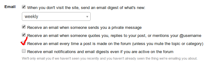
Bug: Preferences screen refers to mysterious "you" entity
WONTFIX: There was a discussion on Meta, and the consensus was to write the Preferences page in the 2nd person. It used to be inconsistent, but it is currently consistent in the 2nd person.
@Lorne_Kates said:
Solution: User preference "Automatically watch all threads"
This exists:
-
WONTFIX: There was a discussion on Meta, and the consensus was to write the Preferences page in the 2nd person. It used to be inconsistent, but it is currently consistent in the 2nd person.
"When you don't visit the site, send an email digest of what's new"
That makes no sense. If "you" refers to me, then does the Preferences page order me to send an email digest? Who do I send it to? Do I need to manually compose it?
You're not paying me enough for this, guys.
Request: post numbers in posts, because the scrollbar thing is inaccurate at best and utterly broken at worst.
-
First person would make the most sense, but it's so far down the priority list beneath all the frequent and painful usability issues (almost all of which are caused by fog-of-war post loading) that I don't particularly care.
-
This! Thunderbird flags all emails containing click-tracker links (actually, any links that go somewhere other than the domain the email came from, I think) as scams.
+10K !!!!
-
Request: post numbers in posts, because the scrollbar thing is inaccurate at best and utterly broken at worst.
Seconded!
-
Request: post numbers in posts, because the scrollbar thing is inaccurate at best and utterly broken at worst.
What's the use-case that isn't served by the Link/Share button? (You know, the one that's currently also duplicated when you click on the post time indicator.)
-
Request: post numbers in posts, because the scrollbar thing is inaccurate at best and utterly broken at worst.
@dkf said:What's the use-case that isn't served by the Link/Share button? (You know, the one that's currently also duplicated when you click on the post time indicator.)
Instant visual confirmation that you are where you think you are in the topic.
-
Not isn't exactly a bug
For the record, that was supposed to read "Note this isn't exactly a bug". My English isn't that borked.
-
No idea if it has been noted (and I don't want to start that issue again), but PageDown/PageUp works – just in the not so useful way of cutting off one/two lines by the header.
No true WTF, but this shouldn't happen, should it?
-
Escape to close the reply window … good idea?
It was a nice surprise to see I did not lose my text, but really? Why?
-
Instant visual confirmation that you are where you think you are in the topic.
Speaking of visual confirmation, let's discuss the idea of "affordances"…
In all standard UI, grey/faded = disabled NOT "unobtrusive" and: the faded actions completely vanish when viewed in contrast impaired environments like (in)direct sunlight, full spectrum lighting for SAD, ad nauseum…
-
affordances
See especially the definition of "hidden affordance" near the end of the article. This is Discourse's UI in a nutshell.
-
Wikipedia article on Affordance
Off topic: from the corner of my eye, and as I was closing the tab, I saw the Design Portal logo.I had to reopen the tab to make sure I didn't see a Portal turret and ASHPD.
How it looked on the page:
 Design Portal
Original size:
-
I knew turrets came in wooden table, but I've never seen a non-portalable-surface paint job on one.
-
This is a Mandrill config option that @apapadimoulis would have to set. Not a Discourse function.
Umm, so if this is to be seriously considered as a replacement forum and comments system for TDWTF, @apapadimoulis will need to fix that then. It's still happening, and we're being shoved over here more often for comments.
Or is TheDailyWTF now trying to lead by example in how not to run a website?
-
What's wrong with the click tracking?
It's a metric that helps show how the emails perform. This info is then used to improve performance and usability.
-
-
-
What's wrong with the click tracking?
It's third-party click tracking. It tells a third party what links I (would, if I hadn't opted-out of email) click on. I wouldn't mind (as much) if it were all kept within the family, so to speak, but I don't trust third party click trackers any farther than I can throw their data centers; it is a major privacy thing.
Plus, at least some email clients flag mails with third-party links as potential scams. Most people getting email from TDWTF probably understand what's going on, but do you really want to risk getting TDWTF blacklisted by email providers?
-
What's wrong with the click tracking?
Umm... This?

How is this any different to some of the Error'd entries where, for example, bank websites tell users to simply ignore the SSL errors? Run it that way long enough and anyone wanting to pull a scam with links to dodgy websites has it a lot easier - the users are already conditioned to ignore the warning signs.
-
I had a thought about the "likes" counter after reading this post: Instead of text below the button bar, why not have the count shown as a number next to the icon? The way it currently looks, with a line of text below the controls, looks more like a placeholder than anything.
I've made a diagram in the highly advanced technical diagramming tool called "Paint":
http://imgur.com/SY3DLox
-
the highly advanced technical diagramming tool called "Paint"

I had a thought about the "likes" counter after reading this post: Instead of text below the button bar, why not have the count shown as a number next to the icon? The way it currently looks, with a line of text below the controls, looks more like a placeholder than anything.
I've made a diagram in the highly advanced technical diagramming tool called "Paint":
http://imgur.com/SY3DLoxAs the one who wrote the post referenced by @hungrier: this won't work. Consider the following:
- It relies on an icon and colors to display a good deal of information (see @Lorne_Kates's Laws of Web UI Design). This is further aggravated by the fact that this icon (and all others on the same row) fade out when not in focus/hovered.
- There is no capability provided to see who else likes the post. Cutting out that functionality will be a no-go for some, and it is almost always a bad idea to remove functionality from a deployed software product.
- Your proposal doesn't take into account what the poster will see. Let's say that the heart was made visible to the poster. Then tell me what this means:
 Does that mean you like a post, or that someone else likes your post? You don't know without context, and if you have a single UI element that requires context to properly interpret, You're Doing It Wrong™. So displaying the heart to the poster is out, which means that the text must stay, so why not continue to display it to everyone for simplicity, and to adhere to @Lorne_Kates's Laws of Web UI Design (which are actually pretty good)?
In other words, keep the text detailing who likes the post. Then, either get rid of the "Like this too" and "Unlike this" text, or put it below the detail of who likes the post.
-
1. It relies on an icon and colors to display a good deal of information (see @Lorne_Kates's [Laws of Web UI Design][1]). This is further aggravated by the fact that this icon (and all others on the same row) fade out when not in focus/hovered.
The most important piece of information is how many people have liked the post, which is a number. It does rely on the colour for the other bit of information (whether you have liked the post) but I think it's clear and distinct enough (red = you have "liked" this, grey = you haven't) to be usable. I do agree about the fading controls; I think they shouldn't fade at all, but I think fading, like infinite scroll, is an integral part of The One True Religion of Discourse UI. @abarker said:2. There is no capability provided to see who else likes the post. Cutting out that functionality will be a no-go for some, and it is almost always a bad idea to remove functionality from a deployed software product.
That could be shown if you click on the number, although on mobile it may be a bit fiddly to hit the number and not the or
or  next to it.
@abarker said:3. Your proposal doesn't take into account what the poster will see. Let's say that the heart was made visible to the poster. Then tell me what this means:
Does that mean you like a post, or that someone else likes your post? You don't know without context, and if you have a single UI element that requires context to properly interpret, You're Doing It Wrong™. So displaying the heart to the poster is out, which means that the text must stay, so why not continue to display it to everyone for simplicity, and to adhere to @Lorne_Kates's [Laws of Web UI Design][1] (which are actually pretty good)?
In my mind, it would always be red vs grey for you have/haven't liked. If the user can like their own post, this would still apply, and if not, clicking the icon wouldn't do anything for the original poster.
-
The most important piece of information is how many people have liked the post, which is a number. It does rely on the colour for the other bit of information (whether you have liked the post) but I think it's clear and distinct enough (red = you have "liked" this, grey = you haven't) to be usable. I do agree about the fading controls; I think they shouldn't fade at all, but I think fading, like infinite scroll, is an integral part of The One True Religion of Discourse UI.
You are ignoring the Third Corollary to Lorne's Second Law ofWebUI design:
@Lorne_Kates said:10-20% of user's BIOLOGY can and will override your colors, or be incapable of recognizing those colors or contrasts. Excluding these users makes you an asshole.
Translation: basing whether or not you have liked the post on color excludes some colorblind people. Do you want to be that asshole?In my mind, it would always be red vs grey for you have/haven't liked. If the user can like their own post, this would still apply, and if not, clicking the icon wouldn't do anything for the original poster.
So now you have a UI element that works only in certain circumstances. To the users, it looks like they should be able to like their own post, but they can't, so You're Doing It Wrong™.
Remember, when it comes to UI, consistency is key.
-
Translation: basing whether or not you have liked the post on color excludes some colorblind people. Do you want to be that asshole?
I tried this at http://www.color-blindness.com/coblis-color-blindness-simulator/
Normal Color Vision: Seems distinguishable
Red-Blind/Protanopia: Seems distinguishable
Green-Blind/Deuteranopia: Seems distinguishable
Blue-Blind/Tritanopia: Seems distinguishable
Red-Weak/Protanomaly: Seems distinguishable
Green-Weak/Deuteranomaly: Seems distinguishable
Blue-Weak/Tritanomaly: Seems distinguishable
Monochromacy/Achromatopsia: Not distinguishable
Blue Cone Monochromacy: Seems distinguishable
-
What's being suggested is "Icon in some colour, vs icon in some shade of grey". Even ignoring Lorne's very good explanation of why this is a bad idea generally, for colourblindness you're not dealing with a single "all can / all can't" case. Sensibility to various colours varies even within specific types of colourblindness.
It doesn't matter what colour combinations you choose - either you will exclude some users, or you will produce something that looks like a sack of shit to people who aren't colourblind. All to remove a minimal amount of perfectly functional text.
Discourse's UI is shit enough as it is. Don't give Jeff a reason to make it worse.
-
I tried this at http://www.color-blindness.com/coblis-color-blindness-simulator/
I'll have to keep that site in mind. We're preparing an internal application for market, due to interest from other companies. As a result, we're going to be redesigning the UI. Having something like that site, while not perfect, would really be helpful.
-
How do you know who likes it?
-
Don't forget: on smaller and dimmer items its a lot harder to make out the difference. You could convince me that the current icons are light blue. Or green. Heck if I click on the bookmark icon I only notice it because I see it change in front of me.
And I wouldn't place a bed on the color of the damn progress thingy.