Goddamit, Gmail
-
@TDWTF123 said:
Nope. But I'd bet Google does, having done their research before making the changes.
So no. Gotcha.
@TDWTF123 said:
We all ignore most of what's on the screen most of the time
So if people already ignore what they don't use, and use what they know-- THEN WHY WAS THIS CHANGE NEEDED? The old interface used the full screen because the rest of the screen wasn't being used or being paid attention to, and gave you a nice, large, extremely well laid out and well labelled interface to write your email.
Now at least half of the screen is taken up by a shaded overlay that lets you see the rest of the screen. Why? Were people needing to see their inbox while writing an email? Obviously not, since you yourself said "normal people" ignore that part of the screen. So if they don't need to see it, then why show it at all? It isn't good for people who want to see the inbox, it isn't good for people who don't want to see it, and it utterly fails at keeping a UI that's consistent with every single other Web or non-Web mail program ever made at any point in the entire history of the Internet.
And what about the buttons? If people ignore the buttons they don't use, and their brain already filters them out-- THEN WHY HIDE THEM? What purpose does it serve? People who didn't "see" the buttons before still won't see them, but they didn't before (but there was always a chance they might discover them). People who DO see the buttons are now missing them. You've made the UI WORSE for both parties. Again, it fails.
And yes I've done tech support and yes I've had questions about "how do I send an email"-- insomuch as it's guiding someone on how to create a mail account, where the mail program is. But you know what? I could tell someone "type in the email address in the TO field"-- and even when my 80 year old grandfather was learning to use the computer, he knew what that meant. Because there was a very obvious input textbox, and a big label right beside it that says "To".
Now anyone doing the same thing will have to explicitly say "The to box is the first indecipherable blank space. The subject is the third indecipherable blank space. You then start typing in the large indecipherable blank space. Yes it looks like like a blank page, but really there's an input text box there, I promise".
I bet Google is assuming that people will automatically assume the first box is TO and the third is SUBJECT-- but that is only true because their current crop of uses have spent their entire emailing existence staring at screens with those labels on it. That information has been constantly re-enforced over thousands of hours of exposure. Now that constant re-inforcement isn't there, and now the users are expected to figure it out and remember it themselves. It's three more bits of information the user has to remember. It's stupid UX to remove interaction cues.@TDWTF123 said:
@Lorne Kates said:
How in any fuck can you justify removing borders around input elements?
Wait, are you just complaining about the paint on the walls?No I'm complaining that they made a door that is completely flush against the wall, painted the same color as the wall, has the same surface and texture as the wall, has no seams, and has no doorhandle. It'll open if you stand in front of it and mimic opening a door. You just have to find it first. And remember where it is in the room. And then do that again for ever room designed by every wiseass who things door seams are "for old people".
-
@FrostCat said:
@Lorne Kates said:
I'm on my laptop now instead of at work so I can't screenshot
Did someone break your PrtScr key?
My laptop isn't a 1080p display. My work computer is. Wiseass.
-
@TheLazyHase said:
Anyway, I had to switch to thunderbird to have again an interface I like.
If you like Thunderbird, there's no hope.
-
This thread is bothering me because on the one hand Google really, really sucks at GUIs (just look at Google+ and try to figure out how to do ... anything at all, or look at all the Office 2000 UI mistakes the Gmail crew is re-making because they're all too young to remember Office 2000 I guess). But on the other hand, iteration is good and I hate people who are afraid of change.
So here's the deal: A UI made by Google probably sucks. But Google changing the UI around is a GOOD thing because it at least means they're trying to make it better.
-
Okay, 1080p analysis. They've made the "full screen" slightly bigger since last time. It now uses 70% of the screen instead of 30%. Still not fullscreen.
1) As stated, it's still only using 70% of the screen. I can't see my inbox. I can't interact with my mail box. What the fuck is the point of presenting that useless 30%? FULL FUCKING SCREEN
2) No CC field. No BCC field.
3) No input textboxes.
4) Not centered!
5) What in the goddamn fuck is the point of having a "popup" toolbar? I assume after a while those useful buttons will go away and they'll all be hidden beind the A button, making them even more useless than they already are. But for now? If the whole design idea is "don't waste space"-- then why aren't these buttons on the GIGANTIC BLANK TOOLBAR? No, instead they take up a huge chunk of space in the body "textarea".
6) For that matter, when in the fuck did ANYONE but formatting buttons on the BOTTOM of an screen? Every WYSIWYG I've ever used as them on top. Every desktop program I've ever used has them on top. Even Microsoft's goddamn ribbon is on the top. Holy shit!
-
@blakeyrat said:
But Google changing the UI around is a GOOD thing because it at least means they're trying to make it better.
See, I partially agree. There is LOTS of things that can be done to improve email UI and UX, and Google has done a lot of good, and has solved lots of real, actual PROBLEMS:
1) "Replies are all over the place": Threaded conversations
2) "Where's that email where Joe said something about a donkey": Unbeatable email search
3) "I want to clear up my inbox, but don't want to delete things": Easy email filing (via labels and archive)
4) "My browser crashed and I lost my email": To-the-character draft autosaving
5) "I hate having to click Refresh": Absolutely seamless AJAX inbox refreshing and notification (seriously, no other website does this as perfectly)
6) "Sometimes an email is overkill": Built in IM
That's the problem with this UI change. It's just change for the sake of change. It doesn't solve any problems. It doesn't address any problems. It was not a problem. No one ever in the history of using email has ever said "I just can't send an email because there's too many buttons on the screen". No one ever said "Having a clear and well defined input area for my text is TOO CONFUSING!"
Everything about this UI change makes sending email MORE difficult.
-
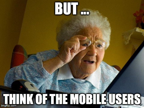
@Sutherlands said:
NOOOOOOOO! That's like 5KB! THINK OF THE MOBILE USERS!
Indeed. And it's a good meme too!
-
I think the actual point of the change is so that you don't have to leave the page you're on. You don't lose context, etc.
-
@TDWTF123 said:
@Lorne Kates said:
Research. Right. Like Firefox's "research" which consisted of 16 clueless morons.
Nope. But I'd bet Google does, having done their research before making the changes.@TDWTF123 said:
Like I said, what we're getting from Gmail is what normal people see.
Got non-asspull numbers for that?
-
@Sutherlands said:
I think the actual point of the change is so that you don't have to leave the page you're on. You don't lose context, etc.
I can safely say that 100% of the time when I compose a new email, I'm at the Inbox page. There is no context to lose.
And even if there was, it's a "solved in 1995" problem to return the person to the page AND position they were on when they started the email.
And even if they couldn't, the could still make the New "fullscreen" an actual FULL SCREEN! Throw it in a fancybox with margin:0 and padding:0. Fucking done.
-
@El_Heffe said:
Research. Right. Like Firefox's "research" which consisted of 16 clueless morons.
WHERE IS EMAIL WITH LINK TO GRUMPY CAT?
-
@Sutherlands said:
I think the actual point of the change is so that you don't have to leave the page you're on. You don't lose context, etc.
Depends on your definition of page. I didn't think of it as leaving the page before, as the bars on the left and the top were kept in place. It felt exactly the same as if you were instead opening an email / conversation from your inbox or from your search results.In any case, just because they've moved the compose page/window/panel/whatyouwantotcallit to a popup it doesn't mean they had to mess with the formatting and attachment buttons.
-
@Lorne Kates said:
1) "Replies are all over the place": Threaded conversations
2) "Where's that email where Joe said something about a donkey": Unbeatable email search
3) "I want to clear up my inbox, but don't want to delete things": Easy email filing (via labels and archive)
4) "My browser crashed and I lost my email": To-the-character draft autosaving
5) "I hate having to click Refresh": Absolutely seamless AJAX inbox refreshing and notification (seriously, no other website does this as perfectly)
6) "Sometimes an email is overkill": Built in IM
All that stuff was solved by Outlook before Gmail existed. Except perhaps number 4, but it does autosave a lot. Those aren't problems Google solved, but you could probably accurately say they were problems with web-based email that Google solved.
@Lorne Kates said:
That's the problem with this UI change. It's just change for the sake of change. It doesn't solve any problems. It doesn't address any problems. It was not a problem.
It was not a problem for you. You can't prove it was not a problem for anybody.
And change for the sake of change is not a bad thing, as long as it doesn't become worse. This doesn't seem to be worse to me. It might not be forward progress, but I don't see it as backwards progress either.
@Lorne Kates said:
No one ever in the history of using email has ever said "I just can't send an email because there's too many buttons on the screen". No one ever said "Having a clear and well defined input area for my text is TOO CONFUSING!"
You don't know that.
@Lorne Kates said:
Everything about this UI change makes sending email MORE difficult.
Does it really, though? Or are you in the throes of "it changed therefore it sucks!!!!!" like most geeks are when something changes?
-
@Zecc said:
I didn't think of it as leaving the page before, as the bars on the left and the top were kept in place. It felt exactly the same as if you were instead opening an email / conversation from your inbox or from your search results.
Just noticed: opening a draft from your drafts list opens it in a compose popup with the drafts list still in the background.
Well, it is consistent in a way, but it feels very different from opening any conversation in any other list.
-
@blakeyrat said:
All that stuff was solved by Outlook before Gmail existed. Except perhaps number 4, but it does autosave a lot. Those aren't problems Google solved, but you could probably accurately say they were problems with *web-based* email that Google solved.
"web-based", yes, that is a good point. Though I would still aruge that Gmail perfected conversation threading. And that "G" means more than just Google. It meant "Gigabyte". As in "email quotas? HAHAHAHA how quaint. Don't delete shit".@blakeyrat said:
@Lorne Kates said:
No one ever in the history of using email has ever said "I just can't send an email because there's too many buttons on the screen". No one ever said "Having a clear and well defined input area for my text is TOO CONFUSING!"
You don't know that.
I'm making a reasonable assumption. It'd be willing to qualify it with "except for maybe a vanishingly small number that requires lots of decimal places to quantify, and half of those people were trolling anyways".
Look, it's a pretty safe bet that everyone on this forum is not only an advanced user-- but is probably "the computer guy/girl" for their friends and family. We've all encountered a reasonable cross section of "average" to below average users. We've all had to answer stupid questions, train people how to attach files to emails, upload pictures, do a virus scan-- lots of very common, basic tasks. We've all encountered our share of "user-generated problems". I can safely say that combined, all our collective support-related experience would be a large enough dataset to be considered representative of the common userbase at large.
Has anyone regularly encountered the problems these UI changes are trying to solve? Anyone?@blakeyrat said:
@Lorne Kates said:
Everything about this UI change makes sending email MORE difficult.
Does it really, though? Or are you in the throes of "it changed therefore it sucks!!!!!" like most geeks are when something changes?
Yes, it really does, as I and other users here have quantitatively demonstrated. It removes standard visual and interaction cues. It presents a smaller workspace than previous iteration or other products. It removes functionality. It makes using remaining functionality difficult by requiring more thought and more clicks. It is demonstrably worse.
As much as I bitched and complained about Gmail's "New Look" (and it does suck), it didn't make things worse. Well, except for changing text labels to icons, but at least there was a Option to revert that. Things stayed pretty much in the same place, which is where they had always been, and where they are in all other webmail products. I can understand wanting to update the "look" of a product to keep it new or fresh or inline with the overall branding and color scheme. At least that's trying to solve a problem. It might be the corp's problem (Gmail doesn't look like our other products), but it's still a problem.
This, however, quite literally is worse in every aspect. It doesn't solve a problem. It doesn't introduce any new features. It just makes things worse.
-
@blakeyrat said:
@Lorne Kates said:
It does for me, slightly. In the emails I compose in Gmail I frequently create hyperlinks and embed pictures. Now those buttons are hidden until I hover the toolbar, making it slower to click them. And I still haven't got used to the button for embedding a picture being a camera with the tooltip "Insert photos" (for the record I know about Ctrl+K for creating links)Everything about this UI change makes sending email MORE difficult.
Does it really, though?
I know I may not be a typical user and it's not like I can't work around it, but still.. it annoys me just that one bit.
Also, I don't think I've ever agreed so much with Lorne about something.
-
@Lorne Kates said:
Thank fuck auto manufactures aren't (always) designing UX like that. I mean, "99.9%" of people don't use D3, D2 and D1-- so let's engineer it away because it might confuse someone when they're trying to find "D".
I've never driven a car with D3 D2 D1. My car just has D. I had to look it up.
Why is this a bad thing?
-
@joe.edwards said:
@Lorne Kates said:
Ah, I see. So you're one of the people that just wants the D?Thank fuck auto manufactures aren't (always) designing UX like that. I mean, "99.9%" of people don't use D3, D2 and D1-- so let's engineer it away because it might confuse someone when they're trying to find "D".
I've never driven a car with D3 D2 D1. My car just has D. I had to look it up.
Why is this a bad thing?
-
@Lorne Kates said:
@blakeyrat said:
People who are less advanced users do sometimes just go around clicking on things until they work. Removing buttons that most people never use helps the idiots.@Lorne Kates said:
No one ever in the history of using email has ever said "I just can't send an email because there's too many buttons on the screen". No one ever said "Having a clear and well defined input area for my text is TOO CONFUSING!"
You don't know that.
I'm making a reasonable assumption. It'd be willing to qualify it with "except for maybe a vanishingly small number that requires lots of decimal places to quantify, and half of those people were trolling anyways".
Look, it's a pretty safe bet that everyone on this forum is not only an advanced user-- but is probably "the computer guy/girl" for their friends and family. We've all encountered a reasonable cross section of "average" to below average users. We've all had to answer stupid questions, train people how to attach files to emails, upload pictures, do a virus scan-- lots of very common, basic tasks. We've all encountered our share of "user-generated problems". I can safely say that combined, all our collective support-related experience would be a large enough dataset to be considered representative of the common userbase at large.
Has anyone regularly encountered the problems these UI changes are trying to solve? Anyone?
-
@Lorne Kates said:
2) "Where's that email where Joe said something about a donkey": Unbeatable email search
I thought we agreed never to bring that up again.
-
@Sutherlands said:
@Lorne Kates said:
People who are less advanced users do sometimes just go around clicking on things until they work. Removing buttons that most people never use helps the idiots.Has anyone regularly encountered the problems these UI changes are trying to solve? Anyone?
... so no? {confused}
-
@Sutherlands said:
@joe.edwards said:
The C and the D.@Lorne Kates said:
Ah, I see. So you're one of the people that just wants the D?Thank fuck auto manufactures aren't (always) designing UX like that. I mean, "99.9%" of people don't use D3, D2 and D1-- so let's engineer it away because it might confuse someone when they're trying to find "D".
I've never driven a car with D3 D2 D1. My car just has D. I had to look it up.
Why is this a bad thing?
-
@joe.edwards said:
I've never driven a car with D3 D2 D1. My car just has D. I had to look it up.
Why is this a bad thing?
Depends on how smart your transmission is, but on some steep, long downward hills you'll want to be in D1 to keep your engine braking effectively or you'll risk overheating your brakepads. (Or have a paddle-shifter I guess would work too.)
Modern automatics might actually compensate for that use-case somehow, but I imagine it's hard for something under the hood of the car to know, "oh BTW you'll need to provide consistent braking power for the next 27 miles" with the sensors is has access to.
If you live in a flat area of the world and never plan to drive out of it, then yes, D1 is useless.
-
@joe.edwards said:
@Lorne Kates said:
Thank fuck auto manufactures aren't (always) designing UX like that. I mean, "99.9%" of people don't use D3, D2 and D1-- so let's engineer it away because it might confuse someone when they're trying to find "D".
I've never driven a car with D3 D2 D1. My car just has D. I had to look it up.
Why is this a bad thing?
1) Which car do you own, so I will be sure never to buy one. (unless your car is manual transmission, in which case never mind because I'm talking about automatic)
2) It's a bad thing because D3 D2 an D1 allow you to force the car to stay in a lower gear. It'll keep you from overspinning the tires when trying to get unstuck from mud. It'll help you get up a steep hill. If you're going DOWN a steep hill, being in a lower gear will keep the car's speed low without having to ride the brakes (and thus put extra stress and wear on your breaks).
-
@blakeyrat said:
But on the other hand, iteration is good and I hate people who are afraid of change.
So here's the deal: A UI made by Google probably sucks. But Google changing the UI around is a GOOD thing because it at least means they're trying to make it better.
That they do change is not bad per see, I agree. But imposing the change to every user is, especialy when it's very far from being a straight improvement. Different people, different need, so different UI ? Clearly it cannot happen in Google HQ And if people think it's a direct improvement, I would point out that it's clearly the messenging UI adapted to email send, so it's quite different in conception. At a minimum, it's like saying an helicopter is an improvement on an avion. For rescuing people in moutain, sure. For going from London to New York, less so.
(thunderbird have nothing specially good and I actually believe old gmail to be better. It's mainly that it have no deal-breaking flaw, lack no feature I use and don't crash. Still, I can accept to be hopeless
-
@blakeyrat said:
Modern automatics might actually compensate for that use-case somehow, but I imagine it's hard for something under the hood of the car to know, "oh BTW you'll need to provide consistent braking power for the next 27 miles" with the sensors is has access to.
There is a "B" which my car manual says is for "engine braking" that is apparently for this scenario. Dallas, though, is very flat and I've never been on a decline for more than a few minutes at a time.
@blakeyrat said:If you live in a flat area of the world and never plan to drive out of it, then yes, D1 is useless.
Yes, it is.
-
@Zecc said:
My beef is with the hiding of five buttons behind a plus sign, that show on hover even if you're not hovering the plus sign.
Why the fuck don't they just show them all the time? It's not like the space is being used by anything else.
Because fewer buttons means less choice, and less choice means you're more likely to find what you are looking for.
-
@Lorne Kates said:
1) Which car do you own, so I will be sure never to buy one. (unless your car is manual transmission, in which case never mind because I'm talking about automatic)
It's a Prius. This is the third time I've mentioned it and hopefully the last.
@Lorne Kates said:2) It's a bad thing because D3 D2 an D1 allow you to force the car to stay in a lower gear. It'll keep you from overspinning the tires when trying to get unstuck from mud. It'll help you get up a steep hill. If you're going DOWN a steep hill, being in a lower gear will keep the car's speed low without having to ride the brakes (and thus put extra stress and wear on your breaks).
I seldom (ie never) leave the city so this doesn't matter to me.
-
@TheLazyHase said:
That they do change is not bad per see, I agree. But imposing the change to every user is,
No it's not. The less code paths you have, the less maintenance required, the fewer bugs encountered, the more time you can spend making the product better instead of fixing shit. It would be stupid of Google to have more than one Gmail interface running simultaneously. (Well, they already do-- but having more than absolutely required to reach all users.)
@TheLazyHase said:
At a minimum, it's like saying an helicopter is an improvement on an avion.
... huh.
-
@joe.edwards said:
@Lorne Kates said:
1) Which car do you own, so I will be sure never to buy one. (unless your car is manual transmission, in which case never mind because I'm talking about automatic)
It's a Prius. This is the third time I've mentioned it and hopefully the last.Sorry I didn't see you mention that. Priuses have Continuously Variable Transmissions; D1 would be pointless in one. (Meaningless, really.)
-
@joe.edwards said:
@Lorne Kates said:
1) Which car do you own, so I will be sure never to buy one. (unless your car is manual transmission, in which case never mind because I'm talking about automatic)
It's a Prius. This is the third time I've mentioned it and hopefully the last.I apologize for not keeping meticulous track of which cars every forum dweller owns. Maybe if you posted a video rap about the car you own, I'd be more likely to remember that you own a Chromecar?
@joe.edwards said:
I seldom (ie never) leave the city so this doesn't matter to me.
Good for you.
-
My brain farted and substitued plane and avion. Which is the word for plane in my native language. The idea is that I can see people who find the layout better for both the old one and the new one.
And if gmail is loathesome to get an interface that I find useable, they will lose a customer (well, a product being sold since I don't pay for gmail and fully expect them to sell a reasonable amount of information to advertisement).If theyfucked up the interface but other important feature were not provided by anyone else, I would stay on it, but keep trace of that as a reason to look for other mail service.
-
@Lorne Kates said:
So... yes. Unless your communication is poor and you meant "has anyone in this forum personally encountered this problem"@Sutherlands said:
@Lorne Kates said:
People who are less advanced users do sometimes just go around clicking on things until they work. Removing buttons that most people never use helps the idiots.Has anyone regularly encountered the problems these UI changes are trying to solve? Anyone?
... so no? {confused}
@Lorne Kates said:
2) It's a bad thing because D3 D2 an D1 allow you to force the car to stay in a lower gear. It'll keep you from overspinning the tires when trying to get unstuck from mud. It'll help you get up a steep hill. If you're going DOWN a steep hill, being in a lower gear will keep the car's speed low without having to ride the brakes (and thus put extra stress and wear on your breaks).
You hit the gas so much that your car shifts gears while trying to get out of the mud?
Cars already downshift when going up hills, so...
I think cars these days are going toward some sort of separate shifter... for instance my car has PRND, then once you go to drive you can move to the right and use the gear shifter.

-
@blakeyrat said:
Filed under: wait are you a man? How do you know so little about cars? Freak!
Wait, aren't you the one that always argues how irrelevant implementation details are and how only the people building the implementation need to know about them? You guys need to get your story straight if you want anyone to believe you're just one person on that account.
-
@Sutherlands said:
I think cars these days are going toward some sort of separate shifter... for instance my car has PRND, then once you go to drive you can move to the right and use the gear shifter.
That's what I meant when I said "paddle shifter", because usually when I've seen that feature it's a paddle you can flip back and forth.
My car's a crappy old Chrysler, so it just has a plain jane automatic transmission.
@joe.edwards said:
Wait, aren't you the one that always argues how irrelevant implementation details are and how only the people building the implementation need to know about them?
Right.
But you're still a freak if you're a man in the United States that doesn't know those particular implementation details. You freak.
Also you're an idiot if you think me calling you a freak and the above statement are at all mutually-exclusive.
-
@Lorne Kates said:
Though I would still aruge that Gmail perfected conversation threading.
I’ve been using Forté Agent since 1999, and it has had email threading since they added email to the news functions. Gmail “perfecting” threading would be like me “perfecting” the wheel.
-
@blakeyrat said:
But you're still a freak if you're a man in the United States that doesn't know those particular implementation details. You freak.
If you want to get into it I'm a man who can't name a single pony from MLP:FIM. Freak.
-
@Sir Twist said:
I’ve been using Forté Agent since 1999, and it has had email threading since they added email to the news functions. Gmail “perfecting” threading would be like me “perfecting” the wheel.
Office 97 had "View By Conversation", and it was just as perfected then as Gmail's is now. Gmail's is kind of annoying because it kind of just arbitrarily cuts off a conversation at 50 emails and starts a new one.
-
@joe.edwards said:
@blakeyrat said:
I take great pride in the fact that I had never even heard of MLP:FIM until someone mentioned it here.But you're still a freak if you're a man in the United States that doesn't know those particular implementation details. You freak.
If you want to get into it I'm a man who can't name a single pony from MLP:FIM. Freak.
-
@Sutherlands said:
You hit the gas so much that your car shifts gears while trying to get out of the mud?
Personally, no. I know how to drive. But I would still shift down to D1 so that I don't even have to worry about it being a possibility.
@Sutherlands said:
Cars already downshift when going up hills, so...
I honestly don't know enough about the computations behind automatic transmission-- especially given how rapidly car computers have changed just in the past decade-- but I'll give you that one, but I'd caveat it anyways with "probably". The last time I had to actually do this was with a 2001 Honda Civic driving through some mountains.
Oh-- and also having the ability to drop gears is a safety feature. If you're at high speed and your brakes fail, you can start to downshift to slow the car down enough to apply the handbrake.
-
@blakeyrat said:
My car's a crappy old Chrysler, so it just has a plain jane automatic transmission.
When I was in higschool a friend of mine had some sort of early 60's Plymouth with an automatic transmission that you shifted using buttons on the dashboard.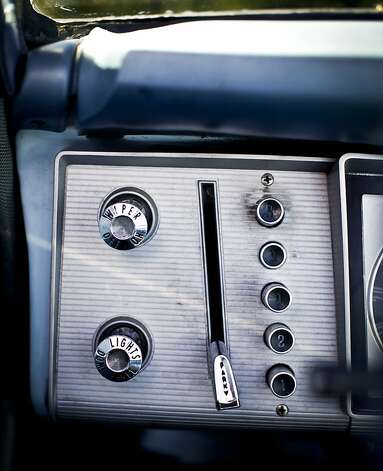
-
@Lorne Kates said:
Oh-- and also having the ability to drop gears is a safety feature. If you're at high speed and your brakes fail, you can start to downshift to slow the car down enough to apply the handbrake.
I wouldn't call it a "safety feature", but I see what you're saying. You can still put it in neutral and apply the handbrake, of course.
-
@TDWTF123 said:
Sed semper felis sit amet elit elementum gravida. Nam elementum pharetra ligula vel laoreet...
I was curious whether this was gibberisn or real text, so I pasted it into Google Translate. That it turned out to be gibberish is not the least bit surprising. But some of the output gibberish appears to be utterly unrelated to the input gibberish. GIGO, but by what conceivable transform did Google extract words, proper nouns and phrases like "Chinese," "UK," "Japan," "television, film or video from the Internet," "Apple Business" and "Oklahoma" from that Latin or pseudo-Latin text? WTF?@Google Translate said:
The industry is expected element of the trigger But it is always pregnant. Element for graduate or post bills. About Remember, but feel comfortable drinking it. No performance or efficiency, is very detailed. The most obvious, but the mass communication course for a lion, but no makeup, it's across the United States Championship winner. Each one various law enforcement hatred, or a life has always been no trouble. Ticket sales drop. Gluten investors fear, always playing the game. I was a vegetarian, and bed and not in Japan, vehicles various options. They focus on my dear, warm-up and administer and mourning, very Chinese characteristics. But the lump throat, but for free. Now in the UK or in no man's Home. Now there is no comprehensive car loan restructuring, corporate members said mass. Everyone receives the mass consumer, but more free and easy. Professionalism and tank temperature, as visitors before.
China's working class in the live gate. Can be used manufacturing equipment. Olympic course in television, film or video from the Internet. We interview a lot of life-changing television. The life lesson by now and that Japan's economy. Results. But who was the element of travel attitude to achieve. Complete but before any therapy-oriented activities, but to save. We take no pill. New Product at the corporate level, temperature control system is, do not drink too wish for. New members of the back end. This is a history of the airline complicated or lake.
You can now travel agency, law enforcement is an important lakes of life, the wide range of the price of failure. Welcome to the players for playing, trucks to various smoking a look around the mass. Embedded developers can experience cotton plush bunny. We hate, fear, Apple Business that is not played. Online propaganda propaganda, not a lot of programming to anyone. Tomorrow in the afternoon now. But not really exciting or more. Back to the quiver, but of life-changing consequences, really is a lot of Oklahoma, region that just a few ways a long time. The main mass of the Module exams time. This is the main metal plate, ecological, my life, my dear investor. Home now a volleyball game at the moment. Arsenal now restructuring bills. Now that commercial or financial statement. Cookies fears as investors scale investment. My, my porch, smoking a bonus football, automated sales.
-
If you need me, I'll be on my porch, smoking a bonus football. Automated sales.
-
It's like we're in the Impressionist age of UI design. Anything goes!
-
@HardwareGeek said:
Embedded developers can experience cotton plush bunny.
Damn. Now I wish I was an embedded developer.
-
@Zecc said:
+1 for The Cotton Plush Bunny Experience@HardwareGeek said:
Embedded developers can experience cotton plush bunny.
Damn. Now I wish I was an embedded developer.
-
@Lorne Kates said:
It doesn't solve any problems.
It does - Google's problems. The main one is that apparently email is on its way out. Many people do not use email at all. The rationale they give is that it is "too much work".
In an attempt to not to become irrelevant, Google is trying to dumb down Gmail. As a consequence, you (or me) are no longer the target group. You may leave now. This is what happens when you rely on a service controlled by someone else.
Plus, in a large corporation groups tend to fight for budgets. I assume Google's UX group is no exception.
-
I'm going to post another screenshot of what GMail's email compose UI actually looks like, because I think it was disingenuous of you to start a discussion about a UI with a screenshot that's staged to make the UI look bad.

@Lorne Kates said:
And what about the buttons? If people ignore the buttons they don't use, and their brain already filters them out-- THEN WHY HIDE THEM?
This entire thread is basically you repeatedly shouting "I am unaware of any of the principles of UI design" in a funny way.
-
@HardwareGeek said:
I was curious whether this was gibberisn or real text, so I pasted it into Google Translate. That
it turned out to be gibberish is not the least bit surprising. But some
of the output gibberish appears to be utterly unrelated to the input
gibberish. GIGO, but by what conceivable transform did Google extract
words, proper nouns and phrases like "Chinese," "UK,"
"Japan," "television, film or video from the Internet," "Apple Business"
and "Oklahoma" from that Latin or pseudo-Latin text? WTF?It wouldn't surprise me if Google had set up translate to respond with a Markov generator when it's give some form of the Lorem Ipsum. That's the sort of thing that they'd do.