MY FRIDAY LINK TOPIC is this a "thing?": First Time User Experiences
-
First Time User Experiences
I'm Krystal Higgins and this is my collection of new user experiences, good and bad, from a variety...
Some good insights; unfortunately, only seems to cover sites/apps that have already put some thought into this. (Presumably so there's something positive to point out like there wouldn't be with, say, TortoiseGit.)
-
I had a good time reading through a similar blog:
User Onboarding Teardowns | UserOnboard | User Onboarding

Want to see how popular web apps handle their signup experiences? Let's deconstruct their user onboarding flows one screen at a time.
This one focuses less on the UI, and more on how the sites get you to open up the account and actually get down to using the thing.
-
-
Some good insights; unfortunately, only seems to cover sites/apps that have already put some thought into this. (Presumably so there's something positive to point out like there wouldn't be with, say, TortoiseGit.)
TortoiseGit is not the worst offender out there. Not even close.

-
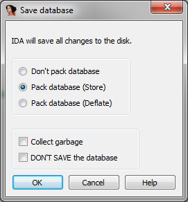
I nominate IDA for worst UX
Dialog that pops up if you try to quit without saving:
-
That's hideous
-
Quite apart from the whole point about why are many of those options even a thing, ever?… What does Help do in that dialog?
-
In al likelyhood, redirect you to the index page of the .hlp file?
-
But does it also delete the database? There's no way to know!
-
I have the free version of IDA, and I'd say that dialog is the best UX in the whole program.
-
TortoiseGit
My only problem with TortoiseGit was the fact that I had to use Git
Dialog that pops up if you try to quit without saving:
At least they had the foresight to plop the help button right there. Pro Tip: if you need to put a help button on your "Don't quit without saving" dialog box, your UI is
