What.ThedailyWTF.com is in sansserif font.
-
wouldn't it be far more appropriate for what.thedailywtf.com to be in a monospace font?
I propose adding the following to our local site css for extra WTF
body {
    font-family: monospace;
}
please? @pjh
-
Why?
It would make the code samples stand out less and look less pretty.
-
I think that instead of monospace, we find some way to randomly kern the existing font. Just a little bit. Just so it looks a little off.
-
because i'm a console junkie?
and also because of what my profile flavour text says?
-
Having the entire site in monospace is definitely a WTF, but sometimes we here need to sacrifice WTF-purity for other considerations.
EDIT: Besides, isn't the fact that we're still using Discourse despite an almost-unanimous dislike of it sufficient WTF?
-
For the ultimate WTF: Comic Sans.
-
-
There's a bookmarklet thingie for that:
javascript:(function(){var%20d=document,j=d.getElementById('__cornify_nodes'),k=null;var%20files=['http://cornify.com/js/cornify.js','http://cornify.com/js/cornify_run.js'];if(j){cornify_add();}else{k=d.createElement('div');k.id='__cornify_nodes';d.getElementsByTagName('body')[0].appendChild(k);for(var%20l=0;l<files.length;l++){j=d.createElement('script');j.src=files[l];k.appendChild(j);}}})();
-
BROWSER FAIL!
in chrome pasting that into the omni bar brings you to google search for that string, but using it as a bookmarklet, which should act the exact same way, works.
BROWSER FAIL!
-
There's a bookmarklet thingie for that:
Did you paste the wrong one? That one's about cornifying, not comic sans.
-
Click it a bunch of times and it adds Comic Sans to some of the text (not all though, seemingly randomly determined).
Pretty WTFy and discoursistent, really.
-
Intentional, it's a fix for some kind of XSS exploit or something:
-
of course...... stupid evil people ruining all the cool features for the rest of us.
-
It's so people don't paste in malicious javascript without knowing what they're doing. You have to manually type 'javascript:', which it's hard to get idiots to do.
-
Is that fullwidth unicode? I very much approve!
-
-
Can we get The Real WTF experience, namely monospace body text with Comic Sans code?
Filed under: Advanced WTF would involve Wingdings
-
Certainly possible.
Whether I can be bothered to do it before next April is another matter.. :)
-
Submit a PR and ship it! Please don't
Can we get The Real WTF experience, namely monospace body text with Comic Sans code?
We need to put together Comic Sans Mono.
-
+

That idea is rainbows.
-
Actually, if you really want to make people wonder what the hell you're
up tosmoking, use Fraktur. They'll beg you to switch to Comic Sans…
-
-
Use Comic Neue, because it's free.
 jsDelivr - A free, fast, and reliable CDN for JS and Open Source

Optimized for JS and ESM delivery from npm and GitHub. Works with all web formats. Serving more than 150 billion requests per month.
//cdn.jsdelivr.net/font-comicneue/1.1/ComicNeue-Angular-Bold-Oblique.eot
//cdn.jsdelivr.net/font-comicneue/1.1/ComicNeue-Angular-Bold-Oblique.ttf
-
For the ultimate WTF: Comic Sans.
And the front page, for good measure:
http://i.imgur.com/2I9nRGa.png
Hm... I dig that look.
-
A big selling point of Comic Sans is it drives away the kind of assholes who complain about people using Comic Sans.
So I'm 100% in favor of this switch.
You can use Papyrus for callouts.
-
It would make the code samples stand out less and look less pretty.
Easy. We'll just show the code samples in a variable width font.
-
In other news, the prettiest website any cryptography library ever had became awful and ugly and an eyesore a few weeks ago:
Compare to the old version:
-
Easy. We'll just show the code samples in a variable width font.
I suggest this. You know it makes sense!
-
-
with goals of modernizing the codebase
... and porting our website to the 90ties
-
90ties
The only possible way to pronounce that is "nine titties". I've had to flag your post as inappropriate.
-
I thought it was just a lot of ties.
-
-
Note to @PJH, there's an upcoming change that has been experimentally found to increase the number of flags.
https://slack-files.com/files-pub/T0250P76L-F02TV996L-b6f4e8/pasted_image_at_2014_11_05_23_00.png
Let's play Spot the Difference(s?)
In the interest of less posts, @loopback0 is the WinRAR.
Source: http://discourse.codinghorror.com/t/what-if-we-could-weaponize-empathy/2705/5
-
Let's play Spot the Difference(s?)
What's the glyph on the “Take Action” button supposed to represent?
-
It's a gavel, I guess. Striking down the hammer?
It basically causes the post to hit the 'auto-hide' threshold manually.
-
Is the only change adding "It's" to the titles for the flags?
-
-
It was reported on by Nick Bilton, NYT.
 What If We Could Weaponize Empathy?
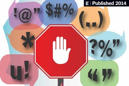
Facebook is apparently looking at this: each week eight million Facebook members use tools that allow users to report a harmful post or photo. (The tools can be used by clicking on the little upside-down arrow in the upper right corner of a post or the options button at the bottom of photos.) ...
-
@quote said:
It's impossible for moderators and administrators to read every single topic and post and see whether people are acting out.
It is?
-
@PJH Is Doing It Wrong™
-
It's impossible for moderators and administrators to read every single topic and post and see whether people are acting out.
It is?Oh, sure, that's possible on here or on Meta.
oh god too many pinned topics on EVOLVE forums. pls guys, ctrl-shift-n once in a while. think of the anons.
-
Good $DEITY!
Does that mean it's that time to check which integer width the Discodevs used for flag count column in the database?
Filed under: Checking stuff the FUN way
-
You actionized the options to "It's ..." instead of being descriptive.
-
It was reported on by Nick Bilton, NYT.
I think the biggest barrier is people actually clicking on it in the first place. And 28% change isn't very dramatic. Almost none of our flags are for those things to begin with.

