Halloween theme
-
Continuing the discussion from Looks like someone's been messing around behind the scenes.:
It turned into a dark theme and wasn't able to satisfy either myself or others.
I may try again tonight.
Don't really want to put too much effort into it, but preview of (an interrupted) 1/2 hrs work:
http://what.thedailywtf.com/?preview-style=5be7e22d-cb63-45b8-8b9f-6db96a579aee
As with all such preview URL's, manually changing the URL, moving back in history, or opening links in new tabs (or any other number of things) will locally revert the CSS being used.
Appending the
?preview-style=5be7e22d-cb63-45b8-8b9f-6db96a579aeeto an existing URL will swap the CSS back.
-
@accalia likes, but i think the text should be darker. it's hard to read white on yellowish orange.
-
Must we have seasonal themes?
-
Grinch.
-
-
-
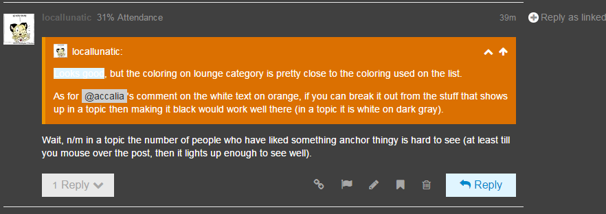
Looks good, but the coloring on lounge category is pretty close to the coloring used on the list.
As for @accalia's comment on the white text on orange, if you can break it out from the stuff that shows up in a topic then making it black would work well there (in a topic it is white on dark gray).
-
So what is the link to the default theme? Just an innocent, hypothetical question.

-
and it destroys the spider effect
and the top grey bar looked like it didn't fit in ...
-
How about........no?
-
So what is the link to the default theme? Just an innocent, hypothetical question.
http://what.thedailywtf.com/?preview-style=a836b201-4155-42f7-a83e-76694b5ba2ee
-
This would be an awesome troll on the sort of people who don't follow meta.
-
Looks good
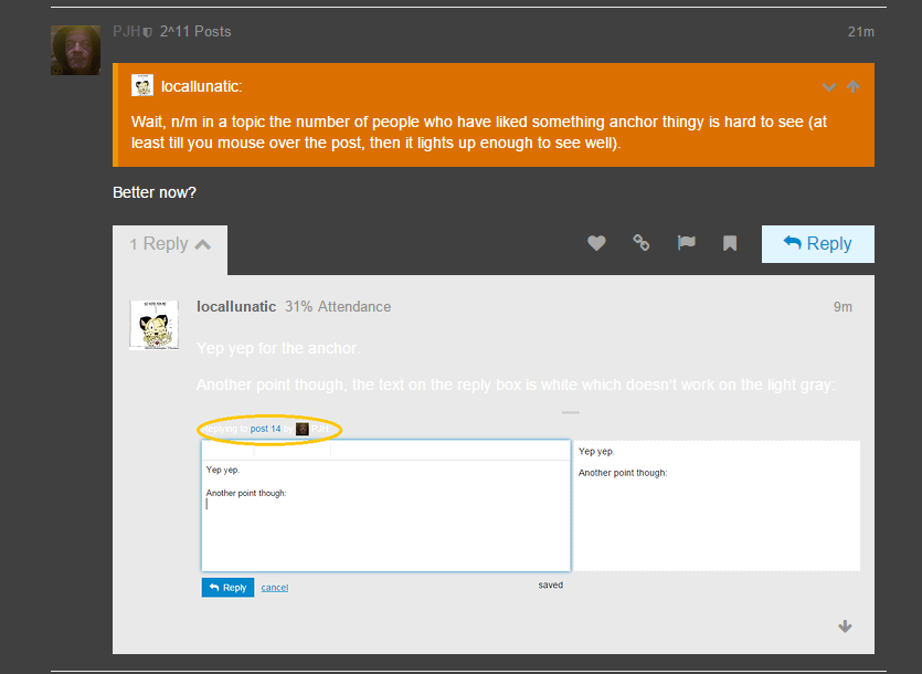
Wait, n/m in a topic the number of people who have liked something anchor thingy is hard to see (at least till you mouse over the post, then it lights up enough to see well).
-
Wait, n/m in a topic the number of people who have liked something anchor thingy is hard to see (at least till you mouse over the post, then it lights up enough to see well).
Better now?
-
That hurts my eyes. I dig the silly spider, but all of the fall colors just make it too busy. I also do not think we are the type of forum that does such things...
-
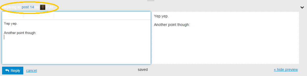
Yep yep for the anchor.
Another point though, the text on the reply box is white which doesn't work on the light gray:
-
these reply arrow up, arrow down buttons are hard to read and the drop downs from them are even harder to read.
-
http://what.thedailywtf.com/?preview-style=a836b201-4155-42f7-a83e-76694b5ba2ee
If you go forward with this, would we be able to access the forum through this link and bypass the Halloween CSS?
-
I'm contemplating having links to both in the header somewhere, defaulting to current white.
-
In addition quoted text highlighting screws with expanded quotes.
Unexpanded:

Expanded:
-
In addition quoted text highlighting screws with expanded quotes.
Try now, think I sorted that while you were constructing that post.
-
OK, is fixed. Also may explain why Halloween theming disappeared for a bit while I was working on it.
-
 Not to shit all over your idea and work, but that hurts my eyes.
Although the gray, if everything else were changed to suit, is rather pleasant. It is just all the orange and such that burns my retinas.
-
Also, when there is a new reply in a thread it fades in from a very light colour. It's kinda visual aneurysm and seizure inducing.
-
TRWTF are the opaque avatars.
-
Does Discourse even support PNGs? Mine was a JPG because I didn't think Discourse did PNG.
-
Yup.
-
-
-
Just checked and nice semi-transparent PNGs are well and supported, so there's really no excuse for you background-pickers.
-
Absolutely valid point, but it is made up on parts: Linux, Ruby, Rails, Javascript, your browser, etc. All of these support png. It stands to reason that Discourse would, unless they went out of their way to break it?
-
@Intercourse said:
Absolutely valid point, but it is made up on parts: Linux, Ruby, Rails, Javascript, your browser, etc. All of these support png. It stands to reason that Discourse would, unless they went out of their way to break it?
DISCOURSE. Is that not enough reason for you?
-
@created_just_to_disl said:
Just checked and nice semi-transparent PNGs are well and supported, so there's really no excuse for you background-pickers.
I
stolepilfered mine, and it was a jpg at the time I believe. ;)
-
I'll be damned, it does actually work, now that I have a PNGified version courtesy of the very, very lovely @royal_poet.
Discourse, of course, may get this wrong for a while.
-

too lazy for good AA but there you go.
-
?preview-style=5be7e22d-cb63-45b8-8b9f-6db96a579aee
I think it's good. The topic list is a little overwhelming, but that's not the main focus of the site, so whatever.
-
Also, when there is a new reply in a thread it fades in from a very light colour. It's kinda visual aneurysm and seizure inducing.
-
I read that decades ago. I should read it again; I probably still have a copy lying around somewhere. The collaboration between Niven and Pournelle is one of my favorite authors.
-
The collaboration between Niven and Pournelle is one of my favorite authors.
Yup. The California Voodoo Game series was pretty good, too.
-
I haven't read as many of the Niven-Barnes books as I have the Niven-Pournelle, but I've liked the ones I've read. I should give it a go someday when I have some spare time (bwahahahahacoughsputter* — sorry) for reading.
-
All your time are belong to us?
You have no chance to survive make your base?
-
-
I read that decades ago. I should read it again; I probably still have a copy lying around somewhere. The collaboration between Niven and Pournelle is one of my favorite authors.
Have you read their remake of Dante's Inferno?
-
Have you read their remake of Dante's Inferno?
http://blog.discourse.org/2014/08/introducing-discourse-1-0/

-
You joke, but Discourse would have probably fit in well with their modern sequel.
-
I've read the sequel, but not the original — remake, that is. I tried reading the original original once, decades ago, but it was a translation that tried to retain the meter and rhyme scheme of the Italian; it was pretty tedious, and I didn't make it very far.
Edit: I'm drawing a blank on the name of the sequel. I was browsing at the library one day, and picked it up. I think I was probably looking for something to read while waiting for a page to load over their WiFi.
-
-
Oh my god fucking burn in a fire with light orange background with white text.
-
Oh my god fucking burn in a fire with light orange background with white text.
Screenshot, for those of us not brave/foolhardy enough to try it out?
-
Click the link in the OP you pussy.
 Amazon.com