Progress bar weirdness
-
For some reason, my topic progress bar looks different than it was. It's half-transparent and has bluish font. Anyone else has that?
Windows 7, Opera 29.
-
Welcome to the latest episode of
What Colour Change Will The Discodevs Apply Today?
-
WONTFIX__AS_DESIGNED
https://meta.discourse.org/t/improving-color-and-contrast-on-topic-progress-widget/27076
-
Improving contrast? With this?
I don't necessarily hate the new colours, but if that's increasing contrast, well then, the next version will probably be white.
-
Posting that link makes you eligible for whoosh badge, but I won't flag because the linked topic has some funny moments. Especially this gem:
[quote=condinghorror]
Oh you are on mobile. Yeah that's different.
[/quote]
- Discourse in nutshell.
-
Maybe they'll make it fade out unless you hover. Invisible elements are the future of UI!
-
What, blue on blue not good enough for you? Getting all high and mighty, 'eh?
Honestly, it's contrasting against the page, but not against itself. Looks like a fucking neonlight.
-
-
Dunno why, but green seemed to draw the attention less.
-
Maybe they'll make it fade out unless you hover. Invisible elements are the future of UI!
I wouldn't mind.
-
Found this contrast checker thing that applies colour-blindness criteria; thought I'd try a couple of things.
Current colours:
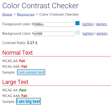
Not good.First fix attempt:
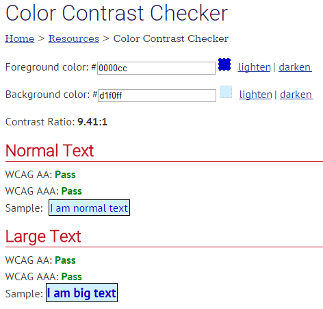
…well then, guess that's the ticket!Bonus trivia: it's the same checker Jeff used to justify the existing colours

-
Improving
!=
increasing
I think they didn't like the high contrast the green provided. Jeff chimed in saying 'hur dur, green means other things too so lets not confuse people', but like most things he says, it doesn't mean anything.
-
Dunno why, but green seemed to draw the attention less.
Not for me. I don't have eye problems, but the blue on blue seems like it has plenty of contrast to me.
-
Plus, the progress bar (background) does not have near enough contrast from white.
I just checked 1.19:1... 😭
-
I wouldn't mind.
$("*:not(:has(*))").hover(function() { $(this).css('opacity', '100'); }, function() { $(this).css('opacity', '0'); });

$("*:not(:has(*))").css('opacity', '0');
Glad to help.
-
It's pretty bad alright:

The problem with using shades of blue is the eye is actually not very sensitive to it; for every blue cone, there are about 15 green and 30(!) red cones. Then again, I played with some green tones, and still got shit contrast…
Basically, the text should be black.
-
Basically, the text should be black.
Which it would be, if not for Jeff.
Somehow I'm not surprised.
-
-
Improving color and contrast

I already knew that Jeff doesn't know what contrast or readability actually means but this ...
so it turning blue is supposed to improve contrast? Except for the avatars I'm seeing only white, black, grey & blue in discourse ... how can adding more blue improve contrast?
-
it's an improvement if you think there is too much contrast on a random unimportant element.
-
random
Indeed, it is.
@Magus said:unimportant element
It would not be so unimportant, were it less random.That said, the blue version does fit the overall design theme better than the green one.
-
That said, the blue version does fit the overall design theme better than the green one.
That's bad, because the overall design sucks.
-
I complained before that the contrast was bad, and it wasn't fixed. Everyone kept posting comparisons of progress bar background vs progress bar text and ignoring the comparisons between the page background and the progress bar background.
-
You must be a Jeff ApprovedTM user to be heard.
-
Jeff is a barrier to Discourse?
-
What's the question mark for?
-
?I don't know¿
-
-
I don't understand. You removed something and replaced it with the same thing.
-
There's a lot of overlap but it's still not the same thing.
-
Nothing Jeff does not agree with is approved by Jeff. All Jeff agrees with is approved by Jeff.
-
I don't understand. You removed something and replaced it with the same thing.
Welcome to Discourse!
-
-
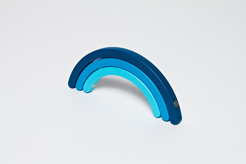
Everything about that image is 1. Indeed, exactly the theme as discourse, and 2. One of the most depressing color schemes I've ever seen. There are even rods of cold metal shoved through the rainbow, for extra depressing.
-
Blue and blue and blue and blue,
Blue and blue and blue.
I can sing a Discourse
500 SERVER ERROR
-
Blue blue blue blue blue blue blue
Blue blue blue blue blue
Blue blue blue blue blue blue blue
-
Blue! Goes the Discourse!
...or are we not singing Pop Goes the Weasel?