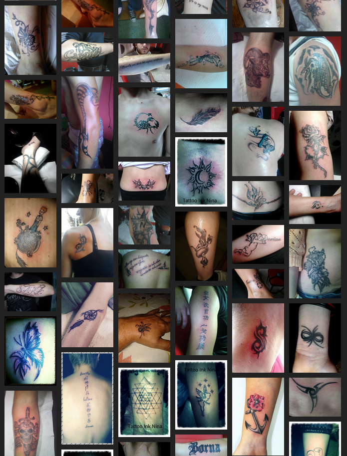
Is it just me or this layout sucks?
-
Asking for a friend. No, honestly - he likes this gallery layout because it's space efficient. Me, I just get a case of broken brains. It's confusing as all hell, IMHO:
Didn't know where to post, TBH. Move to appropriate category as desired.
-
It looks fairly bad, and several of those look very sore. I could imagine it working if it was a background, with a black rectangle on top with a title. It doesn't look great as a gallery.
-
several of those look very sore
I guess they were just made that very moment. Not sure, really, I'm just looking at the site here.
-
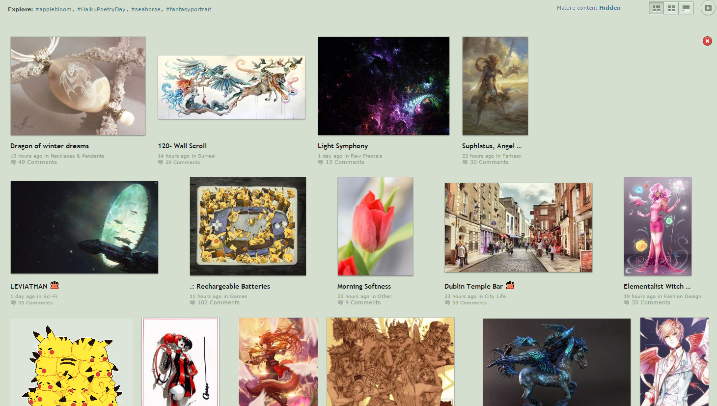
DeviantART does something similar, but they do it differently enough to not look broken and wrong:
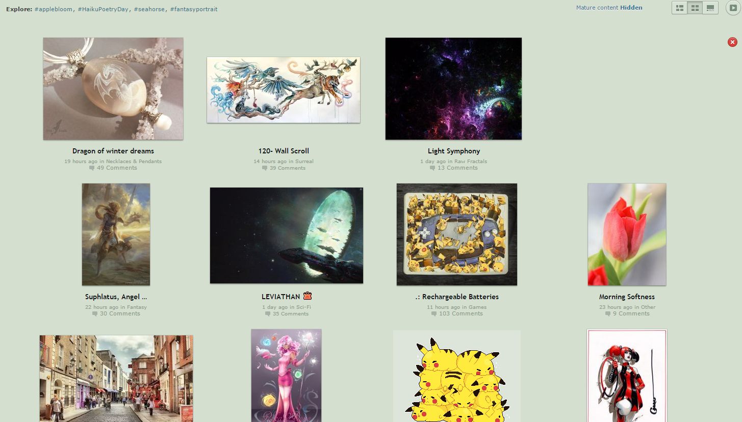
Plus they give you a one-click method to make it this:
Edit: I didn't put in any search terms, yet that first shot clearly includes an anime fox-girl… now I'm wondering how well DeviantART knows me…
-
he likes this gallery layout because it's space efficient
"Space efficient" is rarely a synonym for "good looking"
-
The style works for certain kinds of image galleries. Here it is a mix of different tattoos without connective theming or location, so the space efficiency works. But if you were to do a more organized display then I'd agree that this would be the wrong layout.
-
Deviantart doesn't really look better, but it's at least linear. That makes a huge difference. Besides, something in there reminds me of Chrono Cross.
It's hard to scan across something when there aren't lines.
-
I guess that my main problem is following it along. I'm going at this from a standpoint of not clicking each image, or using the lightbox thing, but rather looking at what's available to see if there's anything I like.
Since there are no rows I "get lost". As in, not literally, I can find my place, but it requires some effort. With distinct rows there is no effort, it just "feels natural".
-
The deviantart one looks bad because of the nasty background colour and the wildly varying clear space on the right, IMO
-
For a site dedicated to hosting art, they sure know how to make something look shit…
-
On the nice grid version, if they were to put squares around the images, or put each item in a tile, it would look considerably better. As it is, the shapes of the images will always cause it to look discordant.
-
but rather looking at what's available to see if there's anything I like.
Yeah, that is pretty much the only place where this kind of layout works I think. But that is cause I think of the use case being either it is "look at all the pretty pictures" or "does anything jump out at you" style of browsing rather than any kind of organized looking. So your getting lost is less of an issue, as you just want lots of input to see standouts.
-
I just instinctively don't look too close. I see raw, red skin, which 'jumps out at me' in a bad way, but the lack of lines means I don't look at the content closely.
-
For a site dedicated to hosting art, they sure know how to make something look shit…
Perhaps you need to approach it like a bridesmaid dress. The point is to make the bride look good, not the bridesmaid.
-
DeviantArt aligns to rows, not columns.
Which brings up an interesting point-- if you're in a culture that traditionally reads top-to-bottom, I wonder if you'd appreciate the column-aligned version or the row-aligned version more? Or maybe there's no correlation at all.
In any case, I agree with OP. It's too visually noisy. At the very least, it needs white space. (Or, dark-grey-space.)
For a site dedicated to hosting art, they sure know how to make something look shit…
90% of the art on it is shit, so. Why would that be surprising?
-
Edit: I didn't put in any search terms, yet that first shot clearly includes an anime fox-girl… now I'm wondering how well DeviantART knows me…

-
Edit: I didn't put in any search terms, yet that first shot clearly includes an anime fox-girl… now I'm wondering how well DeviantART knows me…
There's just a lot of anime fox-girls on DeviantArt.
Also nudity and semi-nudity.Weirdly, it's not blocked from the UAE.
-
Also nudity and semi-nudity.
well they do advertize that in their name, deviantArt.
they also call the works of art on the site Deviations.... or something like that. it's been a bit since i was there.
-
I believe this is referred to as a "masonry" layout.
Designers love it.
It's confusing as shit.
It's only going to become more common.
-
-
I don't get it.
Maybe if it was a "plumbing layout"...
-
-
-
I am not sure I am allowed to giggty my own lines.
so thanks for that ;)
-
-
Thanks, but it looks like we have the giggity thing down.
-
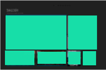
That layout would look a lot better if it was in compartments, like this project I'm starting work on:
-
It is subjective. There is a fair amount of research that shows "disorganized layout" actually provides non-cognitive recognition and tracking results than layouts where the elements are more structured (grids, panels, etc.).
Hopefully (but also doubtfully) the person who chose this did some comparative studies with members of the targeted demographic audience.
Personally I also had the "I see sore, red skin" reaction. I sent my nephew a copy (he is heavily into body art at both a personal and professional level) and had had a completely different reaction.
-
If it's good enough for tumblr archives...
-
-
It's confusing because there's not much contrast between images - all look the same from a distance. In a more diverse gallery this would look better.
