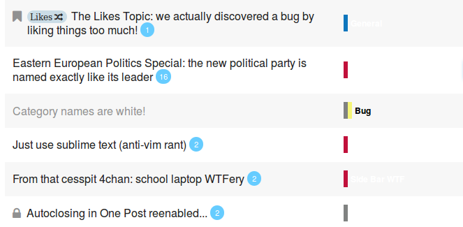
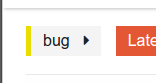
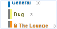
Categories look different
-
Category names are white
(Original title)
Continuing the discussion from [Docker] Upgrades:
##Version 1.2.0.beta5 -> 1.2.0.beta6
discourse (4cf4f1f)
Remote Version: (70daf6e)Last Updated: an hour ago 289 new commits
->
discourse is at the newest version (70daf6e).I think you can go into the category settings and set all the "foreground color"s to black to fix it?
Or just CSS !important it.
edit: yeah, category settings is correct because Bug is black
-
Or, you could copy the color into the foreground color box, that might be neato.
Or you could see if it's possible to restyle it to what it was before.
-

-
 "Fixed in latest lol"
-
Not here it isn't.
- Hard refresh? Nope
- Load in new tab? Nope.
- Open in a different browser? Nope.
I have no faith in trying a different computer.
-
This is pretty:
And @PJH ninjachanged the category text colours already.
-
-
Yup, repro:

Also tried hard refreshing and all that guff...
Well, at least the black text started working as I typed this... but why have the backgrounds gone missing?
-
Rebaking works for TL4s btw:
I made a text adjustment, it didn't stick, and rebaking made it appear!
-
-
-
.....
 ?
?The "fix" I can see is to add the
.barclass toli.has-drop. Updating Discourse causes white on white categories

yeah, its super annoying, something is not restarting right wrt docker manager
Okay so the fix is to restart the web server, neato
-
Great screenshot, 10/10, would download again if my cache got cleared.
-
Not something, that as an admin who can upgrade to latest, I can do.
-
This one's rather marvellous..
-
-
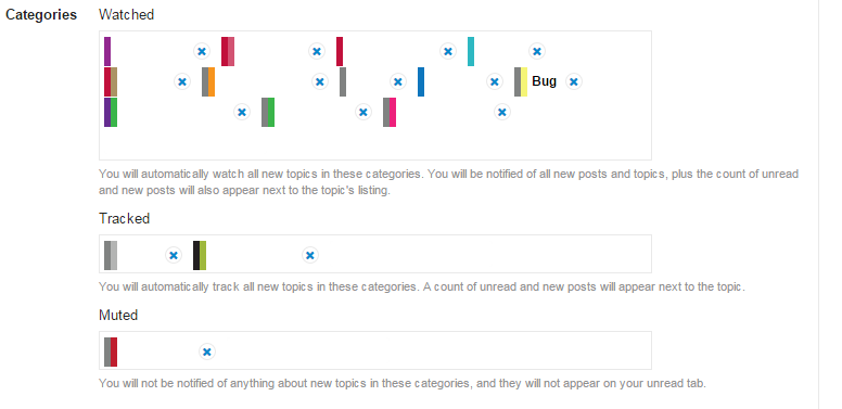
Ok - they're all now black.
Including the ones on black backgrounds.
Next bug? Oh - we found it.
One after that?
-
Or, you could copy the color into the foreground color box, that might be neato.
I'll get right on that...

-
Was thinking more like this:
Also the category dropdowns should be fixed now, I asked @sam to restart the server. Confirmed
Start the new bughunt!
-
not white anymore, I kicked a restart will get this sorted for next stable, btw see:
https://meta.discourse.org/t/the-end-of-clown-vomit-or-simplified-category-styles/24249/118?u=sam
the underlying markup is very flexible
you can safely enable onepost now.
-
Can I ask why Box wasn't made the default for upgrades so I didn't have to go changing everything when I didn't even realise it was an option?
-
We made the call that the new styling is a better default even for existing sites. I agree with it.
As much as I have issues with the bar being a bit disconnected from the words and prefer a little square I find it a vastly better default than the color party we had before. It is much more readable and stuff like the hamburger is a pleasure to open as opposed to a huge eye sore.
-
-
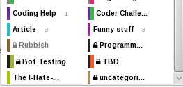
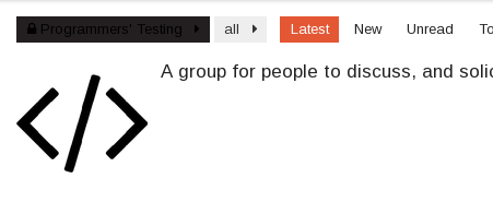
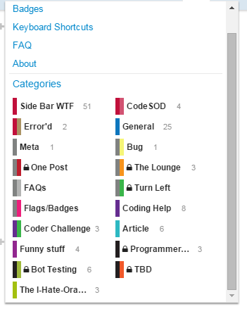
8 letters max?
That is clearly not the case, from "Coder Challe..."
No, we get to look at CSS overflow again.
Dots 4.0.
-
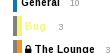
odd, I am seeing 4 more letters here in chrome on mac. what browser is this ? does your theme narrow the hamburger dropdown?
-
-
odd, I am seeing 4 more letters here in chrome on mac. what browser is this ? does your theme narrow the hamburger dropdown?
FF 34.0.5 under any of the CSS styles - that SS was taken from Discourse Default.
-
odd firefox on mac is not truncating that much. this is font related as far as I can tell.
-
If I switch to Widescreen + minimal, I get
'sadded to Programmer's Testing.So yeah, it's limited by angles, not characters.
-
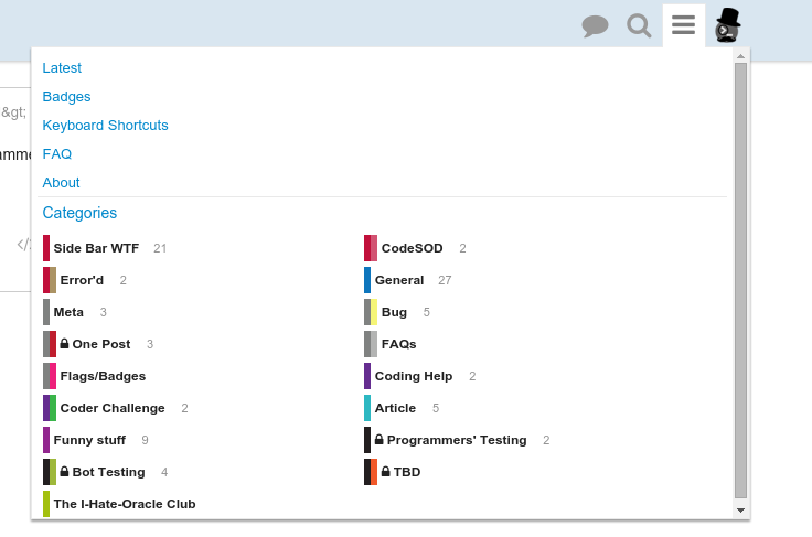
Chrome, Win7:
-
Changing to default zoom gets me 9 characters..

And zooming to 600% or something stupid gets me 10:

-
I think we can afford to make the hamburger drop down a tad wider, will play with that tomorrow.
-
As I said, Dots 4.0.
-
I think we can afford to make the hamburger drop down a tad wider, will play with that tomorrow.
I'll be doubling it.
-
-
@PJH having fun, or just Opera?
-
Live-refresh CSS.
I'm convinced it doesn't work every time, but it doesn't really need to.
-
@PJH having fun, or just Opera?
Ok - maybe doubling was taking it perhaps a bit too far...
-
480px any better? (was 640px)
-
Ok - maybe doubling was taking it perhaps a bit too far...
Eh, fits fine on my 1366x768. Should be fine IMHO, unless we're talking aestethics, but that's always debatable.
-
Kind of huge for my taste.
Could it be that it also makes the notification menu wider?For reasons of visual consistency, I'd make it as wide as the search menu.
-
-
For reasons of visual consistency, I'd make it as wide as the search menu.
Did you want the profile menu widening as well?

-
ah - just noticed - my CSS has hit the notifications menu as well... bugger...
-
Did you want the profile menu widening as well?
Well.. that would mean no (horizontal) resizing when clicking the buttons in turn...
Maybe we should make them match screen height as well? Bonus points if they cover the preview area
-
ah - just noticed - my CSS has hit the notifications menu as well... bugger...
Right - hopefully final for now..
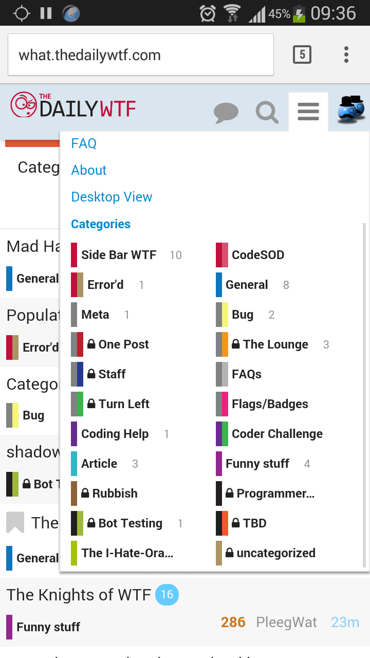
// Widen the hamburger menu so you can actually read the category names
// http://what.thedailywtf.com/t/category-names-are-white/7839/34?u=pjh
#site-map-dropdown {
    width: 540px;
}
-
Great job, I just performed a search for
=/=/=/=/. Thanks.
-
-
I was hitting = then / to open the hamburger followed by search because they're the same width.
-
I was hitting = then / to open the hamburger followed by search because they're the same width.
We had a similar bug back in May when hitting the help key combination made weird glyphs come up sometimes.