Incoming changes
-
Continuing the discussion from The nerdy jokes thread:
Hamburger menus?
and on that rather tenuous link:
An upcoming UI change whenever we next update....
Current:

-
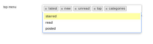
What's the lounge doing way over there?
-
It's something to do with the site CSS I have on here, which I copied over there a while back. My bug not DC's.
Not had a chance to find out what though.
-
They are allergic to "stuff." We aren't stopping until discourse is a wall of monochrome.
-
It's fine in my view (because I don't have access to as many categories), so I can't help to debug it:
-
To my non-colorblind eyes, the colors help me find stuff. Here's my menu on meta:
Awful. Here's my current TDWTF menu:
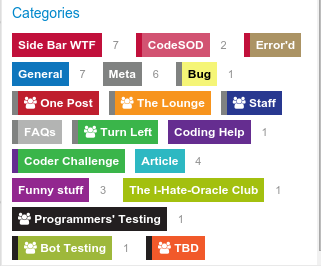
Much easier to read.
-
-
I couldn't discofind a topic where this was discussed, so I dropped a line in the Minimal Discourse topic:
https://meta.discourse.org/t/minimal-discourse/23288/133?u=boomzilla
-
I think they're going for elegance over ease of use. I don't mind too much really, but the block colours do seem a bit easier to scan.
-
It would be reasonable if the stupid lines were vertically aligned and not thrown like sticks all over the damn place.
-
Word.
-
Also, the problem I have with this sort of thing is that I have trouble figuring out if the color is on the left or the right of the thing it goes with.
-
Also, the problem I have with this sort of thing is that I have trouble figuring out if the color is on the left or the right of the thing it goes with.
And what about these numbers?
-
non-colorblind eyes
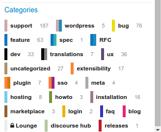
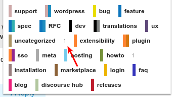
For my colorblind eyes/brain the small colored bars are difficult to distinguish. Is there a difference between wordpress and spec expect for the order? What master category does 'wordpress' belong to? Support, meta, installation, hub?
-
I suspect this post will be memory holed:
https://meta.discourse.org/t/minimal-discourse/23288/136?u=boomzilla
So...
-
That was Descartes wasn't it?
-
Is there a difference between wordpress and spec expect for the order? What master category does 'wordpress' belong to? Support, meta, installation, hub?
FYI...
Support -> Wordpress
Feature -> SpecThe main and subcategories are still run together like the are now, just harder to read.
-
-
The main and subcategories are still run together like the are now, just harder to read.
I guessed as much ... but just going from the colors it would have been a hard call.
-
It's Clown Barf you insensitive clod.
We're just Doing It Wrong. I know that was the original thing, but do try to keep up:
https://meta.discourse.org/t/the-end-of-clown-vomit-or-simplified-category-styles/24249
I only found that thanks to @cpradio, though @zogstrip clued me in too.
-
I couldn't discofind a topic where this was discussed, so I dropped a line in the Minimal Discourse topic:
From the topic linked to reply there:
but I was just wondering what the profile / avatar images would look like if they lost a little colour too
KILL ALL THE COLOURS!
Here's a Discourse 2.0 sneak preview

-
From the topic linked to reply there:
Grr....I haven't read the whole thing yet. I guess now that I've calmed down a little, I'll go back and see what else I should be complaining about.
-
I'm pretty sure it's not a Discodev, just some other racist who hates the coloureds, but you never know what terrible ideas Jeff will take to heart
-
Yeah. That's the problem. These trouble makers put a seed in his head and you never know WTF will sprout. I've told them it's a bad idea, so expect it to happen for 1.3.
-
I think I may be heading for a ban on meta today. I lasted over 24 hours though, so it's not bad going.
-
For those interested, I've thrown a challenge to our community's CSS gurus to see if they can provide a few CSS rules to get back the original rendering of category badges.
Expand the color bar behind the text using CSS

So I suck at CSS, but I decided to take on a challenge but I believe it to be impossible without altering the markup (or using JavaScript). So here are the rules (for whoever is interested) You can’t change the markup You can alter the CSS You can use JavaScript (if you must, but I’m really...
Especially since my question hasn't been answered yet.
https://meta.discourse.org/t/the-end-of-clown-vomit-or-simplified-category-styles/24249/13?u=cpradio
-
I've thrown a challenge to our community's CSS gurus to see if they can provide a few CSS rules to get back the original rendering of category badges.
I’m not a CSS expert either, but given the DOM structure I don’t think it will be possible.
I guess we’ll resort to fragile JavaScript hacks, then.$(".badge-wrapper .clear-badge").each(function () { this.style.color = "#FFF"; this.style.backgroundColor = this.previousSibling.style.backgroundColor; this.previousSibling.style.width = "0"; })
-
I’m not a CSS expert either, but given the DOM structure I don’t think it will be possible.
Someone actually did solve it with CSS only (at least it works in Chrome)
http://codepen.io/cpradio/pen/bNWmzW?editors=110
-
The current one is better, but the numbers should be inside the colored areas, otherwise they're just kind of hovering in a void signifying--- what?
-
Yeah. The number is topics in the category that are unread or new or some combination thereof.
-
Posted this in reply to @Boomzilla over there:
https://meta.discourse.org/t/the-end-of-clown-vomit-or-simplified-category-styles/24249/19?u=abarker
@boomzilla said:
This is a big step backwards for me, usability wise. I hate the current trend towards minimalism. The colors mean things!
The colors are just confusing now, and so small that it's more difficult to even see what they are. It's difficult to tell whether it's relating to the thing on the left or the right. The words seem smaller and more difficult to read.
When you take this with one of @codinghorror's initial complaints - that the categories are easy to confuse with buttons - it doesn't make sense to apply the minimal design in the menu. In the menu, categories are buttons. They should look like buttons.
-
When you take this with one of @codinghorror's initial complaints - that the categories are easy to confuse with buttons - it doesn't make sense to apply the minimal design in the menu. In the menu, categories are buttons. They should look like buttons.
Your mistake is assuming some kind of consistency of thought. Ironically, those guys are captivated by the opposite of, "Ooooo shiny!"
-
Your mistake is assuming some kind of consistency of thought. Ironically, those guys are captivated by the opposite of, "Ooooo shiny!"
I know, but we can always try presenting logic. Maybe one day it will work.
-
Maybe one day it will work.
It works to at least make me feel better for talking back. And seeing all the people who inevitably like the stuff we say, even if we're discovetoed.
-
discovetoed
-
At this point the tag colors are entirely pointless.
Color in UI is supposed to minimize visual processing time.
With the new look, I have to take more time to discern what the color even means, than if there was no color at all.
If you want to minimize color, at least run the colors below the tag.

-
But, but, but...
What about single-letter sub-categories?
-

 :P
:P
-
Someone actually did solve it with CSS only (at least it works in Chrome)
Oh hey, I didn't know that onebox. Off to exploit it.
-
And what about these numbers?
I would assume that's the number of topics in that category that are unread and/or have unread posts, but this is Discourse, so WhoTF knows.
... and @boomzilla said that 4h.
-
I think the hamburger categories would look better if they were aligned in columns. Even with the old style, it looks like a jumble.
In the new style, the color bars aren't tied to the labels very well. Sam's idea of muted or semi-transparent colors under the labels might work better. The skinny two-color category-subcategory bars look bad, and are too small to make any sense visually.
-
DiscoVeto noun When a DiscoDev ignores sensible advice and keeps developing Discourse.
Sure, but isn't that standard operating procedure?
-
Sure, but isn't that standard operating procedure?
Sure. Feel free to add that to the definition.

-
FYI
-
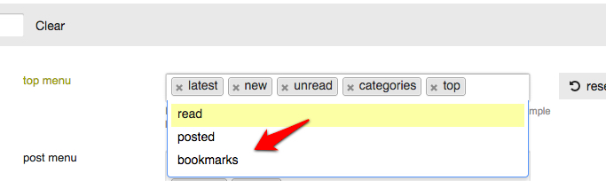
@PJH, do we have this yet? If so, could you add "bookmarks"?
-
@PJH, do we have this yet?
Nope - we have the rather useless alternative which didn't get removed with the rest of the functionality: