Front Page Comments Roadmap
-
So now some front page articles get the old comment system and some get Discourse. What's the plan for the future? I've now been trained to come to discourse to find all my TDWTF content. I spend a lot less time in my RSS reader, so I often miss the front page entirely. It's probably discrimination against me, in which case I suppose I'll start a tumblr for my anti-old-commment system crusade.
Paging: @apapadimoulis @mark_bowytz @Remy
-
Good question! We will update an answer with this after Friday (we're meeting to discuss).
The new site was going to have only Discourse comments, but obviously we didn't launch that yet.
Now we're considering something like, the first [s]page[/s] 50 or so comments be shown on the main site, and then like a "Continue Discussion..." thing. Thoughts?
-
If the automatic starter topic from @PaulaBean shows up with a link to the article, I'd be happy.
The hybrid comments idea sounds like a huge WTF. I'm in favor.
-
Now we're considering something like, the first page 50 or so comments be shown on the main site, and then like a "Continue Discussion..." thing. Thoughts?
User content on the front page. What could possibly go wrong?
-
User content on the front page
He just said the main site. I take that to mean the native commenting system, not DC here at what.thedwtf.com. But still behind a link.
-
I spend a lot less time in my RSS reader, so I often miss the front page entirely.
I haven't gone to the front page in over a week. I can't say that I miss it.
-
So, audio, Mr Burns, what else can we possibly exploit next?
-
Doesn't Discourse already have a built-in "widget" sort of thing to promote the best replies to a thread? Of course that won't help if the discussion immediately gets derailed by discoursistency.
-
So, audio, Mr Burns, what else can we possibly exploit next?
Has AutoCornify been done yet?
Filed under: No Blakeyrat, I mean “auto” as in “automatic”
-
-
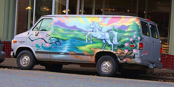
That's one scary van.
-
I used to work on the same block where this bitchin' Star Wars van was parked:
http://www.galacticbinder.com/images/StarWarsVehicles/star-wars-force-van.jpg
-
I bet that's @remy's ride.
-
What happened to the colors? Why doesn't request desktop return a desktop view? That stacked layout isn't really your new design for non mobile is it?
You're not taking design advice from Jeff I hope?
-
Most people hated the colors, so we toned them down a bit.
There is no desktop/mobile view... the site just "scales down" using responsive CSS and whatnot. It'll look the same if you make your browser really small.
-
There is no desktop/mobile view... the site just "scales down" using responsive CSS and whatnot. It'll look the same if you make your browser really small.
Responsive Design FTW. Being able to write one webpage that looks sane regardless of browser window sizing is what I've wanted for ages. It's only now that it's caught on with the rise of mobile, though...
-
I hated the original colors, but that's a loooot of grey around the first two content boxes. The whole screen on mobile is literally grey outline with black text. It's jarring.
-
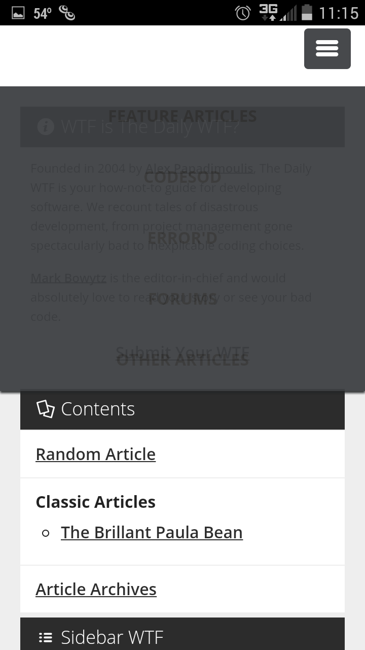
That doesn't seem right... can you take a screenshot?
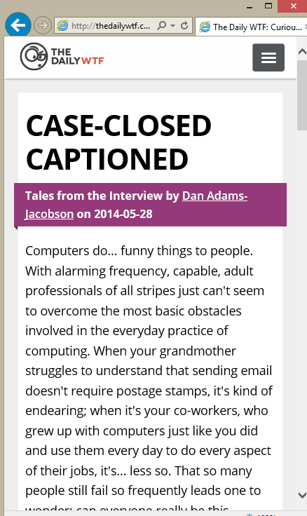
This is what the article view is supposed to look like with a small widft.
-
-
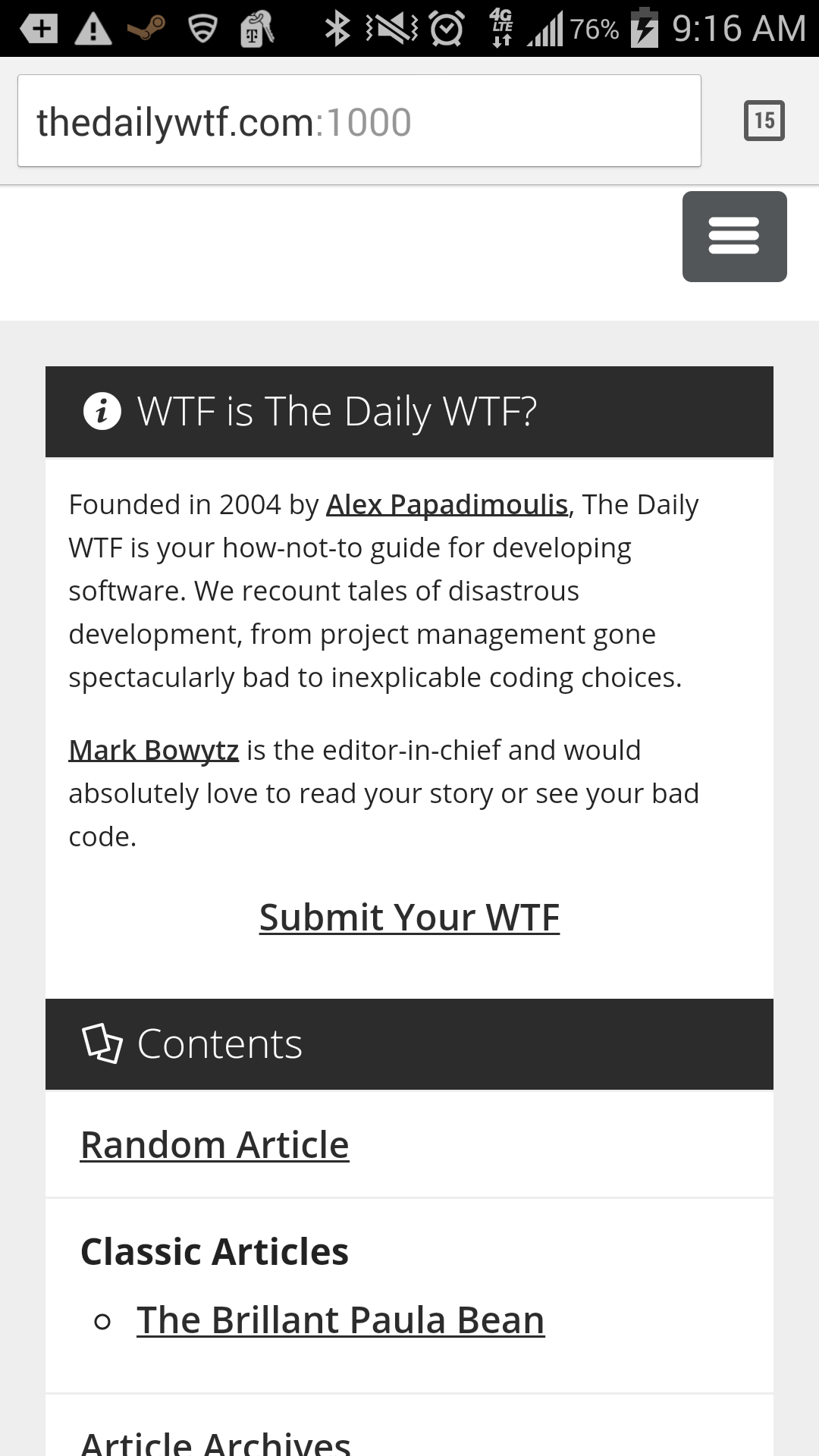
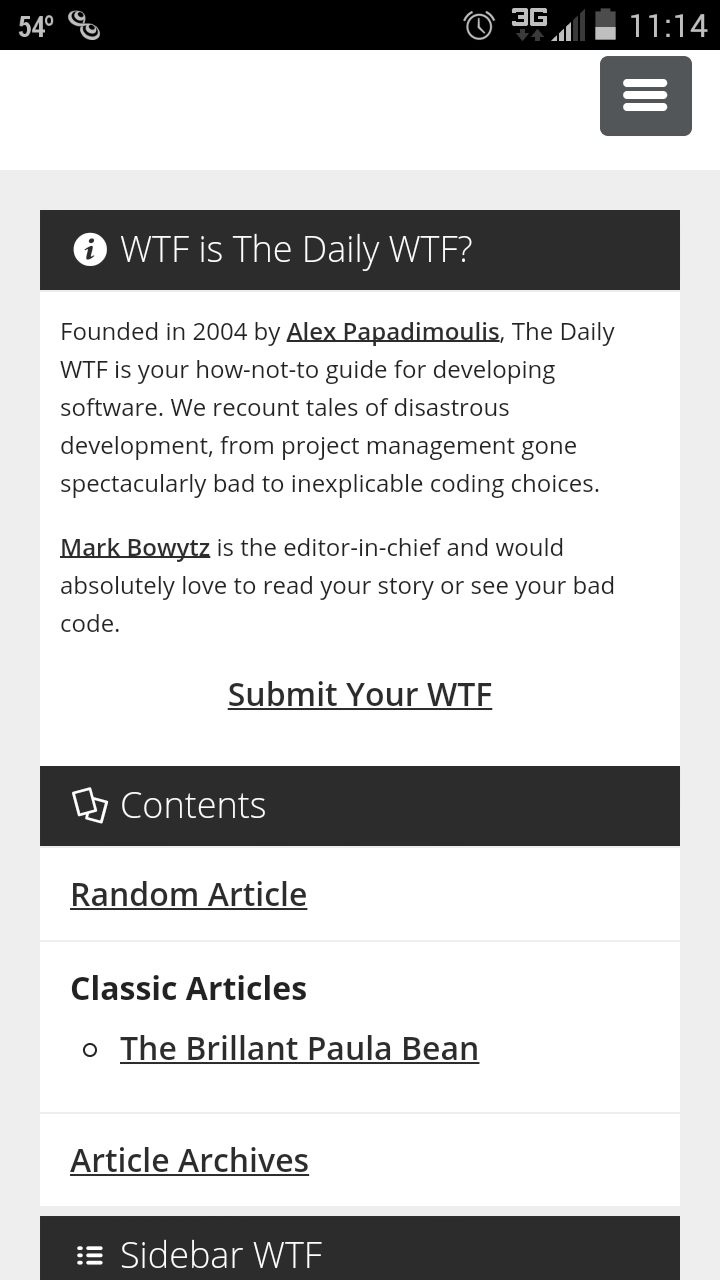
Chrome on Android, here's how that page loads, and how it looks when you click the menu.
Damn you ninja posting @Matches
-
ah , so the sizing is OK , but clearly the menu hover color is broken.
The sidebar is displayed first, does that seem OK? I do know that we can hide certain elements if the screen width is < a certain width.
-
I'd think you'd want the articles first and have the sidebar at the end and/or the features of the sidebar (like random article or archives) in that menu at the top.
Just my opinion, though.
-
Good question! We will update an answer with this after Friday [Sep 12] (we're meeting to discuss).
BUMP!
-
Always articles first in this type of layout. .. But this type of layout isn't very beneficial for desktop that has a lot of space, or mobile that has very little (it is better for mobile than desktop though. )
-
UPDAT!
I think we are almost ready to go. I just updated all the stuffs in GitHub issue tracker, with hopefully all the remaining things before 1.0 launch.
Regardign the front page comments, this is our idea now...
On Article Page...
•Display Featured comments (as is)
•Read Comments(to comments page)
•View Entire Discussion (to discourse)On Comments Page...
•For Non-discourse-articles, display paged as per normal
•For Discourse Articles, display first 50 comments and have link at bottom (View Entire Discussion)Thoughts?
-
My real question is still about Discourse vs Non-discourse articles. Are these going all-discourse any time soon?
-
New site will be All Discourse, but we will bring in first 50 posts to the front page.
-
Why is there an envelope next to the timestamp?!
-
Hovering says he authored that via email.
-
That actually seems like a handy indicator actually. As emailed posts don't have edits in them, so it could clear up things caused by an edit on whatever they were replying to.
EDIT: has that always worked that way or is it a new indicator, hmm.
-
has that always worked that way or is it a new indicator, hmm
Definitely new! I reply by email quite a bit, and this is first time I saw that. I dig it, because sometimes the weird outlook html doesn't get cleaned properly.