Hamburger Spacing Inconsistent
-
My hamburger has a bigger gap at the bottom than the top on Chrome 35 and IE11 on Windows 7.
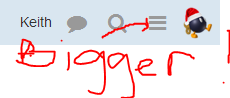
Expected: My hamburger should be evenly spaced.
-
.d-header .icons [class^="fa fa-"] { font-size: 21px; }Dump that into your custom CSS plugin.
Filed under: [Workaround until we get real styles to make the forums look better.](#tag2), [The stock stylesheet for Discourse seems pretty sketchy.](#tag2), [Assuming this is a stock stylesheet.](#tag2)
-
-
Assuming not sarcasm
Stylish or Stylebot or whatever your browser offers as a plugin to do custom CSS.
-
-
=D

-
I thought it just meant there was a layer of blue sauce on the bottom of the hamburger, padding it out some. Looks delicious.
-
Stylish or Stylebot or whatever your browser offers as a plugin to do custom CSS.
yadda yadda, Opera before 15, yadda yadda, best browser ever, yadda yadda, custom CSS being a core feature, yadda, you damn maniacs you ruined it all.
Filed under: Obligatory "bitter about Opera fucking up" post
-
I thought it just meant there was a layer of blue sauce on the bottom of the hamburger, padding it out some. Looks delicious.
yadda yadda, Opera before 15, yadda yadda, best browser ever, yadda yadda, custom CSS being a core feature, yadda, you damn maniacs you ruined it all.
How would you rate your jealousy regarding my perfectly spaced hamburger on a scale of 0 (not at all jealous) to 10 (green with envy)?
Filed under: Values under 8 will be discarded as anomalous.
-
I relish your icon.
-
I'm blue with envy. I hate green. Didn't used to, but people keep forcing me to design things in green. Do you know how hard it is to find a good green pallete where half of colors don't look like shit or have terrible contrast?
Harder than dealing with unequally spaced hamburgers, that's how hard it is.
Also, WTF is it with font scaling anyway? I use glyphicon's "record" icon in one place, and if you don't set it's size to one of like 3 very specific heights it looks like a potato instead of a circle.
-
Green is awesome.
-
Harder than dealing with unequally spaced hamburgers, that's how hard it is.
Dealing with unequally spaced hamburgers is the hardest thing I can imagine, so I won't pretend to understand your pain.
-
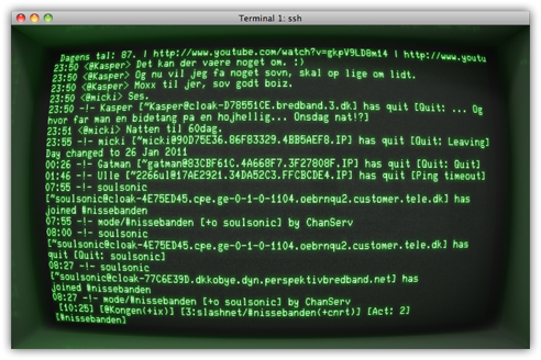
It's a terminal. No one asks you to do animated gradients in it.
Also, fuck, now I have to find a Linux terminal emulator that can do that CRT effect.
-
Also, fuck, now I have to find a Linux terminal emulator that can do that CRT effect.
Do share if you succeed!
-
XScreensaver contains one!
http://linux.die.net/man/6/phosphor
-
Found this:
 GitHub - Swordfish90/cool-retro-term: A good looking terminal emulator which mimics the old cathode display...
A good looking terminal emulator which mimics the old cathode display... - Swordfish90/cool-retro-term
But it seems to be a Konsole plugin and also doesn't looks like it doesn't like to run under anything but KDE.
-
How would you rate your jealousy regarding my perfectly spaced hamburger on a scale of 0 (not at all jealous) to 10 (green with envy)?
0, I prefer my hamburgers to have some extra stuff under the patty.
-
0, I prefer my hamburgers to have some extra stuff under the patty.
I'm going to treat that as a euphemism and realign my opinion of you appropriately.
-
No, that would be if I had said I like my hot dogs sweaty. Or like my taco to pop.
-
No, that would be if I had said I like my hot dogs sweaty. Or like my taco to pop.
Well, I'm just thankful that there's been no mention of mayo.
Filed under: Until now.
-
font-size: 19px:

font-size: 22px:

I thought font rendering technologies were advanced enough to prevent those things from happening. Is this what they call "hinting"?
-
21 is divisible by 3 and 7. There are 3 parts to the hamburger. 7 if you count the blue parts.
-
This is the clue that these are really Stargate rings and not hamburgers.
-
I thought font rendering technologies were advanced enough
Cleartype on windows only has the tricky high-res AA in the horizontal axis, sadly.
-
Personally, I'd just prefer to just find a CRT monitor and use that.
-
Personally, I'd just prefer to just find a CRT monitor and use that.
The last generation of CRTs are basically flat, so you're have to go find a really old one.
-
I am nothing if not resourceful. And in the habit of making frequent trips to Hong Kong
Filed under: 8-track player, anyone?
-
I thought font rendering technologies were advanced enough to prevent those things from happening. Is this what they call "hinting"?
Hinting means slightly deforming the character so its shape line up with the display pixels. If it has something to do with this uneven rendering, it’s probably the cause, not the solution.