Goddamit, Gmail
-
In their continuing quest to make email less usable, here's Gmail's "improved" version of their compose screen. It's cropped, but I'll note that rather than having a nice, big, distraction free canvas to write the email on-- you get something squished down to about 30% of your screen real-estate, surrounded by grey-overlayed controls that are unusable so WHAT THE FUCK IS THE POINT OF SHOWING THEM RATHER THAN FULL SCREEN?
And yes, 30% of the screen is their definition of "full screen".
Anyways, gaze upon the shit and try to answer the questions that follow:

1) In the above example, you see an email address. Assuming for a second that "stupid@example.com" is a valid Gmail address, is this email FROM, TO, CC, or BCC to stupid@example.com
2) Where would you enter the subject line of this email?
3) Is the massive blank space in the middle the text entry box, or a rendering error?
3a) BONUS: As you write your reply, please look left, right, up and down from the position of the cursor. Do you see borders around the text area?
4) Using only the UX cues on the screen, how do you CC or BCC someone on this email?
5) Using only the UX cues on the screen, what is the difference between the paperclip and the plus sign?
6) Please survey a subset of everyone you know personally, come across in your daily life, or are in fact a perfect stranger. Show them this screen shot side-by-side with their familiar email compose screen. Ask them which one they prefer. If anyone answers "the new Gmail Compose Experince", assume they work for the Gmail team and murder them. (This isn't a question. This is a command. I'm sorry I numbered it. I know that's confusing)
Godfuckingdamnit, Gmail. I didn't want to spend my afternoon writing ANOTHER Stylish userstyle to fix your fucking stupid UI decision to fuck up things that have been working and stable since the inception of webmail interfaces! Seriously, I will pay loads of real, fake money for someone to put together a screenshot compilation of webmail interfaces from around 1995 to present day, just to show that thinks HAVE NOT FUCKING CHANGED because that is what ever single user is used to.
-
There is some guy at Google HQ jerking himself off as he watches his Pure Minimalist Design. He has rockstar status and people look at him with envy as he gets on the GoogleBus every morning. I hope this gives you solace.
-
And if anyone from Gmail tries to defend this shitpile as being "lightweight with mobile users in mind" or anything else, you have my official blessing to deliver non-stop dick/cunt punches until you damage their DNA enough that they CHANGE GENDER, and then CONTINUE to cunt/dick punch them until they are infertile two ways.
I refuse to Ben L. you with the screen shot, but please click through:
Ignoring the outeroverlay, going from the div that contains the compose elements, down to the actual body textarea, you traverse through the nest of:
11 divs
2 tables
1 form
1 iframe (embedded in the form!)In fact, just inside that top-level div, there are 367 child elements. To give you an idea, in CS's post composition window, the BODY element only has 260 children.
Gmail you retarded monkeyfuckers. You force this new interface ostensibly to be faster and more responsive (AJAX OOOOO), and you expect to realize that with 367 child elements, including TWO MOTHERFUCKING NESTED TABLES!
I mean, it's great that you use three letter acronyms for ID and class for all those elements. Really saving bandwidth on those bytes-- oh, wait-- THREE HUNDRED AND SIXTY SEVEN DOM ELEMENTS!
Fuck. Fuck. Motherfucker-fucker.
-
Ugh. Ok, I'm all for less UI elements. Only show what you need to show, don't confuse the user... but if you take it too far you not only get diminishing returns, eventually everything goes all wibbly-wobbly and the curve arcs quite rapidly back towards, "WTF is this shit?!"
My preferred way of doing UI design. Find an ignorant user, plop them at the controls, and tell them to do something. If they immediately give up, or don't even know where to start, then you fail at UI.
-
-
@Lorne Kates said:
Hmm, didn't know they use Twitter Bootstrap. (Some of my colleagues are very keen on it; I've not had a chance to look in detail yet so I'm not currently horrified.)
-
@Lorne Kates said:
1 iframe (embedded in the form!)
Yeah, I've always found it strange that google fucking loves them some iframes. ReCAPTCHAs, embedded YouTube videos, you name it. Furthermore, the new twitter widget is just an iframe as well, which was another thing that left me scratching my head. Really, people? Iframes? Fucking hell.
<iframe src="http://forums.thedailywtf.com/forums/t/29217.aspx" height="600" width="600"> </iframe>Interestingly, CS seems to strip out iframes.
-
@Lorne Kates said:
The changed that like months ago, and your just bitching now, you must not use gmail enough for this to matter.In their continuing quest to make email less usable, here's Gmail's "improved" version of their compose screen. ...
as for the UI stuff, it tells you things when you mouse over etc.
-
You need the iframe to put the widget in the same domain as the main site so you can share cookies.
-
@blakeyrat said:
You need the iframe to put the widget in the same domain as the main site so you can share cookies.
bar.foo.com can access cookies www.foo.com set without such trickery IFF www.foo.com set the domain of the cookie to .foo.com instead of the default www.foo.com.
-
Yes. Very good joe.edwards. You get a gold star.
Now did your post have a FUCKING POINT!?
-
@blakeyrat said:
Yes. Very good joe.edwards. You get a gold star.
I'm collecting gold stars.Now did your post have a FUCKING POINT!?
-
@dkf said:
@Lorne Kates said:
Hmm, didn't know they use Twitter Bootstrap. (Some of my colleagues are very keen on it; I've not had a chance to look in detail yet so I'm not currently horrified.)They don't use bootstrap, check the classes. The buttons are also styled differently than either Bootstrap 2 or 3 is. I agree it looks a bit like it though.
-
@mikeTheLiar said:
Yeah, I've always found it strange that google fucking loves them some iframes. ReCAPTCHAs, embedded YouTube videos, you name it.
That's mainly because it's the most well supported and easiest way to embed content when compared to having to load javascript and target specific placeholder elements. It also means any updates to their player (or whatever is behind the iframe) get propagated immediately without having to worry if people are using a specific library version.
I've had my fair share of headaches from dealing with iframes while building Facebook apps, custom youtube One Channel pages, etc. But the alternative would mean having to host your apps right in facebook or youtube.
-
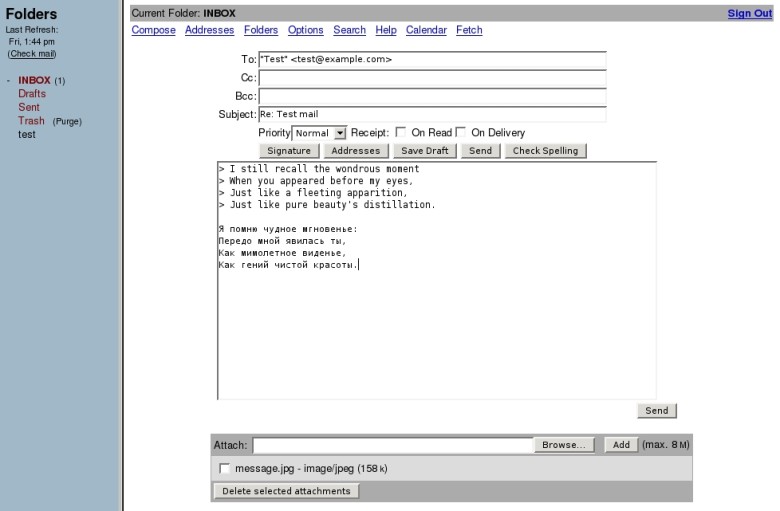
There's one problem with his rant: Upon first clicking upon "Compose", the window does not look like this. This is what it looks like:

Notice the placeholder texts and the CC and BCC fields?
By the way: This is what "full screen" on a 1080p screen looks like.
-
-
I started writing a rant here about the new Maps for Android interface, but in short: they removed the menu and buttons, because apparently menus are too mainstream, and replaced them with a search bar and "my profile" button that takes you to to a list of things you've favorited/rated. It pisses me off because the old interface was practically perfect, and this one's counterintuitive as hell. You can still save map areas to cache (the button's pretty well hidden), but you have no way to know which areas you have saved in cache (and while you're offline you can't even see your list of favorites so don't bother saving them there).
I think they call it "card-based interface". You know, because they put white squares around everything so it looks like cards.
-
@anonymous234 said:
I started writing a rant here about the new Maps for Android interface, but in short: they removed the menu and buttons, because apparently menus are too mainstream, and replaced them with a search bar and "my profile" button that takes you to to a list of things you've favorited/rated. It pisses me off because the old interface was practically perfect, and this one's counterintuitive as hell. You can still save map areas to cache (the button's pretty well hidden), but you have no way to know which areas you have saved in cache (and while you're offline you can't even see your list of favorites so don't bother saving them there).
I think they call it "card-based interface". You know, because they put white squares around everything so it looks like cards.
What about the part where you Android users now get ads in your Maps!
Apple Maps doesn't look so bad anymore.
-
@anonymous234 said:
I started writing a rant here about the new Maps for Android interface, but in short: they removed the menu and buttons, because apparently menus are too mainstream, and replaced them with a search bar and "my profile" button that takes you to to a list of things you've favorited/rated. It pisses me off because the old interface was practically perfect, and this one's counterintuitive as hell. You can still save map areas to cache (the button's pretty well hidden), but you have no way to know which areas you have saved in cache (and while you're offline you can't even see your list of favorites so don't bother saving them there).
I think they call it "card-based interface". You know, because they put white squares around everything so it looks like cards.
On one of my laptops I have mistakenly agreed to use the new Google Maps. Not only is this new version slow as shit, things that were pretty convenient are now either hidden or broken (like: search nearby). My theory is that Google is dumbing down everything so they can easily convert Apple users.
-
@Lorne Kates said:
How is it possible that anyone remains unaware that what Google is displaying is the same subset a typical user registers in, say, Outlook? People blank out most of the screen. The workings of the human brain are always TRWTF.In their continuing quest to make email less usable, here's Gmail's "improved" version of their compose screen. It's cropped, but I'll note that rather than having a nice, big, distraction free canvas to write the email on-- you get something squished down to about 30% of your screen real-estate, surrounded by grey-overlayed controls that are unusable so WHAT THE FUCK IS THE POINT OF SHOWING THEM RATHER THAN FULL SCREEN?
And yes, 30% of the screen is their definition of "full screen".
Anyways, gaze upon the shit and try to answer the questions that follow:
1) In the above example, you see an email address. Assuming for a second that "stupid@example.com" is a valid Gmail address, is this email FROM, TO, CC, or BCC to stupid@example.com
2) Where would you enter the subject line of this email?
3) Is the massive blank space in the middle the text entry box, or a rendering error?
3a) BONUS: As you write your reply, please look left, right, up and down from the position of the cursor. Do you see borders around the text area?
4) Using only the UX cues on the screen, how do you CC or BCC someone on this email?
5) Using only the UX cues on the screen, what is the difference between the paperclip and the plus sign?
6) Please survey a subset of everyone you know personally, come across in your daily life, or are in fact a perfect stranger. Show them this screen shot side-by-side with their familiar email compose screen. Ask them which one they prefer. If anyone answers "the new Gmail Compose Experince", assume they work for the Gmail team and murder them. (This isn't a question. This is a command. I'm sorry I numbered it. I know that's confusing)
Godfuckingdamnit, Gmail. I didn't want to spend my afternoon writing ANOTHER Stylish userstyle to fix your fucking stupid UI decision to fuck up things that have been working and stable since the inception of webmail interfaces! Seriously, I will pay loads of real, fake money for someone to put together a screenshot compilation of webmail interfaces from around 1995 to present day, just to show that thinks HAVE NOT FUCKING CHANGED because that is what ever single user is used to.
-
@Lorne Kates said:
[snip fully justified rant]
As a several-times-daily Gmail web user, I'm hoping against hope that attaching files to an email using the "new experience" becomes possible before they make it the only experience.
-
At work, we are a flagship Google Apps For Enterprise customer. This means we're fucking stuck with gmail and all our bosses have huge boners for Google Docs (Think 'Oh lets try to do all our project management in Excel' is bad? Try 'Oh, lets try to do all our project management in a collaboratively edited Google Spreadsheet'!)
We got this compose screen change ages ago. We all murdered it. That morning I spent most of my time telling people where the hidden 'fuck off give me back the way it used to be' option was. Only our admin assistant uses it, because the only emails she authors (as opposed to replying to, which still has a useful UI) are lolcats anyway.
We pay Google literally SKAZILLIONS of funnybucks for this service, and they are 100% in no way responsive to neither our metrics nor complaints. I'd almost rather use Notes. At least it doesn't randomly change.
-
@flabdablet said:
As a several-times-daily Gmail web user, I'm hoping against hope that attaching files to an email using the "new experience" becomes possible before they make it the only experience.
What's preventing you from doing it now?
-
@blakeyrat said:
@flabdablet said:
As a several-times-daily Gmail web user, I'm hoping against hope that attaching files to an email using the "new experience" becomes possible before they make it the only experience.
What's preventing you from doing it now?
Mainly the fact that when I clicked on the little paperclip, the New Compose Experience failed to respond in any way whatsoever. I said "fuck it" and showed my beloved how to switch her Gmail back to the
OldActually Works Compose Experience.
-
-
I dunno. Drag-and-drop worked for attachments before, and works for attachments now. Paperclip button? Welcome to 1994.
-
@Rhywden said:
There's one problem with his rant: Upon first clicking upon "Compose", the window does not look like this. This is what it looks like:
Placeholder text is not labels. The minute you click on it it vanishes, the cursor is nigh invisible, and once you tab out the placeholder text is gone. And with the lack of borders or labels, you have to remember exactly which empty part of the screen is for which.
Fuck each and every single placeholder text that ever existed.
@Rhywden said:
By the way: This is what "full screen" on a 1080p screen looks like. snip Ben L. worthy screenshot
Not on my 1080p display. I'm on my laptop now instead of at work so I can't screenshot, but even fullscreen was only a tiny sliver in the bottom 30%.
And hey notice all that empty space around your compose window? That's part of your fucking screen. No matter how many times gmail says it, THAT IS NOT FUCKING FULL SCREEN!
-
@esoterik said:
The changed that like months ago, and your just bitching now
Because I've been pressing the "fuck off and don't change my fucking UI button" for months now!
Also: YOU'RE
@esoterik said:
you must not use gmail enough for this to matter.
Do you orgasam from being wrong? If so, cleanup on aisle you.
-
Anyone whom dislikes this interface is taking too much trouble writing each email (you really don't need any more than this for most of your emails).
Anyone whom is unable to figure it out within the first 5 minutes of using it is either a retard, or just old.
@Lorne Kates said:
Godfuckingdamnit, Gmail. I didn't want to spend my afternoon writing ANOTHER Stylish userstyle to fix your fucking stupid UI decision to fuck up things that have been working and stable since the inception of webmail interfaces!
The conservatism is strong in this one.
-
@Ronald said:
On one of my laptops I have mistakenly agreed to use the new Google Maps. Not only is this new version slow as shit, things that were pretty convenient are now either hidden or broken (like: search nearby). My theory is that Google is dumbing down everything so they can easily convert Apple users.
Oh, yes, new-Maps.
So... I can find the bicycle map overlay for new-Maps.
And I can ask for bicycle directions.Can I get bicycle directions on the bicycle map proper?
I can display the transit overlay on new-Maps. I can search for a street address on new-Maps. Any chance I could get a location marker on top of the transit map?
-
@Aeolun said:
Anyone whom dislikes this interface is taking too much trouble writing each email (you really don't need any more than this for most of your emails).
Sorry, we took Trolling off Easy Mode a while back. You're welcome to try again.
-
@Lorne Kates said:
@Aeolun said:
Anyone whom dislikes this interface is taking too much trouble writing each email (you really don't need any more than this for most of your emails).
Sorry, we took Trolling off Easy Mode a while back. You're welcome to try again.
You're talking about the misuse of whom, right? eye twitch
-
@TDWTF123 said:
How is it possible that anyone remains unaware that what Google is displaying is the same subset a typical user registers in, say, Outlook?
[url="http://forums.thedailywtf.com/forums/p/27835/325394.aspx#325323"]Fuck Outlook just as hard[/url] - Fri, May 17 2013 1:29 PM
-
@joe.edwards said:
You're talking about the misuse of whom, right? eye twitch
At least on that I stand corrected.@Lorne Kates said:
Sorry, we took Trolling off Easy Mode a while back. You're welcome to try again.
I don't really care. I just couldn't help the feeling that you must be incredibly set in your ways if you can't deal with Gmail changing their compose interface. You don't have to deal with all that useless clutter when composing an email anymore. I personally think it's quite refreshing.
Seriously, if you dislike change, don't use Google.
Use this
-
@Weng said:
At work, we are a flagship Google Apps For Enterprise customer. This means we're fucking stuck with gmail and all our bosses have huge boners for Google Docs (Think 'Oh lets try to do all our project management in Excel' is bad? Try 'Oh, lets try to do all our project management in a collaboratively edited Google Spreadsheet'!)
But you can see what the other people are typing in the same document at the same time! This is an essential feature in any company! Now if they could roll out the same thing for developers; it would be very pleasant to code in a browser and see conflicts as they happen. Got to be careful where the focus is when you hit backspace and make sure no link is opened in the coding tab, but those are minor inconvenience and I'm sure there is a Firefox add-on for that.
-
@Aeolun said:
I don't really care. I just couldn't help the feeling that you must be incredibly set in your ways if you can't deal with Gmail changing their compose interface. You don't have to deal with all that useless clutter when composing an email anymore.
There is two problems with your reasonment.
The first one is, a lot of people don't use email enough to want to learn a new UI for their use. In the same way, I don't try new kind of high tech meat-cutting technology because my old knife do the job and I don't use them enough to want something more efficiant.
The second one is, some people do use this "useless clutter". I can understand making this UI for people who want it, but why break what work to
Anyway, I had to switch to thunderbird to have again an interface I like. Which mean I will certainly ditch gmail now that it have nothing I really want on it. It's almost the only consequence of this move, bitching on google is pretty much useless anyway.
-
@Rhywden said:
There's one problem with his rant: Upon first clicking upon "Compose", the window does not look like this. This is what it looks like:
Notice the placeholder texts and the CC and BCC fields?
By the way: This is what "full screen" on a 1080p screen looks like.
Agree. It isn't that bad. It's bad but usable. What I hate most about it tha it opens somehwere in the low right corner. That is the WTF. Why don't dispaly it in center of the screen?
-
@beginner_ said:
That is the WTF. Why don't dispaly it in center of the screen?
Because it's not a compose mail feature. It's a chat feature that post mail. And too bad for those who don't use mail as a chatting system but as a mailing system.
-
My beef is with the hiding of five buttons behind a plus sign, that show on hover even if you're not hovering the plus sign.
Why the fuck don't they just show them all the time? It's not like the space is being used by anything else.
And this happens even in "full screen" mode.
-
@Lorne Kates said:
@Rhywden said:
There's one problem with his rant: Upon first clicking upon "Compose", the window does not look like this. This is what it looks like:
Placeholder text is not labels. The minute you click on it it vanishes, the cursor is nigh invisible, and once you tab out the placeholder text is gone.
Maybe then you should think about using a browser which is not from 1990 or something. The cursor thing is a browser problem, placeholder texts reappear for me regardless of tab-position and if you can't remember that "top is addresses, bottom is subject" then you've got bigger problems.
Also, I've got borders between the three areas. Maybe it's just a case of PEBKAC coupled with a shitty browser?
-
@Aeolun said:
Anyone whom dislikes this interface is taking too much trouble writing each email (you really don't need any more than this for most of your emails).
Anyone whom is unable to figure it out within the first 5 minutes of using it is either a retard, or just old.
Anyone who actually believes this, as opposed to merely saying it for the sake of being a shit headed gratuitously annoying worthless pointless immature little fuckwit troll, is a shit headed gratuitously annoying worthless pointless immature little wilfully ignorant fuckwit. So there's that.
-
@Zecc said:
Why the fuck don't they just show them all the time? It's not like the space is being used by anything else.
Sed semper felis sit amet elit elementum gravida. Nam elementum pharetra ligula vel laoreet. Morbi imperdiet lacinia tortor, sed bibendum dui tristique id. Nullam vel laoreet tortor, sit amet feugiat ipsum. Integer eleifend, massa sed vulputate cursus, leo nisi rutrum nulla, id congue eros risus eu lorem. Quisque varius egestas odio, nec semper nulla molestie vitae. Donec nec accumsan dui. Vestibulum eu dignissim metus, semper dapibus lectus. Duis erat leo, eleifend ac lectus nec, vehicula varius nibh. Ut dolor mi, fermentum luctus laoreet ac, cursus quis ipsum. Sed faucibus et massa sed facilisis. Nunc in augue nec orci malesuada vestibulum quis in nulla. Nulla mattis augue eget nunc bibendum, ullamcorper sodales massa dictum. Quisque suscipit massa orci, sed sollicitudin libero facilisis ac. Phasellus ac tristique tortor, ut sagittis ante.
Vivamus porta eu elit in pulvinar. Donec sit amet vestibulum orci. In cursus vulputate sem, vel dignissim turpis dignissim a. Maecenas tempor sem vitae molestie ultrices. Praesent a nunc vitae eros eleifend laoreet ac id mauris. Aliquam erat volutpat. Sed quis erat elementum purus feugiat accumsan. Integer sed ante quis justo accumsan hendrerit sed ut nisi. Phasellus lobortis suscipit nulla. Duis malesuada, massa in tempor ullamcorper, tortor est viverra lorem, non bibendum velit sapien id enim. Proin sodales iaculis tincidunt. Praesent a mauris a est porttitor interdum eget nec lacus.
Nulla nunc arcu, egestas sit amet lacus vitae, rhoncus pretium elit. Aenean ipsum ligula, aliquet ut varius a, pellentesque vulputate massa. Integer tincidunt risus quis elit luctus egestas. Duis odio metus, rutrum malesuada pharetra id, ullamcorper non est. Curabitur convallis augue augue, non mattis velit vestibulum quis. Cras in nunc felis. Sed blandit vel felis non volutpat. Vivamus pharetra, nisi vitae consectetur ultrices, felis est lacinia sem, a ullamcorper tellus mi a turpis. In fermentum massa at massa volutpat tempus. Integer eget tortor consectetur, fringilla mi vitae, viverra mi. Nunc nec diam quis lectus pulvinar tempor. Nunc fringilla bibendum laoreet. Nunc posuere vel diam id dictum. Praesent congue metus ut elit malesuada dignissim. Vestibulum mi mi, pellentesque a ligula eu, sollicitudin accumsan felis.
I can't think of any reason. It's not like filling the screen with useless cruft makes it harder to find what you actually wanted, is it?
Sed semper felis sit amet elit elementum gravida. Nam elementum pharetra ligula vel laoreet. Morbi imperdiet lacinia tortor, sed bibendum dui tristique id. Nullam vel laoreet tortor, sit amet feugiat ipsum. Integer eleifend, massa sed vulputate cursus, leo nisi rutrum nulla, id congue eros risus eu lorem. Quisque varius egestas odio, nec semper nulla molestie vitae. Donec nec accumsan dui. Vestibulum eu dignissim metus, semper dapibus lectus. Duis erat leo, eleifend ac lectus nec, vehicula varius nibh. Ut dolor mi, fermentum luctus laoreet ac, cursus quis ipsum. Sed faucibus et massa sed facilisis. Nunc in augue nec orci malesuada vestibulum quis in nulla. Nulla mattis augue eget nunc bibendum, ullamcorper sodales massa dictum. Quisque suscipit massa orci, sed sollicitudin libero facilisis ac. Phasellus ac tristique tortor, ut sagittis ante.
Vivamus porta eu elit in pulvinar. Donec sit amet vestibulum orci. In cursus vulputate sem, vel dignissim turpis dignissim a. Maecenas tempor sem vitae molestie ultrices. Praesent a nunc vitae eros eleifend laoreet ac id mauris. Aliquam erat volutpat. Sed quis erat elementum purus feugiat accumsan. Integer sed ante quis justo accumsan hendrerit sed ut nisi. Phasellus lobortis suscipit nulla. Duis malesuada, massa in tempor ullamcorper, tortor est viverra lorem, non bibendum velit sapien id enim. Proin sodales iaculis tincidunt. Praesent a mauris a est porttitor interdum eget nec lacus.
Nulla nunc arcu, egestas sit amet lacus vitae, rhoncus pretium elit. Aenean ipsum ligula, aliquet ut varius a, pellentesque vulputate massa. Integer tincidunt risus quis elit luctus egestas. Duis odio metus, rutrum malesuada pharetra id, ullamcorper non est. Curabitur convallis augue augue, non mattis velit vestibulum quis. Cras in nunc felis. Sed blandit vel felis non volutpat. Vivamus pharetra, nisi vitae consectetur ultrices, felis est lacinia sem, a ullamcorper tellus mi a turpis. In fermentum massa at massa volutpat tempus. Integer eget tortor consectetur, fringilla mi vitae, viverra mi. Nunc nec diam quis lectus pulvinar tempor. Nunc fringilla bibendum laoreet. Nunc posuere vel diam id dictum. Praesent congue metus ut elit malesuada dignissim. Vestibulum mi mi, pellentesque a ligula eu, sollicitudin accumsan felis.
-
-
@Lorne Kates said:
I already explained to you precisely why they are. Like I said, what we're getting from Gmail is what normal people see. What you're complaining about is Google being extremely good at working out how the users actually use stuff, and adapting it to that pattern instead of attempting to mandate how/what they should use. It's directly analogous to what they've done with searches - which is another thing that the superusers here have complained about in the past.@TDWTF123 said:
... idiot analogy...
If you think standard buttons are "useless cruft", then y...[+]
Bear in mind that Google wants to suck up the 99.9% of users with a very generic use-case, rather than the 0.1% who use esoteric features like 'CC:'. That doesn't mean they've necessarily got it right, but if you don't understand that the buttons you're talking about may be standard, but have been identified by Google as useless cruft to be removed, then you can't hope to understand why the interface is now the way it is.
-
@TDWTF123 said:
I can't think of any reason. It's not like filling the screen with useless cruft makes it harder to find what you actually wanted, is it?
Turns out what I actually wanted is either:a) the text inputs for the recipient address, subject and message body; (Hint: they are the big white spaces)
b) the buttons that allow me to operate on the message body. (which are now partially hidden for no good reason)
-
@TDWTF123 said:
Like I said, what we're getting from Gmail is what normal people see.
Got non-asspull numbers for that?
Have you ever, ever, EVER heard anyone say "I can't figure out how to send an email!" If you have-- have you ever, ever, ever heard them ask it more than once?
What do you think will happen if your IT department decides to hide 90% of the Outlook buttons in a corporation using a group policy?
How in any fuck can you justify removing borders around input elements? An input textbox/textarea is a very, VERY standard and recognizable thing with a VERY distinct look and feel. It's UI as old as UI-- and I'm not even talking about GUI! Things look the way they do because they work, and EVERY FUCKING USER is used to it. Change for the sake of change is not innovative. It's just change.
Thank fuck auto manufactures aren't (always) designing UX like that. I mean, "99.9%" of people don't use D3, D2 and D1-- so let's engineer it away because it might confuse someone when they're trying to find "D". Nope, instead they're wasting their time coming up with new design features like lights that go on when people are in your blindspot-- or rearview cameras-- or collision detection and avoidance systems-- you know, useless stuff.
It'll be a dark fucking day when Google starts designing cars--- oh. =(
-
God help me, but I kind of like how Outlook.com handles their UI. It's clean, and very Metro-y (as expected) but it's still pretty intuitive. Which sucks because I've used GMail for years. Also, the online Word/Excel etc. are 1000000% better than Google Docs, both in use and UI. Even Chrome is starting to wear thin on me.
-
@Lorne Kates said:
Nope. But I'd bet Google does, having done their research before making the changes.@TDWTF123 said:
Like I said, what we're getting from Gmail is what normal people see.
Got non-asspull numbers for that?
I'm astonished that you can't see it's obviously true. We all ignore most of what's on the screen most of the time, fixating on certain elements and masking off others. Most people are even capable of ignoring flashing banner ads, and giving them no more attention than the bezel of the monitor.
No, it's no surprise to me that people can walk straight past something every day for years without noticing it, nor that they can do exactly the same thing with a mouse and screen.
@Lorne Kates said:Have you ever, ever, EVER heard anyone say "I can't figure out how to send an email!" If you have-- have you ever, ever, ever heard them ask it more than once?
You have clearly never done any tech support of any kind. Having actually supported ordinary users for stuff like email, I can tell you I'd much rather support the new Gmail interface than Outlook because there's so much less for the idiots to fiddle with or get distracted by.
@Lorne Kates said:What do you think will happen if your IT department decides to hide 90% of the Outlook buttons in a corporation using a group policy?
The sets of people who care and people who know what a group policy is will likely be nearly homogeneous. Some reasonably large minority of users will at least notice a change, but will probably think it's a new version of Outlook. Maybe 0.1% of the users will actually have been using even just one of the removed buttons. The majority of users will not even notice the change because as far as they're concerned, those buttons were always just background clutter.
@Lorne Kates said:How in any fuck can you justify removing borders around input elements?
Wait, are you just complaining about the paint on the walls?
@Lorne Kates said:Thank fuck auto manufactures aren't (always) designing UX like that. I mean, "99.9%" of people don't use D3, D2 and D1-- so let's engineer it away because it might confuse someone when they're trying to find "D".
Er, car manufacturers are doing their best along those lines. They're not as good at it as google, perhaps, but they're trying. Of course, they are in a much more mature field so radical change is less likely, but to take your specific example, there has indeed been a tendency towards PRND labelling instead of PRNDL23.
-
@Lorne Kates said:
I'm on my laptop now instead of at work so I can't screenshot
Did someone break your PrtScr key?
-
@Lorne Kates said:
1) In the above example, you see an email address. Assuming for a second that "stupid@example.com" is a valid Gmail address, is this email FROM, TO, CC, or BCC to stupid@example.com
2) Where would you enter the subject line of this email?
3) Is the massive blank space in the middle the text entry box, or a rendering error?
3a) BONUS: As you write your reply, please look left, right, up and down from the position of the cursor. Do you see borders around the text area?
4) Using only the UX cues on the screen, how do you CC or BCC someone on this email?
5) Using only the UX cues on the screen, what is the difference between the paperclip and the plus sign?
6) Please survey a subset of everyone you know personally, come across in your daily life, or are in fact a perfect stranger. Show them this screen shot side-by-side with their familiar email compose screen. Ask them which one they prefer. If anyone answers "the new Gmail Compose Experince", assume they work for the Gmail team and murder them. (This isn't a question. This is a command. I'm sorry I numbered it. I know that's confusing)
1) To
2) Second line
3) Text entry
4) Click on the To, something will show up
5) paperclip is for attachments, not sure about +
Now after reading the thread:
@Lorne Kates said:
I mean, it's great that you use three letter acronyms for ID and class for all those elements. Really saving bandwidth on those bytes-- oh, wait-- THREE HUNDRED AND SIXTY SEVEN DOM ELEMENTS!
NOOOOOOOO! That's like 5KB! THINK OF THE MOBILE USERS!