What is your favorite visual representation of a thing you can't see?
-
Examples: psychic abilities in video games, dramatizations of quantum mechanical phenomena, source control graph animations, audio visualizations
-
I laugh when magic is represented by star sparkles.
-
Pizza
-
I like when sound damage powers in video games is represented by "smoke circles" moving fast.
Both CoH and Champions online do this. It was a great effect.
-
-
A car.
-
That rotating image of a hypercube
-
-
@ben_lubar The Big Bang illustrated by an explosion seen from the outside.
-
@boner said in What is your favorite visual representation of a thing you can't see?:
Memories of hours and hours of seeing this on the screen :) :)
-
@boner said in What is your favorite visual representation of a thing you can't see?:
Out of all versions you find one in... Slovenian?
Sigh, we always have to bail you westerners out...Anyway, @Gurth stole mine, so I'll just add an image (though this one isn't just the pretties):

-
I wouldn't say that they are my favorites, but two which I find fascinating are the Bohr model of the atom, and the Waterfall Model Diagram, because they both illustrate the dangers of a compelling, but incorrect, visual model.
The Bohr visualization was the first attempt at bridging the gap between the classical Newtonian model of physics and what they were just starting to learn about quantum effects when it was developed in 1913:
It depicts the electron orbits as circular orbits similar to, but inconsistent with, planetary orbits (which are always elliptical to some degree). The idea was that the motion of the electrons was similar to that created by gravitation, but that unlike gravitational orbits, the paths were fixed - the electrons could move from one orbit to another, but they couldn't move between orbits.
It was visually striking, and the mathematical model that led to Bohr developing initially seemed to work for hydrogen, but even before the paper it first appeared in was published he'd realized it couldn't work for helium or any other element, and that the model had to be scrapped.
But despite this, it has remained the popular image of 'what an atom is' for over a hundred years. It is still used in textbooks, at least as a historical note, and while those textbooks all add something to the effect of, "Dude, it's a cool picture and all but it's bullshit', it still causes a lot of confusion for students because the later models are a lot less visually compelling.
The Royce diagram is even better, or perhaps I should say worse:
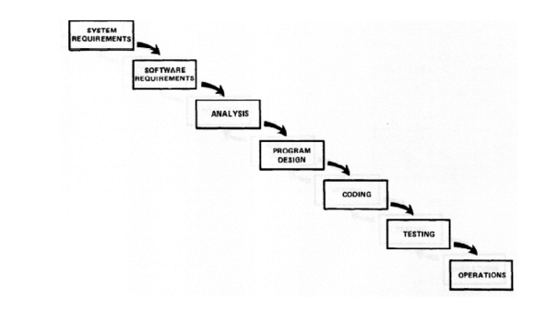
The intersting thing here is that the whole point of the diagram was to be a straw man. The very first sentence in the paper after this diagram is:
I believe in this concept, but the implementation described above is risky and invites failure.
That is to say, it was adequate as a general overview of the steps needed, but you couldn't actually do it that way, because there would always be unforeseen issues that would require you to go back one or more steps. The diagram he expected to become the standard model showed this part:
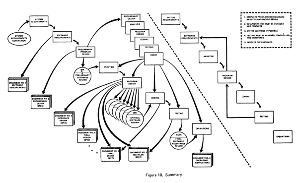
It was still flawed, but it did depict the kind of iterative, multi-layered process that is at the heart of actual software development, regardless of the 'methodology' nominally in use.
But it's complicated. That was deliberate, because his whole point was that the problem was complicated, and that the existing informal approaches - and the semi-formal, overly optimistic ones which the first diagram was meant to formalize and describe - were too simplistic. That's fine and all, but putting the more compelling diagram first proved to be a catastrophe, as most of the people who read the paper took away exactly the wrong idea. It is as if the entire software engineering community decided to stop reading after the first page of the paper - the page which ends with that first diagram.
It has been described as the costliest error in engineering history, and came out of an attempt to prevent exactly the problem it caused.
Every intro course in both cognitive studies and data modeling should spend a week on each of these, just to drive home the point of how effective a visualization can be, and how dangerous a flawed but compelling visualization can be.
-
-
Motorcycles. I haven't started seeing them yet.
-
@scholrlea said in What is your favorite visual representation of a thing you can't see?:
But despite this, it has remained the popular image of 'what an atom is' for over a hundred years. It is still used in textbooks, at least as a historical note, and while those textbooks all add something to the effect of, "Dude, it's a cool picture and all but it's bullshit', it still causes a lot of confusion for students because the later models are a lot less visually compelling.
Huh. I thought the s and p hybridisation diagrams in my Chemistry 101 class were truly awesome, as they explained a lot more about why molecules are the shape they are. (It was a damn good class. It was a pity the other Chemistry classes in the year sucked.)
@scholrlea said in What is your favorite visual representation of a thing you can't see?:
It is as if the entire software engineering community decided to stop reading after the first page of the paper - the page which ends with that first diagram.
That's the computing industry all over.
