ad-hoc graphing toolkit
-
Our product spits out performance data in flat files as a side effect. Every once in a while, there is need to massage and plot the data resulting from this. However, the office product of preference is libreoffice, and the raw data volumes are too large for libreoffice calc to handle.
I have in the past played with R for this a bit, and while it would undoubtedly work well if I invested the time in learning it properly, I don't particularly feel like spending that time.
Does anyone know a flexible, intuitive, preferably free solution?
-
@PleegWat said in ad-hoc graphing toolkit:
Our product spits out performance data in flat files as a side effect. Every once in a while, there is need to massage and plot the data resulting from this. However, the office product of preference is libreoffice, and the raw data volumes are too large for libreoffice calc to handle.
I have in the past played with R for this a bit, and while it would undoubtedly work well if I invested the time in learning it properly, I don't particularly feel like spending that time.
Does anyone know a flexible, intuitive, preferably free solution?
pyplot/matplotlib (for Python), perhaps?
-
@PleegWat
if you have to start from scratch, i doubt there will be something easier than R.
What's your technology of choice for the product?
-
@PleegWat said in ad-hoc graphing toolkit:
Our product spits out performance data in flat files as a side effect. Every once in a while, there is need to massage and plot the data resulting from this. However, the office product of preference is libreoffice, and the raw data volumes are too large for libreoffice calc to handle.
I have in the past played with R for this a bit, and while it would undoubtedly work well if I invested the time in learning it properly, I don't particularly feel like spending that time.
Does anyone know a flexible, intuitive, preferably free solution?
Example code (from here):
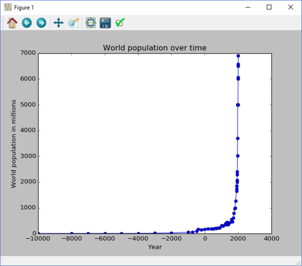
from matplotlib import pyplot

data = open("world_population.txt", "r").readlines()
dates = []
populations = []
for point in data:
    date, population = point.split()
    dates.append(date)
    populations.append(population)

pyplot.plot(dates, populations, "o-")
pyplot.ylabel("World population in millions")
pyplot.xlabel("Year")
pyplot.title("World population over time")
pyplot.show()
Produces:
-
There's a long series on it here:
https://www.youtube.com/watch?v=q7Bo_J8x_dwSome of the examples can get pretty involved:
https://www.youtube.com/watch?v=OebyvmZo3w0(NB: I have not watched the series, just looked at a couple example videos.)
-
@Jarry said in ad-hoc graphing toolkit:
What's your technology of choice for the product?
Frontend is PHP. We've got our own graphing library for the main data output, but it's not easily possible to hook that up to anything else. Though we have considered doing that as well, or there's a wishlist item to build a better interface inbetween.
-
@Dreikin Hm, that looks interesting.
-
If there's a *NIX machine somewhere in the pipeline check out XGraph, it might work for you if the data is simple enough.
-
@Onyx Practically all linux. I'll pass it on.
-
@Onyx said in ad-hoc graphing toolkit:
If there's a *NIX machine somewhere in the pipeline check out XGraph, it might work for you if the data is simple enough.
Btw, their site offer Linux, Windows, Mac OS X, FreeBSD and Solaris package for you to download, so maybe platform preference does not matter much here.
-
@cheong Huh. The X part made me think it's dependent on the X server. Apparently not. I sit on my squeaky chair corrected.
-
-
@Luhmann said in ad-hoc graphing toolkit:
When will you finally lube that up?
Perfect avatar for that question

-
Not necessarily intuitive, and as with R it depends pretty much on how your input data is formatted, but once you've decided what you want it to do (and how and with what), you don't need it to be that intuitive anymore.
-
@Luhmann said in ad-hoc graphing toolkit:
@Onyx said in ad-hoc graphing toolkit:
my squeaky chair
When will you finally lube that up?
Oh yeah, thanks for the reminder!
-
